Looks like that white monstrosity jersey remains. F*** meParramatta teasing their 2024 range in their membership ads. Looks like the leak of the home jersey in the toddler's pack on their website was correct
Looks like that white monstrosity jersey remains. F*** meParramatta teasing their 2024 range in their membership ads. Looks like the leak of the home jersey in the toddler's pack on their website was correct
It doesn't clash at allHow long is it going to take for the NRL to sack up and force the Rabbitohs to create a genuine alternate jersey that contrasts with their home, because it's got beyond a joke at this point. Taking the side panels away will make the clash with the Raiders home jersey even worse as well, especially considering that the Raiders major sponsor is red and white.
Basic shit like avoiding major clashes like this shouldn't be this hard.
I know it’s a little detail but what are your thoughts on black vs white rabbit logo? I love the meaning behind the black rabbit but think it should be reserved for either the away strip or indigenous round given the white has been on the home jersey for a fair chunk of those 21 premiershipsBit of a late reaction to the Souths jerseys but anyways. Keep in mind I am biased haha.
This is probably the most changes we've had to our regular strip in a number of years. But holy hecka, they look absolutely beautiful, and I am in awe. Honestly, I'm gonna come out and say these are the nicest jerseys we've had in the modern era. These are THAT good!!
It's basically a perfect modern day Souths jersey. One of the biggest changes is that for what seems like the first time in forever, the side panels that so many people complained about are gone! The hoops now go all the way around! How good! On the hoops, they've changed a bit too. There is one less stripe on the 2024 jerseys than in previous years and they're thicker. This is more in line with a traditional Souths jersey which I love. Other changes include the MG logo on the home jersey changing to black which I've called for since MG signed with us because it just looks so much crisper and nicer. Ingenia Holiday Parks also becomes the new sleeve sponsor, and it appears that Crown Resorts are gone.
I'm ignoring the shade of Red and Green on these 3D renders for now. Really hoping it's just the render and they haven't actually changed to a lighter shade of green, but time will tell. Surely, they'll just use the same shade they have for years.
In summary, I just absolutely love them! As I said, they're perfect modern-day Souths jerseys and the nicest we've had in years.
I don't think it's any coincidence that some of these changes were implemented the year after the Sattler jersey. People loved that jersey because it was more old school and I have no doubt it would have been one of the highest selling Rabbitohs jerseys for a long time. The people spoke with their money and the club has somewhat listened by making some of these changes.
Beauty!!!!!
Settling for crap is the Wests Tigers way. It's in their DNA.they have had some great designs… and have settled on this crap as their “iconic brand”
Similar to how Cronulla reverted to a lighter shade of blue and their traditional hoops jerseys after they wore them a couple of times for one-off games in the early/ mid 2000's and they sold out in a flash.Bit of a late reaction to the Souths jerseys but anyways. Keep in mind I am biased haha.
This is probably the most changes we've had to our regular strip in a number of years. But holy hecka, they look absolutely beautiful, and I am in awe. Honestly, I'm gonna come out and say these are the nicest jerseys we've had in the modern era. These are THAT good!!
It's basically a perfect modern day Souths jersey. One of the biggest changes is that for what seems like the first time in forever, the side panels that so many people complained about are gone! The hoops now go all the way around! How good! On the hoops, they've changed a bit too. There is one less stripe on the 2024 jerseys than in previous years and they're thicker. This is more in line with a traditional Souths jersey which I love. Other changes include the MG logo on the home jersey changing to black which I've called for since MG signed with us because it just looks so much crisper and nicer. Ingenia Holiday Parks also becomes the new sleeve sponsor, and it appears that Crown Resorts are gone.
I'm ignoring the shade of Red and Green on these 3D renders for now. Really hoping it's just the render and they haven't actually changed to a lighter shade of green, but time will tell. Surely, they'll just use the same shade they have for years.
In summary, I just absolutely love them! As I said, they're perfect modern-day Souths jerseys and the nicest we've had in years.
I don't think it's any coincidence that some of these changes were implemented the year after the Sattler jersey. People loved that jersey because it was more old school and I have no doubt it would have been one of the highest selling Rabbitohs jerseys for a long time. The people spoke with their money and the club has somewhat listened by making some of these changes.
Beauty!!!!!
Is there any other type of Souths fan, apart from the Junior Labor party, 7 figure earner who spends more on the adult whizz fizz in a month than the average person spends on their energy bills in a financial year and sticks their chest about how Souths are "the people's team" unlike those toffs at the Roosters?Its not red and green, its cardinal and myrtle. I had some deranged weirdo souths fan lecture me on that for half an hour once.
Yeah, I did notice a bit of a 2001 jersey theme for the Knights of late. A lot of it is subtle, but some is more obvious. I just thought that it was a theme the social media team were running with ... and I hope that's all it ends up being. Don't get me wrong, I don't mind that jersey, and did think the heritage version last year looked good, but I like the 'main' one we had this year and last, and was just hoping (certainly not 'expecting'!) they would run with a mostly red version of it as their 'away' kit one of these years soon. I much prefer that 2001-2003ish home kit to the white away kit if that same era ... but I fear it's coming along for the ride in 2024 too.
This really isn’t a surprise as over the past couple of years Castore has shown that they haven’t been able to deliver gear for the players - especially this year. All jerseys worn this year were manufactured by ISC (or whoever they outsource manufacturing to).
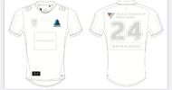
This might mean a new jersey design - however there are membership items that vaguely resemble the design of the current jersey.

I’ve lost count of the amount of rabbits stickers I’ve seen on Range Rovers back windscreens.Is there any other type of Souths fan, apart from the Junior Labor party, 7 figure earner who spends more on the adult whizz fizz in a month than the average person spends on their energy bills in a financial year and sticks their chest about how Souths are "the people's team" unlike those toffs at the Roosters?
Never mind the fact he's on first name terms with half the people who have Roosters corporate memberships because they played Rugby together at school...
All the tradie Souths fans have moved to Perth, I swear every ute and van here as a rabbit sticker on the back!I’ve lost count of the amount of rabbits stickers I’ve seen on Range Rovers back windscreens.
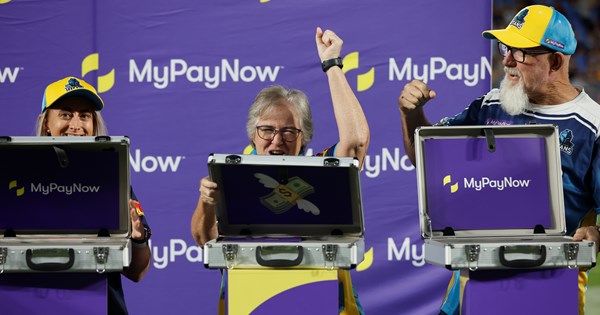
Looks like the Titans are getting a new principal sponsor. My Pay Now has gone to a “premier sponsor”. I thought it may have been so when the club ran a comp to design the ‘24 City Jersey and had a space holder for the main sponsor of the jersey. I pray to god it has decent integration….
View attachment 81442View attachment 81442

MyPayNow extend Titans commitment to 2025
MyPayNow has re-committed to the Titans long-term with the Gold Coast-based firm continuing their support for the club through to the end of the 2025 season.www.titans.com.au

All i gotta say is it better be purple, not some navy shit with a dash or smidge of itStorm are teasing the reveal of the new O’Neills jersey for tomorrow.
