What's new
The Front Row Forums

Register a free account today to become a member of the world's largest Rugby League discussion forum! Once signed in, you'll be able to participate on this site by adding your own topics and posts, as well as connect with other members through your own private inbox!

2025 NRL Jerseys, Sponsorship, Logos

flippikat

First Grade
Messages
5,221
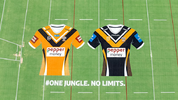
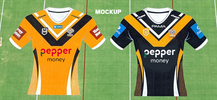
I know it's just graphics of the new Tigers jersey & not a photo of the real thing, but it looks like they've done a good job combining some elements of the 2005 design (curves, hexagons, gradients) with a V and a pretty clean centre of the jersey.

Honestly, the drawings are far better than what I was anticipating.
 

yakstorm

First Grade
Messages
6,037
Will be keen to see if the final jersey looks like the graphic. The V is a big improvement than what they've run around with in the past few years, and nice to see it go back over the shoulders.

I'll be keen to see how the 2005 elements look when worn. Hopefully they get the balance right so it's not completely hidden under the arms, and it doesn't come too far across the stomach.

Would have been nice if Pepper money didn't need to be in a black box... IMO, I feel this looks a lot better.

1732759705033.png
 

Vic Mackey

Referee
Messages
25,378
I know it's just graphics of the new Tigers jersey & not a photo of the real thing, but it looks like they've done a good job combining some elements of the 2005 design (curves, hexagons, gradients) with a V and a pretty clean centre of the jersey.

Honestly, the drawings are far better than what I was anticipating.
Will be keen to see if the final jersey looks like the graphic. The V is a big improvement than what they've run around with in the past few years, and nice to see it go back over the shoulders.

I'll be keen to see how the 2005 elements look when worn. Hopefully they get the balance right so it's not completely hidden under the arms, and it doesn't come too far across the stomach.

Would have been nice if Pepper money didn't need to be in a black box... IMO, I feel this looks a lot better.

View attachment 97032

They look heaps better in person, particuarly the black. ONly had black shorts and socks this morning with both jerseys so not sure if we have alternate ones of those.
 
Messages
11,934
Clearer photo from the Tigers' media release - orange one is the NRLW jersey with slightly different sponsors


View attachment 97030
Looks F'en crap, rectangular logo sponsor and stupid naughties nostalgia grand final side wind panels.... Honestly original Balmain and black Western Suburbs jerseys would be a massive cash bonanza for the club. 👎
 

flippikat

First Grade
Messages
5,221
Looks F'en crap, rectangular logo sponsor and stupid naughties nostalgia grand final side wind panels.... Honestly original Balmain and black Western Suburbs jerseys would be a massive cash bonanza for the club. 👎
Ahh but by using a modern orange, black & white design (no matter what the proportions of each color), means that a) they forge a unique identity for the Wests Tigers that's separate from the two original clubs and b) they can use historical designs for when that's worth doing - whether that's celebrating an anniversary of something Wests or Balmain did or a heritage round.
 

Vic Mackey

Referee
Messages
25,378
Looks F'en crap, rectangular logo sponsor and stupid naughties nostalgia grand final side wind panels.... Honestly original Balmain and black Western Suburbs jerseys would be a massive cash bonanza for the club. 👎

The target audience for buying jerseys generally isnt 65 + year old males
 

Latest posts

Top