- Messages
- 8,710

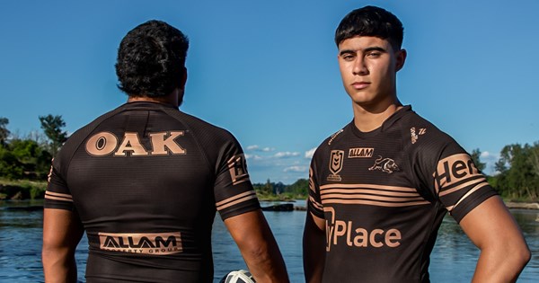
Panthers launches 2025 Alternate Jersey
The Panthers are thrilled to announce the launch of the club’s official Alternate Jersey for the 2025 season.


The best ran club in Australian sportView attachment 97206

Panthers launches 2025 Alternate Jersey
The Panthers are thrilled to announce the launch of the club’s official Alternate Jersey for the 2025 season.www.penrithpanthers.com.au
Sort of, they launch the new alternate jersey, then talk about how the 4 gold stripes represents the 4 premierships that the male model recruits from the armpit clubs weren’t a part ofThe best ran club in Australian sport
The trim looks kinda light-caramel/tan... and honestly this mix of colours would sit well as a lasting alternate.View attachment 97206

Panthers launches 2025 Alternate Jersey
The Panthers are thrilled to announce the launch of the club’s official Alternate Jersey for the 2025 season.www.penrithpanthers.com.au
No!!! It's taken until the last 5 years for Penrith to finally have our own colours and identity. No changing anythingThe trim looks kinda light-caramel/tan... and honestly this mix of colours would sit well as a lasting alternate.
Maybe rest the pink strip for a while & try variations using that caramel & black?
Remember, they used it in 2016.. how about some vintage Panthers jerseys (1967 original jersey, early 1970s vertical stripes, 80s shoulder stripes) with these colours?
You mean until the last 5 years to remember how good the 1991 colourset & design was?No!!! It's taken until the last 5 years for Penrith to finally have our own colours and identity. No changing anything
And despite that they wore the 03 throwback in a grand final, and now a 16 colour throwback for possibly the biggest regular season game of the year. Their branding is all over the placeNo!!! It's taken until the last 5 years for Penrith to finally have our own colours and identity. No changing anything
100%. Me too. And many others too, if we're going by the comments on here year after year.The Bronze and Black NRL logo is pretty much what I had in mind for what the reigning premiers NRL logo should look like
Hopefully off the back of the Panthers releasing this jersey, it starts the right conversations at Moore Park.100%. Me too. And many others too, if we're going by the comments on here year after year.
I agree this may be the ‘norm’ has poker machine reforms increase it will be a revenue that clubs won’t have anymoreI think it’s more likely for the NRL to move towards more sponsors on jerseys, not less. I can see them allowing teams to use the upper shoulder/collarbone area for non-apparel sponsors - either by letting clubs swap placements or just allowing non-apparel brands to take both spots. It’s becoming common in the AFL for teams wearing one brand in particular (New Balance/Belgravia) to sell off the apparel brand logo spot - so you’d really need an apparel partner willing to do it.
I think we’ll also continue to see clubs push the boundaries for the size of sponsor logos. Some clubs are already there, of course. But we might see more things like Storm’s vertical Carsales logo on the sleeves which ends up with it being a larger logo compared to horizontal.
I think that’s a bit harsh. I think they’ve been doing a great job, it might not conform to your opinion of how it should be but that’s okay.And despite that they wore the 03 throwback in a grand final, and now a 16 colour throwback for possibly the biggest regular season game of the year. Their branding is all over the place

Not a bad stab at it, but unfortunately the red side-panels on the 2025 Dragons away jersey undermine the thingLooks to be based off the 1996-98 Steelers jersey (pic for reference)


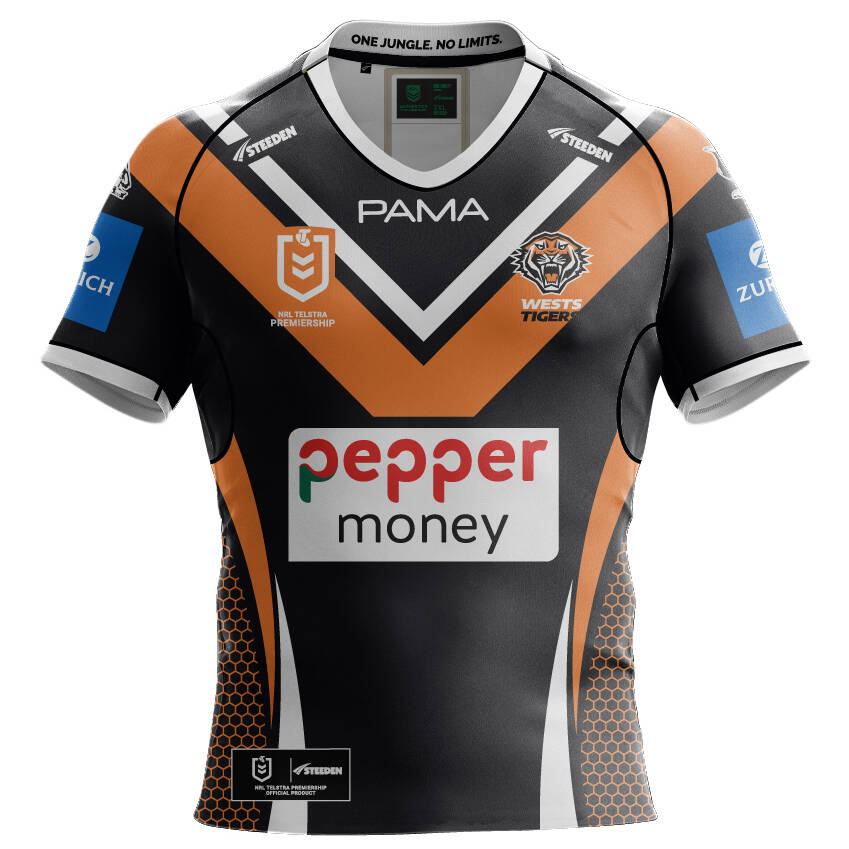
| Home Jersey |
|
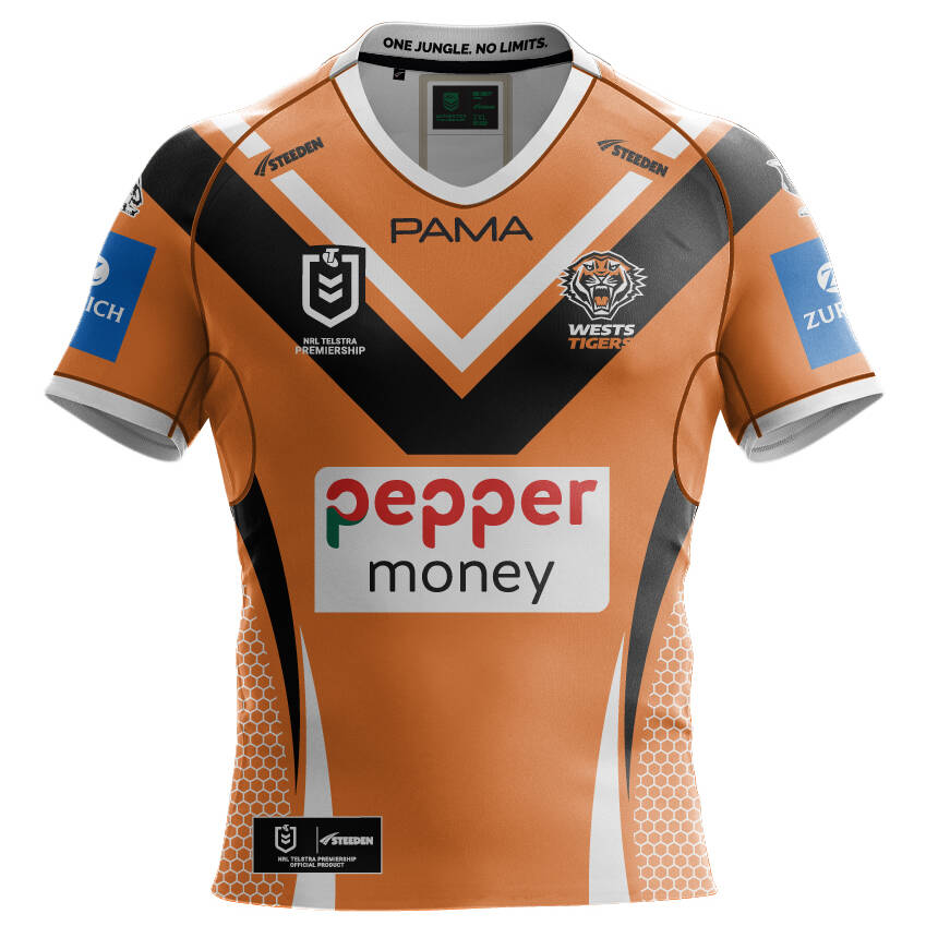
| Away Jersey |
|
Our branding has improved out of sight, its by far the best its ever beenAnd despite that they wore the 03 throwback in a grand final, and now a 16 colour throwback for possibly the biggest regular season game of the year. Their branding is all over the place
