Needs some refining. Panther isn't too bad but the 3/4 view is a tough one to nail as it makes the Panther relatively small in the logo. Having the Panther not rely on the wordmark to fit to the shield would be good, kind of like the Richmond Tigers logo but you'd obviously want to make a clear differentiation.
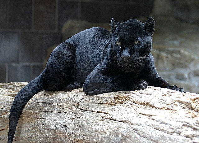
Too much white to register as a Panther, if the shield colour was switched from black to the secondary colour (teal) then the panther could be darker and the shield would stand out on a black jersey. The rounded edges and heavy contrasting remind me more of a mountain lion, such as this Penn State logo:
EDIT: Comparing them side by side, I wouldn't be surprised if the logo was based on this. Not necessarily calling plagiarism but they'd want to make changes to make it more distinct to avoid potential shit down the track.
The wordmark is too tight and wont read well at small scales. The dual Panthers are excessive, the "P" and panther would make a decent secondary logo though (not in white).


