Foreign Legion
Coach
- Messages
- 12,400

Salford Reds S.L.

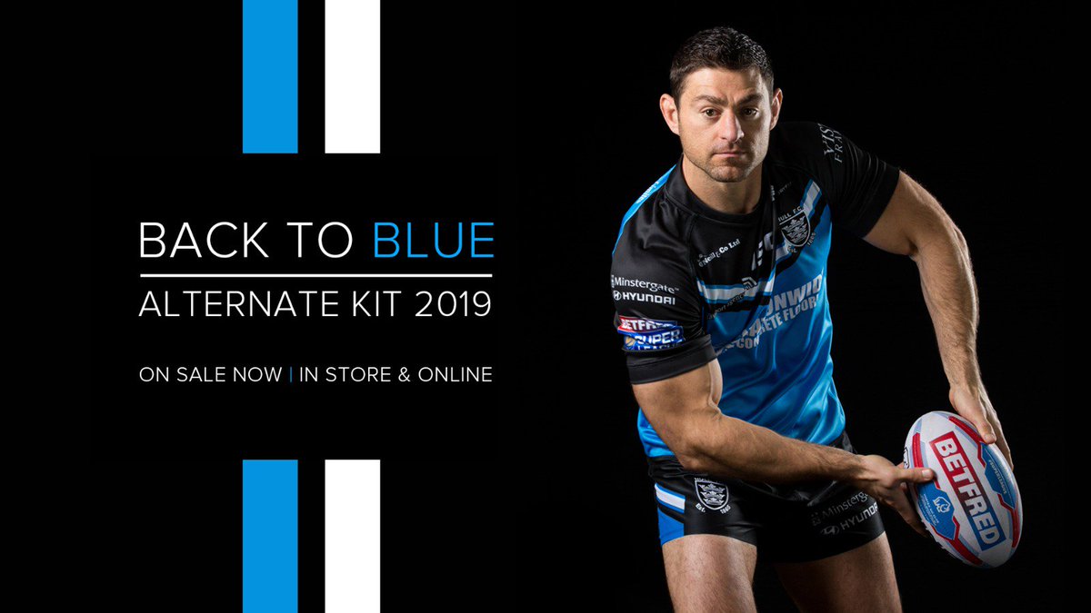

Hull FC away kit
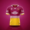
As the 2019 jerseys start to be unveiled, you get a sense of who you'd like to see in the Grand Final, jersey wise. After the Titans mercurial jersey unveil, i'm sure there are many people who wouldn't want them to lift the Trophy for their maiden premiership wearing a very confusing sense of identity.
As for past Grand Finals, we've been pretty lucky that all our premiers have had their traditional jerseys, or a solid club identify. If i had to choose the worse NRL premiers jersey of the last 20 years, it would probably be the 2006 Broncos white and navy away jersey. I know Brisbane had no say in what jersey they could wear, but depicting the Broncos brand, it was hard to tell who they were if you were an occasional NRL supporter.
Although, the remaining Premiers have had great identifying jerseys. Some of the best have been Roosters 2013/2018, Rabbitohs 2014, Knights 1997, 2001, Panthers 2003 and Bulldogs 2004.
Let's hope for jersey sake that the 2019 Grand Final isn't between Gold Coast Titans wearing their home jersey, and the Parramatta eels wearing their away jersey.


I think you’ll find that it was St. George Illawarra winning their very first grand final in 2010.St.George in 2010 was pretty iconic. Not sure how you could have wiped that one from your memory. Shall I refresh you?
Also I wouldn’t keep yourself up at night worrying about a Titans vs Eels grand final
I think you’ll find that it was St. George Illawarra winning their very first grand final in 2010.
Beating the Sydney Roosters who'd won 2 grand finals up 'til 2010.. A third coming in 2018. Well done.

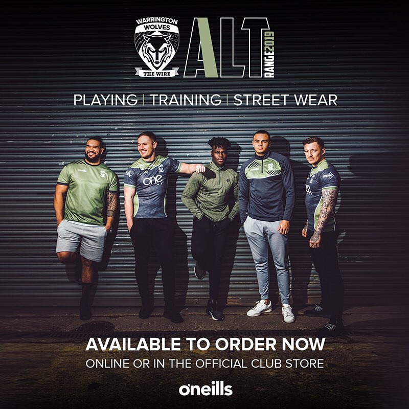
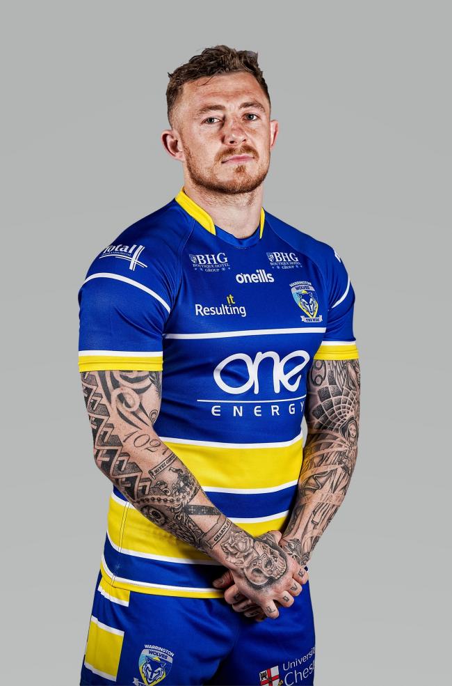
While ESL clubs have always had odd-coloured and designed alternate kits compared to their main kits, however prior to about a month ago I'd never noticed that their club logos also change colour to go with the alternate kits. This Warrington kit and I think it was St.Helens a few weeks ago are the two that I've now seen do this.
I don't particularly like the fact that ESL clubs have an alternate kits that in no way resembles the club it's meant to represent, however it's something I (we?) are used to, so I can tolerate that, however the changing of the club's logo to match the random colours of the alternate jersey I'm not a fan of. The club logo should remain the correct colours in my opinion.
yeah its pretty gross- every team in the ESL is red, and every team in the NRL is blueI'd say the alternate kits being in unusual colours is largely down to a lot of teams sharing colours, so there's a higher number of clashes, just in Super League for example only Huddersfield & Castleford have kit colours that are unique, but both clash with reds. At least Wigan have kind of created a 'tradition' of having an alternate kit that is either blue or black.