kdalymc
Bench
- Messages
- 4,384
I'd prefer us to use scarlet red, old gold and black as our brand colours and then come up with a very iconic jersey design using these colours. We can save the Reds kit for heritage round.

It's mine but it was modified. I didn't put the silhouette there.It needs to be this and it’s inverse only. (Red or black)
Someone chucked this up a few years ago (gaz?) maybe it could have a tweak- fix the vee similar to the new tigers, scratch the silhouette but something simple that they can keep for 10 plusView attachment 27105
That name tho, yuk f**k me you already have west coast eagles, why not Perth Pirates
Edit- ah it is @GAZF i see the logo
In my head i can picture their jersey pretty much like the roosters template but in black red and gold. Can switch them all around for clashesIt needs to be this and it’s inverse only. (Red or black)
Someone chucked this up a few years ago (gaz?) maybe it could have a tweak- fix the vee similar to the new tigers, scratch the silhouette but something simple that they can keep for 10 plusView attachment 27105
That name tho, yuk f**k me you already have west coast eagles, why not Perth Pirates
Edit- ah it is @GAZF i see the logo
Only souths is allowed to have the same design in almost the same colour distribution. They're the chosen ones.In my head i can picture their jersey pretty much like the roosters template but in black red and gold. Can switch them all around for clashes
Home - gold jersey, red V, black collar area, black shorts
Away - gold jersey, black v, red collar area, red shirts
Alt - black jersey, red v, gold collar, gold shorts
Rabbitohs lower grade jerseys by Classic have used mini Rabbitohs logos where the grip on the chest goes. Couldn't get a decent screen shot of it but jump to 1:20 in the video below to take a look
https://www.rabbitohs.com.au/news/2019/02/08/bennett-delivers-stirring-speech-to-souths-juniors/

Looks like a Peter North finishing move all over the chest


Hey guys,
This is the start of a new series I’ll be doing over the next few months where I post my ideal jerseys for an NRL club every week.
Some of my rough guidelines are:
- Names and numbers on the back of jerseys, with a new font for both.
- Reduction of the middle chest and upper back of jersey sponsor.
- Active effort to make the primary sponsor fit with the rest of the jersey.
- Less jerseys per season + tighter restriction on when jerseys can be worn (primary unless a genuine clash)
- Finally, trying to come up with a design that can be iconic + timeless for a club so that they only have to make minor changes over the years.
I’ve been reading this forum for years and love the attitude a lot of posters have towards jerseys and design in general so would love some feedback each week!
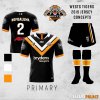
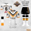
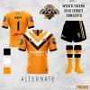
First up is the Tigers! (shoutout to GAZF for the shorts and socks template!)View attachment 27358View attachment 27360 View attachment 27361
Beautiful jerseys. My only suggestion is the orange jersey should be their main. This would better fit in with your criteria of an iconic look and less need to use an alternate/clash jersey.
But the issue is that Wests Magpies wouldn't allow it as they put in 75% of the funding for WT.
Not sure why but I've always been a fan of white jerseys and reckon the white one looks fantastic.
One tip when using the GAZF shorts and socks is using a lighter black so that the texture can be seen. Helps with the aesthetic.Hey guys,
This is the start of a new series I’ll be doing over the next few months where I post my ideal jerseys for an NRL club every week.
Some of my rough guidelines are:
- Names and numbers on the back of jerseys, with a new font for both.
- Reduction of the middle chest and upper back of jersey sponsor.
- Active effort to make the primary sponsor fit with the rest of the jersey.
- Less jerseys per season + tighter restriction on when jerseys can be worn (primary unless a genuine clash)
- Finally, trying to come up with a design that can be iconic + timeless for a club so that they only have to make minor changes over the years.
I’ve been reading this forum for years and love the attitude a lot of posters have towards jerseys and design in general so would love some feedback each week!
First up is the Tigers! (shoutout to GAZF for the shorts and socks template!)View attachment 27358View attachment 27360 View attachment 27361
PMS 426c is a personal favourite.One tip when using the GAZF shorts and socks is using a lighter black so that the texture can be seen. Helps with the aesthetic.
