What's new
The Front Row Forums

Register a free account today to become a member of the world's largest Rugby League discussion forum! Once signed in, you'll be able to participate on this site by adding your own topics and posts, as well as connect with other members through your own private inbox!

The Game Jerseys, Logos, Mock Ups, Photos ANYTHING

Nuke

Moderator
Staff member
Messages
5,019
good to see the knights have gotten rid of the ugly NAB box or reduced its size. That was a disgrace.
The NIB logo has been tweaked. The colours are different to last year's, and instead of a square / rectangle, it's inside more of a 'pill' shape.
I wouldn't say it's any smaller, it just may 'appear' smaller ... which is a minor victory, I suppose.
 

dannlarusso

Juniors
Messages
13
I used to work for Jaguar Land Rover's ad agency a few seasons ago and had a first hand look into how Melbourne Football Club in the AFL went about approving kit designs and integration of sponsor logos, etc. Chuck in Ash Barty's Jag sponsored playing gear before her retirement as well, but this was easier.

I was the creative "gatekeeper" of the brand (approving individual Dealership marketing, among other hilarious things) and was therefore the name JLR gave to MFC for approval on their sponsorship integration on training kits, corporate/team polos and jerseys. I still find it funny that it was my call on how it ended up looking.

The process was surprisingly simple - someone within MFC's Marketing team came to me with mock up designs across all the apparel that used the Jaguar logo. By this point they had asked for and received the logos from JLR directly, and it was here where JLR handed over the approval and question-answering to me as most of the Marketing team internally weren't confident in providing design feedback despite the existence of a brand style guide.

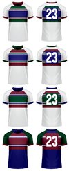
What was shared with me were designs of a predominantly black kit, using the 3D-effect chrome Jaguar logo on a solid white background. It looked hideous, and they were really hoping for a quick approval so they could be done with the back and forth. Thankfully the existence of a 2 colour white on black "line" logo is actually what Jaguar specify in their style guide for usage across clothing and any embroidered/printed sponsorship/partnership material. This looked infinitely better and didn't detract at all from the design of the jersey.

So yeah, sorry for the long post but it's experiences like the above that make me realise how monstrosities like NAB or One NZ can so easily happen, even with the existence of logos or wordmarks that are MADE for these types of things.
 

yakstorm

First Grade
Messages
5,415
Quite a fan of the Warriors NSWRL jerseys this year.
raphael-sio-1a.jpg


Simple design, but even the white alternative looks solid.
 

GAZF

First Grade
Messages
8,740
Set of Souths design ideas I found on Instagram.

Yeah, they should certainly make this happen... a great set.

Nice clean designs. I use the CTRL + Windows + C to quickly evaluate potential clash issues for colourblindness out of habit. The home and alt 2 are basically the same design on that metric, and would not provide additional contrast to the Raiders if a viewer is red-green colourblind. Alt 1 wouldn't be a problem at all though.
 

flippikat

Bench
Messages
4,465
Nice clean designs. I use the CTRL + Windows + C to quickly evaluate potential clash issues for colourblindness out of habit. The home and alt 2 are basically the same design on that metric, and would not provide additional contrast to the Raiders if a viewer is red-green colourblind. Alt 1 wouldn't be a problem at all though.
Yeah, I think the only real reason for the red alt-2 would be merchandising - something different for fans to wear.

I imagine it'd be worn in away games against the likes of the Warriors or Cowboys or Storm - teams from outside Sydney that have blue or dark home jerseys.
 
Messages
23,953
Quick one for those with a bit of time and a love to tinker.

The school I work at is participating at a PSSA footy carnival this week and to say the jerseys are horrid is a gross understatement. At the moment, it's a white jersey with royal blue, maroon and bottle green slashes (we are part of a small school region, so we combine our students together to field a team: the 3 colours are the main ones from each school). Could anyone come up with a better design?
 

MugaB

Coach
Messages
12,155
Quick one for those with a bit of time and a love to tinker.

The school I work at is participating at a PSSA footy carnival this week and to say the jerseys are horrid is a gross understatement. At the moment, it's a white jersey with royal blue, maroon and bottle green slashes (we are part of a small school region, so we combine our students together to field a team: the 3 colours are the main ones from each school). Could anyone come up with a better design?
Post a pic, i can throw something together
 

Nuke

Moderator
Staff member
Messages
5,019
Post a pic, i can throw something together
Likewise. I don't often these days have any time, but I do the next couple of days. I think I can picture what you presently have based on your description. The colours aren't brilliant, but let's see what comes of it. I presume, ideally, the white, green, & blue would be roughly in equal measures if possible?
 

MugaB

Coach
Messages
12,155
Likewise. I don't often these days have any time, but I do the next couple of days. I think I can picture what you presently have based on your description. The colours aren't brilliant, but let's see what comes of it. I presume, ideally, the white, green, & blue would be roughly in equal measures if possible?
Warriors do alright with that color combo, it all depends on which colors you want to have at the forefront, if its mainly white and blue, then a strip of bottle green, then look at some of the away strips from the cowboys, their first away jersey was pretty good, just replace the silver with the green
 

Nuke

Moderator
Staff member
Messages
5,019
They do, yeah. I was just seeking clarification on if the balance of colours matters or not.
 

Nuke

Moderator
Staff member
Messages
5,019
Quick one for those with a bit of time and a love to tinker.

The school I work at is participating at a PSSA footy carnival this week and to say the jerseys are horrid is a gross understatement. At the moment, it's a white jersey with royal blue, maroon and bottle green slashes (we are part of a small school region, so we combine our students together to field a team: the 3 colours are the main ones from each school). Could anyone come up with a better design?
Just a quick crack at this is attached. Feel free to use to dismiss as you wish!
 

Attachments

  • LU jersey designs.jpg
    LU jersey designs.jpg
    273.9 KB · Views: 25
Top