What's new
The Front Row Forums

Register a free account today to become a member of the world's largest Rugby League discussion forum! Once signed in, you'll be able to participate on this site by adding your own topics and posts, as well as connect with other members through your own private inbox!

The Game Jerseys, Logos, Mock Ups, Photos ANYTHING

Messages
296
That implies no special skill on behalf of the club. Have you seen the size of the TV rights deals now? It is impossible to fail. The NRL is too big to fail and the clubs are the same. None of the 90s club deaths or mergers would have happened if they had the tv money the game has now. The Titans are in no way superior to the previous Gold Coast clubs. And in my humble opinion are a lot worse at designing jerseys.

I feel like you missed the point. I dont think they were says the Titans are intrinsically superior, just that the brand is inevitable a hundred times stronger and better known.

none of the old GC brands lasted more than 5 years, so only diehard fans will recognise them at all.

the question for branding choices is whether a choice strengthens the brand. In this case, does drawing on the history of the old GC teams help the Titans in any way?

Pro - most of the old brands have solid designs and everyone loves a story of heritage
Con - they are only known by people who already follow the NRL.

To the question of linking with older brands to try to integrate their history, GC would probably see more benefits working with Ipswich Jets or another well supported QRL team (but god knows how youd do it without doing a total rebrand. And that would just piss everyone off…)
 
  • Like
Reactions: MRN
Messages
296
I feel like you missed the point. I dont think they were says the Titans are intrinsically superior, just that the brand is inevitable a hundred times stronger and better known.

none of the old GC brands lasted more than 5 years, so only diehard fans will recognise them at all.

the question for branding choices is whether a choice strengthens the brand. In this case, does drawing on the history of the old GC teams help the Titans in any way?

Pro - most of the old brands have solid designs and everyone loves a story of heritage
Con - they are only known by people who already follow the NRL.

To the question of linking with older brands to try to integrate their history, GC would probably see more benefits working with Ipswich Jets or another well supported QRL team (but god knows how youd do it without doing a total rebrand. And that would just piss everyone off…)

I don’t know much about QLD Cup, so I might be missing something obvious.

but it always seemed like a mistake not to promote the Burleigh Bears.

I know that Michael Searle was the driver of the winning bid (really, that guy must have sucked so many d***s for the publicity he was getting). So i guess he didnt want to tie himself to an established club

The Redcliffe experience shows it has some big advantages with the right club.
 
Messages
296
You got that right, GC jerseys are crap.... especially when they have some historically really good designs.

This has been in my head for a few days. GC branding is so shit right to their logo (seriously, what do titans have to do with the GC?!?!), but they cant do a hard rebrand obviously….

Rather than using the old GC teams, i think they should steal from classic RL looks.

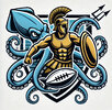
Logo = Mimic the St George (dragon + knight). Keep the centurion and add in a Kraken/sea monster.

IMG_8508.jpeg
IMG_8507.jpeg
Only a soft reboot but gives it an ocean theme and adds a new secondary mascot

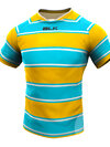
jersey = mimic South
IMG_8506.jpeg
Simple, direct. Then do all of the crazy ones from this base
 

Santino Patane

Juniors
Messages
301
This has been in my head for a few days. GC branding is so shit right to their logo (seriously, what do titans have to do with the GC?!?!), but they cant do a hard rebrand obviously….

Rather than using the old GC teams, i think they should steal from classic RL looks.

Logo = Mimic the St George (dragon + knight). Keep the centurion and add in a Kraken/sea monster.

View attachment 97893
View attachment 97894
Only a soft reboot but gives it an ocean theme and adds a new secondary mascot

jersey = mimic South
View attachment 97895
Simple, direct. Then do all of the crazy ones from this base
I like your idea on the logo and your mockups are pretty cool. When we redesigned it a few years ago a was a bit disappointed with it. I get though in today’s market you need a logo that is easily reproduced digitally, and I’d say that why I can’t see your good idea here land unfortunately.

as for the jersey, I’ve always been a fan of the blue fade and a good amount of gold. Our inaugural jersey from ‘07 is on point and should be the base of what we do IMO as an avlctual Titans member…
 
Messages
296
I like your idea on the logo and your mockups are pretty cool. When we redesigned it a few years ago a was a bit disappointed with it. I get though in today’s market you need a logo that is easily reproduced digitally, and I’d say that why I can’t see your good idea here land unfortunately.

I think the solution to that is in the initial designs, which is why i compare it to St George. Create a logo with layers that can be pulled apart.

the logo on the jersey would be the full image of Centurion + Sea Monster.

but the thumbnail logo would only be the gold centurion.

Eg
1735467905237.png

it would still be evocative of the full image while satisfying the needs of the digital age

I just think this is how the name makes sense for the team and the branding opportunities around a kraken mascot would be great!
IMG_8529.jpeg
In that case, it would just be a question of creating a good enough design (the ones i poster were AI, so way to complicated for the idea)

as for the jersey, I’ve always been a fan of the blue fade and a good amount of gold. Our inaugural jersey from ‘07 is on point and should be the base of what we do IMO as an avlctual Titans member…

Yeh, the 07 jumper was perfect.

i just have so little faith in the club to do it properly, i think they would be better off with something even more simple and identifiable
 

Latest posts

Top