What's new
The Front Row Forums

Register a free account today to become a member of the world's largest Rugby League discussion forum! Once signed in, you'll be able to participate on this site by adding your own topics and posts, as well as connect with other members through your own private inbox!

Logos are geting worse

Which are the best club logos re representing their area or heritage, or marketing?


  • Total voters
    148
  • Poll closed .

Bluebags1908

Juniors
Messages
1,258
The name Parramatta relates directly to eels (aboriginal word) so I voted for them. Warriors is also pretty suitable. Sea Eagles and Sharks would be next, I voted sea eagles. Dragons is pretty obvious for St George but surely it should have been dragon slayers or something, especially given the design of their logo? Rabbitohs relates to the area, Cowboys is an americanisation of something that suits NQ. Roosters just copied the design and colours from the French. Don't think any of the others have any particular meanings. Maybe Penrith and the fabled Panthers West of the mountains?

Whilst it is true that the red white and blue and the Roosters is parltly because it is a copy from the French, they are also called the Roosters because the sun rises in the east and sets in the west. So the Roosters are crowing on sunrise in the east. "Eastern Suburbs Roosters" and all that.

The Sydney Roosters put out their 100-year history book in 2007 titled "From Where The Sun Rises: 100 Years Of The Sydney Roosters" -
http://www.oo.com.au/From-Where-the-Sun-Rises-100-_P29326.cfm
 

Loudstrat

Coach
Messages
15,224
Because the Bulldogs has a lot to do with Canterbury. And a heap of Sea-Eagles flying around Manly. And a colony of Tigers living in Balmain.
Tigers get their name from their original black and gold hooped jerseys. Sea Eagles were originally the Seagulls, which hover en masse around anyone eating chips on the Corso. They tweaked it to Sea Eagles to sound tougher.


I'm also positive you could find at least one breeder of Bulldogs in the Canterbury-Bankstown district.

That said, most of them are probably bought into the area, not bred.
:lol::lol: If I had posted that you'd burn my car!

Perth Platypus.

Platypuses.
From Wikipedia..........
There is no universally agreed plural of "platypus" in the English language. Scientists generally use "platypuses" or simply "platypus". Colloquially, the term "platypi" is also used for the plural, although this is technically incorrect and a form of pseudo-Latin;[6] the correct Greek plural would be "platypodes"

We did a thread on the origins of club logos/mascots a while ago. Every club logo has some link to something about the club or district, until the Broncos and Giants in 1988.

Personally, the Warriors IMHO is an outstanding logo, tieing with the cultural heritage of the Maori warrior. The Tiger is simply marketable.

Im still trying to work out what a Titan is. Pirates? Pfft. May as well call them the Perth Wiggles. The Reds was such a strong symbol.
 

Loudstrat

Coach
Messages
15,224
The Roosters is a great marketing logo. I reckon it's been a century since there was a chook east of Hyde Park that wasn't covered in breadcrumbs though.

I think the Poms lost a lot when they modernised their logos. The Wire, how cool was that? If you were a Wire supporter, like an Eels supporter, that only means one thing. Rabbitohs is the same - plus it rolls off the tongue easy. Some are so duplicated now that there is no recognition. Anywhere in the world the statement "I support the Broncos" could mean a variety of teams, and one has to look for more subtle clues, such as the number of fingers, or how many knuckles drag on the ground, to work out if they support Brisbane instead of Denver, London, Boise State, Humboldt, Western Michigan, Swift Current, Santa Clara, CD, Cal Poly Pomona, or if they are a Ford mechanic.
 
Last edited:

firechild

First Grade
Messages
8,068
Sea Eagles were originally the Seagulls, which hover en masse around anyone eating chips on the Corso. They tweaked it to Sea Eagles to sound tougher.

Manly were never officially the seagulls. It was a name used more as a derogatory term by opposition fans. They were simply MWDRLFC before mascots became a common marketting tool and Manly adopted the Sea Eagle is theirs.
 

firechild

First Grade
Messages
8,068
There is no universally agreed plural of "platypus" in the English language. Scientists generally use "platypuses" or simply "platypus". Colloquially, the term "platypi" is also used for the plural, although this is technically incorrect and a form of pseudo-Latin;[6] the correct Greek plural would be "platypodes"

Scientists rarely use platypus as a plural, the same as they rarely use the term octopus as a plural. You'll find that almost all scientific papers will refer to platypuses and octopuses. Either way, platypi is just a term for stupid merkins that want to sound smart (enter Timmah).
 

9701

First Grade
Messages
5,400
The Knights logo makes perfect sense when reading the history of the club
"Team formed under the name Newcastle Knights, so named as Knights are men of steel, and Newcastle was a steel town;"
 

Loudstrat

Coach
Messages
15,224
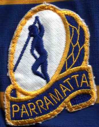
The Parra eel is probably the most legitimately Australian of all the logos, given it's roots. It is based upon the logo of the Parramatta local council area which had (not sure if it is still the case) an illustration of an indigenous man in a canoe/dugout spearing eels in I assume the Parramatta river. At one time this was actually Parra's logo. I'm sure Loudy or some other like minded type can post a pic of the original logo.

Always loved it, traditional, Australian and real.

eels_1977.jpg


Last used in 1975 - still the logo of the Parramatta City Council.

WC_315340_39_image.jpg
 
Last edited:
Messages
1,695
The Roosters is a great marketing logo. I reckon it's been a century since there was a chook east of Hyde Park that wasn't covered in breadcrumbs though.

I think the Poms lost a lot when they modernised their logos. The Wire, how cool was that? If you were a Wire supporter, like an Eels supporter, that only means one thing. Rabbitohs is the same - plus it rolls off the tongue easy. Some are so duplicated now that there is no recognition. Anywhere in the world the statement "I support the Broncos" could mean a variety of teams, and one has to look for more subtle clues, such as the number of fingers, or how many knuckles drag on the ground, to work out if they support Brisbane instead of Denver, London, Boise State, Humboldt, Western Michigan, Swift Current, Santa Clara, CD, Cal Poly Pomona, or if they are a Ford mechanic.


.......Roosting next to a latte

On Topic......the Dogs Retro Logo is good, as Tim Tam said less Black would be better

The Roosters 100 Year Logo was also good
 

bottle

Coach
Messages
14,126
Lol, careful.

Btw just goes to show the effect that old age has. For some reaon I had the spearing man in the canoe itself.

Wasn't the Parra logo once more akin to the PCC one, that is the whole scene?
 

Perth Red

Post Whore
Messages
70,271
Loudy having a whinge, who'd have expected it. Tell me this wouldn;t be the best looking club Tshirt in the NRL! I loved the Reds brand but can see that Pirates will take us to a whole new level with kids and marketing.

333304_386283738101260_1227316973_o.jpg
 

Fire

First Grade
Messages
9,669
Is that Chris Sandow in the boat?

Nah, too skinny.

All the current logos are pretty cool with the exception of Panthers and Tigers and both QLD and NSW.

Surprised a lot of the Broncos fans don't like their logo, I think it's pretty good for a modern one.
 

Fire

First Grade
Messages
9,669
^ That shirt is pretty awesome. Too loud for me, but it'll appeal to a lot of the young fans over there.
 

Perth Red

Post Whore
Messages
70,271
And I think that's the point. The 40 year old WA AFL fan isn't likely to jump on board (excuse the pun) but the 10 year olds? Who doesn't want to be a Pirate at that age? We have 20K+ older Perth RL fans to get the club going, get the new kids in and generate a whole new batch of RL fans from WA born and bred kids. Good long term strategy imo.
 

Fire

First Grade
Messages
9,669
And I think that's the point. The 40 year old WA AFL fan isn't likely to jump on board (excuse the pun) but the 10 year olds? Who doesn't want to be a Pirate at that age? We have 20K+ older Perth RL fans to get the club going, get the new kids in and generate a whole new batch of RL fans from WA born and bred kids. Good long term strategy imo.

Exactly. Good luck with it mate.
 

Lucky Roy

Juniors
Messages
112
All of these new clubs like Melbourne, Titans, Canberra, NQ and even the Warriors have logos that are glorified hood ornaments. The Titans and Storm ones belong in super hero comics.
 

Latest posts

Top