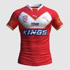
Looks good against the black regarding the dolphin logo in that pic.... but yeah FMD you really know how to whingeThat gold really isnt looking any better! View attachment 67120
Light and/or temperamental colors like gold really work well against a very dark shade of another color, and in small amounts. But two bright colors like that red and gold (and in a 50:50 split) just don't work well with each other.Looks good against the black regarding the dolphin logo in that pic
stop whinging!Looks good against the black regarding the dolphin logo in that pic.... but yeah FMD you really know how to whinge
You just posted this on two threads, then had a bitch about it... do you work for news ltdstop whinging!
stop whingingYou just posted this on two threads, then had a bitch about it... do you work for news ltd
The "gold" looks a bit better here. A jersey where that is the predominant colour would be interesting, very unique....That gold really isnt looking any better! View attachment 67120
Thats wht I've been saying all along... might be too many fobs here used to the boring as batshit english superleague butcherstipes kitsThe "gold" looks a bit better here. A jersey where that is the predominant colour would be interesting, very unique....
I love their new logo. It's right up there with the Cowboys as best in the business.Worth a read for those who haven't read it before re: the thought process and due diligence about our logo, and colours.
The New Dolphin
It would be good if the club sent club representatives into primary schools across Moreton Bay to promote this "brand" and run clinics. Market it as "history" and it'll help convert kids into Dolphins fans for life.Worth a read for those who haven't read it before re: the thought process and due diligence about our logo, and colours.
The New Dolphin
so apart from their name and their colours they’ve done well? LolI love their new logo. It's right up there with the Cowboys as best in the business.
The jersey should replace the Gold with grey. Red, white and grey works well.
Moreton Bay Dolphins has to be the club's name.
All games should be at Lang Park.so apart from their name and their colours they’ve done well? Lol
So, apart from name, colours, stadium and recruitment they’ve done well?All games should be at Lang Park.
The one thing have in their favour is a strong club from U7 to NRL, plus lots of money. In the long-term they will be strong on and off the field.So, apart from name, colours, stadium and recruitment they’ve done well?
I did a mock up of what i meant here..Personally i dont mind it... hopefully the away version looks like this but gold/red reversedView attachment 67042
Also having the tail run down the jersey would be pretty cool too, kinda would remind me of the freo dockers anchor, which is very unique

IMO - others can disagree - Gold should only be used on jerseys as trim or highlight colours.I did a mock up of what i meant here..
That looks better than anything else I've seen for the dolphins.
Totally agree, in a big block like they’ve used it it looks very butterscotch more than gold. This is nicest fan mock up I’ve seen so far. Sometimes less is more.IMO - others can disagree - Gold should only be used on jerseys as trim or highlight colours.
I'd love to see the first jersey again but with a classic gold double chevron instead of the dolphin tail and no gold under the armpits.

Agreed. The best jerseys are often the simplest.Totally agree, in a big block like they’ve used it it looks very butterscotch more than gold. This is nicest fan mock up I’ve seen so far. Sometimes less is more.
