What's new
The Front Row Forums

Register a free account today to become a member of the world's largest Rugby League discussion forum! Once signed in, you'll be able to participate on this site by adding your own topics and posts, as well as connect with other members through your own private inbox!

The Game Jerseys, Logos, Mock Ups, Photos ANYTHING

Hello, I'm The Doctor

First Grade
Messages
9,124
People going on about whether titans had helmets, Vikings had horns... We have a team called the dragons, they aren't even real..

Btw when you google "titan" and f**king moon comes up. Maybe should have went with a space theme, would bring the kids back

The difference for "Dragons" is that it aligns closer to the animal logos (even if it is mythical). There is human element that needs to be justified, just "here is a blank canvas that we will build our brand on".

The human characters, on the other hand, have established cultural value that the clubs is therefore associated with. Mostly within the NRL, this has been done well

- "Warriors" perfectly match the Maori culture of NZ
- "Raiders" are the outsiders invading and raiding cities. Perfect for Canberra, one of the first non-Sydney clubs.
- "Storm", same as "Raiders", storming the capital
- "Steelers", working-class guys from the Steel city
- "Knights", basically a metaphorical blend of "Steelers" and "Warriors"
- "Cowboys", represents rural culture and taming the "Broncos"

But what the f*ck are greek "Titans" meant to represent about GC culture?!?!?!?!?!?!?!
 

Saint Doc

Coach
Messages
11,061
One of the main things that makes a successful brand is to be unique and memorable, if you copy somebody else (or in this case everybody else) all you are going to achieve is reminding your potential customers of the companies that did it originally, and probably do it better you.

If you line up fifty Titans brands and the only one that doesn't have a Hoplite or swords in the imagery is yours, then at least your brand will stand out from the pack and be memorable simply because it's different.

Same goes for colours, if you are the only team in the league with teal as your as your main colour surrounded by a seas of blue, yellow, and white teams, then you'll instantly stand out and be memorable.

this post would have been fine in 2007.
But the Titans have been around for a long time now, and changing their colours again, after the numerous GC failures in the past would be a disaster. Especially since they have great colours, they just need better execution.

And the titans aren’t competitive against other titan brands across the world, so there is no need to stand out from them. My point was that Hello’s biannual rant wanting the titans to switch to some Greek goddess imagery (on the basis that the helmet is an inaccurate representation of titans) is clearly inaccurate given the way almost every Titans brand in the world has chosen to design their logo.
 
Messages
11,711
[QUOTE="Hello, I'm The Doctor, post: 14077130, member

- "Storm", same as "Raiders", storming the capital [/QUOTE]


I thought they were Storm cos they came from bleak city.
 

Dark Corner

Juniors
Messages
1,357
My expensive barely year old made in China Roosters jersey is starting to look shabby so I wonder if the NRL will manufacture jerseys IN THEIR COUNTRY.
 

Hello, I'm The Doctor

First Grade
Messages
9,124
- "Storm", same as "Raiders", storming the capital


I thought they were Storm cos they came from bleak city.[/QUOTE]

I think it os meant to have a few meanings.

“Storm”
- to represent Melbourne weather
- a literary reference to “a storm is coming”
- a verb: to storm the castle
And i am probably missing a few angles

Altogether, it is probably the most clever branding in Australian sport.
 

The Great Dane

First Grade
Messages
7,785
this post would have been fine in 2007.
But the Titans have been around for a long time now, and changing their colours again, after the numerous GC failures in the past would be a disaster. Especially since they have great colours, they just need better execution.
Firstly I wasn't necessarily advocating that they should change their colours, I was just pointing out that you could used the same logic to decide that changing their colours might be a good idea.

But lets delve deeper anyway.

Why would it be a disaster for them to change their colours? Just because you say so!?

The Titans have already changed their colours once by adding dark navy, and it didn't negatively effect them then. Also brands evolving is a natural process, it happens all the time. In fact it can be detrimental for a brand to become stagnate and grow stale.

It's also obvious that the Titans marketing and branding isn't very successful and some changes need to be made, so considering that why not consider all the options on the table.
And the titans aren’t competitive against other titan brands across the world, so there is no need to stand out from them. My point was that Hello’s biannual rant wanting the titans to switch to some Greek goddess imagery (on the basis that the helmet is an inaccurate representation of titans) is clearly inaccurate given the way almost every Titans brand in the world has chosen to design their logo.

Firstly, the Titans are competing with the other titans brand across the world. Every time somebody searches 'Titans' images of titans will come up and the one that best attracts their eye will get their attention. The world is also a global market now, everybody is competing with each other to some degree.

Secondly, the fact that 'everyone' with a titans brand uses a Hoplite in a Corinthian helmet in their logo design doesn't mean that a Hoplite or Corinthian helmet is an accurate depiction of a Titan. They could all be misrepresenting Titans, and as anybody that knows even a little bit about ancient Greek history and mythology can attest to, that is in fact what is happening in your examples.
 

Hello, I'm The Doctor

First Grade
Messages
9,124
this post would have been fine in 2007.
But the Titans have been around for a long time now, and changing their colours again, after the numerous GC failures in the past would be a disaster. Especially since they have great colours, they just need better execution.

And the titans aren’t competitive against other titan brands across the world, so there is no need to stand out from them. My point was that Hello’s biannual rant wanting the titans to switch to some Greek goddess imagery (on the basis that the helmet is an inaccurate representation of titans) is clearly inaccurate given the way almost every Titans brand in the world has chosen to design their logo.

A soft reboot is not a brand failure...

Panthers and Warriors have both changed their club colors without accusations of “collapse”. Hell, the Titans change their colours every 2 years and no one says they are a different club from 2007.

And for the logo, of all current clubs only the 12 of our 16 clubs have changed logos at some point (only Titans, Knights, Dragons and Rabbits haven't. And even the last 3 do regular updates.

Calling a soft reboot of the jumper and logo “another GC failure” is laughable...
 

Saint Doc

Coach
Messages
11,061
Firstly I wasn't necessarily advocating that they should change their colours, I was just pointing out that you could used the same logic to decide that changing their colours might be a good idea.

But lets delve deeper anyway.

Why would it be a disaster for them to change their colours? Just because you say so!?

The Titans have already changed their colours once by adding dark navy, and it didn't negatively effect them then. Also brands evolving is a natural process, it happens all the time. In fact it can be detrimental for a brand to become stagnate and grow stale.

It's also obvious that the Titans marketing and branding isn't very successful and some changes need to be made, so considering that why not consider all the options on the table.


Firstly, the Titans are competing with the other titans brand across the world. Every time somebody searches 'Titans' images of titans will come up and the one that best attracts their eye will get their attention. The world is also a global market now, everybody is competing with each other to some degree.

Secondly, the fact that 'everyone' with a titans brand uses a Hoplite in a Corinthian helmet in their logo design doesn't mean that a Hoplite or Corinthian helmet is an accurate depiction of a Titan. They could all be misrepresenting Titans, and as anybody that knows even a little bit about ancient Greek history and mythology can attest to, that is in fact what is happening in your examples.
A soft reboot is not a brand failure...

Panthers and Warriors have both changed their club colors without accusations of “collapse”. Hell, the Titans change their colours every 2 years and no one says they are a different club from 2007.

And for the logo, of all current clubs only the 12 of our 16 clubs have changed logos at some point (only Titans, Knights, Dragons and Rabbits haven't. And even the last 3 do regular updates.

Calling a soft reboot of the jumper and logo “another GC failure” is laughable...

Yawn.

1. Titans are not competing with other Titan brands in the world. What an joke. Do you wake up and think “I’m going to start supporting a team called the Bears today” and then google image every “Bears logo” and then opt to support Moscow Bears basketball team
In the Russian comp because you like their logo the best? Actually, you probably do. Nevermind.

2. You asked “Why would it be a disaster for them to change their colours? Just because you say so!?”
- yes, I’m not sure if you are able to distinguish statements that are opinion from fact, but clearly since we are talking about a hypothetical, my statement is an opinion that the Titans need brand stability. For a town that has encountered Giants/Seagulls/Chargers/Titans, each with completely different colours/logos/jerseys, in my opinion stability on the core branding elements is key.

3. I don’t give a frig if the helmet as an accurate depiction of ancient mythology. My point is that your argument it should be changed because of historical inaccuracies is ludicrous given every Titans club in the world uses the same imagery. But I guess you’re smarter than them

4. using the panthers and Warriors as examples? Seriously. Two clubs who are by FAR the most criticized on this forum for lack of a consistent brand, two clubs who’s constant colour changes have been the source of a decade of unanimous derision? Wow.

5. no problem with a logo update. Current one is tacky. but changing to some bearded shirtless Greek god Zeus character is not what I would do.

Anyway, you two can continue this all you want. The Titans won’t change to teal. And they won’t change to Zeus. Because the ideas suck. Sorry about that. Happy Easter!
 
Messages
14,506
I thought they were Storm cos they came from bleak city.

I think it os meant to have a few meanings.

“Storm”
- to represent Melbourne weather
- a literary reference to “a storm is coming”
- a verb: to storm the castle
And i am probably missing a few angles

Altogether, it is probably the most clever branding in Australian sport.[/QUOTE]


Ironically...the Storm logo was lifted from an image of Zeus from a book on Gods.
 
Messages
11,711
I love LU. I can’t believe we’re discussing historical accuracies of Titan helmets on a footy club’s logo. Just can’t see it being discussed in research groups during the design process. While we’re at it, there’s no evidence that Vikings wore horned helmets. Wagner used a horned helmet in his operas, probably so the merkins in the back row could see the main character. Someone get on the phone to Raiders HQ.
 
Messages
11,402
I like the '97
' SL USA jersey looks sweet

gorden-tallis-in-action-v-usa-three-years-later-he-captained-australia-against-russia-e1507021882561.jpeg
 
Last edited:
Messages
11,402
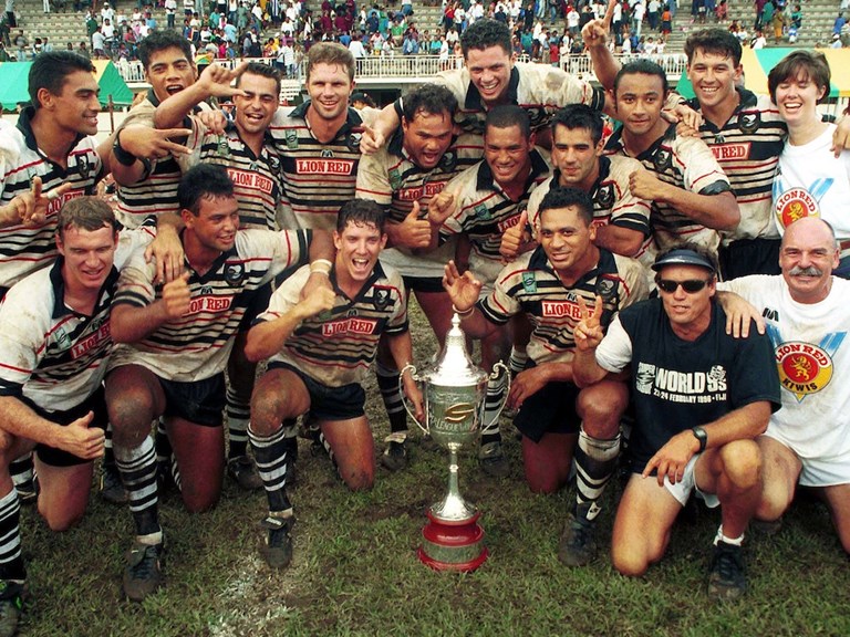
Anyone got pics or jerseys or remember what the kits looked like from the Super League Gatorade World Nines from 1997 Townsville?
 
Messages
14,506
Canberra Raiders use a Viking.

If they'd been the Vikings, they'd have used a Vandal.

images (4).jpeg

If they'd been the Senators, they'd have used a Centurion.

images.png

If Canberra had been the Capitols, they'd have used a Big C.

feelisgood170900676.jpg
 
Top