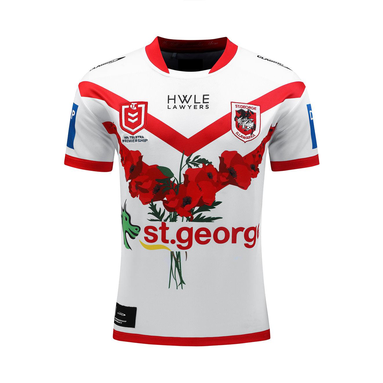
What's new
The Front Row Forums

Register a free account today to become a member of the world's largest Rugby League discussion forum! Once signed in, you'll be able to participate on this site by adding your own topics and posts, as well as connect with other members through your own private inbox!

2024 Jerseys, Sponsorship, Logos discussion etc

beave

Coach
Messages
15,565
I hate the Broncos RL club with my very soul but holy shit that kit looked mint live in person last night.

Look good, feel good, play good.
 

Yosemite Sam

Juniors
Messages
729
The dragons with some 25th anniversary merch.
View attachment 85723
Could have sworn some folks here reckon they've been around longer and have more than 1 premiership.
It's all about marketing and $$$. In 2021 they were flogging off merchandise saying '100 years of the Dragons'.

In saying that though most of their merchandise does say 'established 1921'.
 

mn_tibor

Juniors
Messages
213
It was also really obvious last night how much the Broncos maroon has changed. The heritage jersey looked very red compared to the more modern purple shade.
 

Hit The Post

Juniors
Messages
187
The NIB box looks even worse on the Knights' away than their home. Ruins the entire jersey. Do O'Neills really not have anybody smart enough to put the NIB text in an appropriate colour? It should be (without the green background obviously) white on the home and red on the away IMO.
 

flippikat

Bench
Messages
4,477
The NIB box looks even worse on the Knights' away than their home. Ruins the entire jersey. Do O'Neills really not have anybody smart enough to put the NIB text in an appropriate colour? It should be (without the green background obviously) white on the home and red on the away IMO.
It's an awful lot better than it was in the early days of NIB's Knights sponsorship.

The huge sponsorship-logo box back then was truly horrendous.
 

Nuke

Moderator
Staff member
Messages
5,025
The NIB box looks even worse on the Knights' away than their home. Ruins the entire jersey. Do O'Neills really not have anybody smart enough to put the NIB text in an appropriate colour? It should be (without the green background obviously) white on the home and red on the away IMO.
No. They didn't.

And Classic have followed in their footsteps.

And, sadly, it's neither of their fault, as it's the Knights who decide it, not the manufacturer.
 

Hit The Post

Juniors
Messages
187
No. They didn't.

And Classic have followed in their footsteps.

And, sadly, it's neither of their fault, as it's the Knights who decide it, not the manufacturer.
Wherever or whoever they were from, the guy who decided on the big green box needs his ass kicked.
 

Hit The Post

Juniors
Messages
187
Melbourne are teasing the release of their Anzac jersey tomorrow. Interesting to note that the coordinates displayed are that of the Melbourne Shrine of Remembrance, so I won't be surprised if that features somehow on the jersey.


yakstorm

First Grade
Messages
5,428
View attachment 86008

Not sure what the lines are.

Same V design as the home and away jerseys on the front.

I'm liking that it is looking like a more subtle design than some of the previous Storm ANZAC kits. Personally I wish the Storm went back to what they use to do for the first 5 or so years of the ANZAC Day match and just add the ANZAC shield (and maybe a single poppy) to their main kit.

anzac-day-jersey-auction.jpg


Not a huge fan of some of the designs worn over the years...
 

Hit The Post

Juniors
Messages
187
I'm liking that it is looking like a more subtle design than some of the previous Storm ANZAC kits. Personally I wish the Storm went back to what they use to do for the first 5 or so years of the ANZAC Day match and just add the ANZAC shield (and maybe a single poppy) to their main kit.

anzac-day-jersey-auction.jpg


Not a huge fan of some of the designs worn over the years...
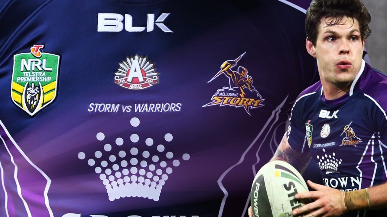
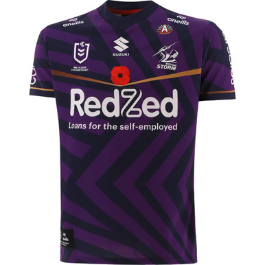
yeah i'm rarely a fan of anzac jerseys, but the one the storm did with a simple V of poppies across the front was perfect
 

League Unlimited News

Administrator
Staff member
Messages
7,836

The 2024 design utilises a zigzag pattern, taken as inspiration from The Shrine Courtyards in Melbourne. The zig zag walls of the courtyard and tiling, represents the way trenches were dug in the war and appears across all four of The Shrine courtyards.

The jersey also pays homage to the dazzle camouflage used by the Navy through WWI and WWII. Unlike other forms of camouflage, the intention of the dazzle is not to conceal but to make it difficult to estimate a target’s range, speed, and heading. The HMAS Melbourne ship used this camouflage in WWI, as well as being featured on the floor of one of The Shrine courtyards.


sempmrh

Juniors
Messages
1,197
It retains a design element from the regular home and away jerseys, is in club colours, the dazzle pattern would be an interesting idea even outside the context of an ANZAC jersey - very happy with this one, and I’m someone who usually dislikes ANZAC jerseys.

O’Neills have been knocking it out of the park so far for Storm.
 

jim_57

Moderator
Staff member
Messages
4,369
It retains a design element from the regular home and away jerseys, is in club colours, the dazzle pattern would be an interesting idea even outside the context of an ANZAC jersey - very happy with this one, and I’m someone who usually dislikes ANZAC jerseys.

O’Neills have been knocking it out of the park so far for Storm.

Anyone with some skills able to swap the navy for white? Could look good as an away jersey.
 

Latest posts

Top