What's new
The Front Row Forums

Register a free account today to become a member of the world's largest Rugby League discussion forum! Once signed in, you'll be able to participate on this site by adding your own topics and posts, as well as connect with other members through your own private inbox!

2010+11 Jerseys, Logos & Sponsors

JF_Henson_Hill

Juniors
Messages
166
Wow, that Storm jersey is f**king horrible. Why would they ditch a classic design _and_ add more colour to the sponsor logo ffs?

Because they are trying to purge the colour of it's history & change as much as possible to purple. The yellow has largely been ditched & the blue is largely gone too these days.

I thought Storm wearing navy & yellow was supposed to be indicative of representing Victoria. Now they want us looking like Barney the Dinosaur when we go to the game. Why the gradual change away from Victorian state colours? Some marketing guru likes purple or something?

Thank heavens for Ebay & retro FILA brand Storm gear! :cool:
JF (who has little choice but to buy stuff in purple in 2010 :o:o:eek:)
 

Tom Shines

First Grade
Messages
9,854
Because they are trying to purge the colour of it's history & change as much as possible to purple. The yellow has largely been ditched & the blue is largely gone too these days.

I thought Storm wearing navy & yellow was supposed to be indicative of representing Victoria. Now they want us looking like Barney the Dinosaur when we go to the game. Why the gradual change away from Victorian state colours? Some marketing guru likes purple or something?

Thank heavens for Ebay & retro FILA brand Storm gear! :cool:
JF (who has little choice but to buy stuff in purple in 2010 :o:o:eek:)

That's pretty much it. Apparently purple was added to the navy of Victoria to enable more merch and crap to be sold.
 

LeagueNut

First Grade
Messages
6,978
Seriously, what the f#$k are the Storm or Kooga, thinking with the lime in the Members Equity logo?? Is it that hard to incorporate the f@$king thing into the jersey design to actually make it look attractive?? Wouldn't it be in their best interest to make people want to buy the jersey, which in turn gets your brand out there?????

Maybe I am missing something here...
If it was incorporated into the jersey then people wouldn't necessarily notice it. By making it stand out they get better "brand penetration" or whatever bollocks term those marketing nimrods use these days.
 

hrundi99

First Grade
Messages
8,411
If it was incorporated into the jersey then people wouldn't necessarily notice it. By making it stand out they get better "brand penetration" or whatever bollocks term those marketing nimrods use these days.

You're right, and it's not bollocks at all. It works.
 

Goddo

Bench
Messages
4,257
Well, when looking at it, between vomiting all over the place, I notice the advertising does stand out... horribly for all the wrong reasons, but stand out it does.

WoW with the Broncos is no longer the worst! Storm are the new champs of ugly advertising!
 

Joker's Wild

Coach
Messages
17,894
If it was incorporated into the jersey then people wouldn't necessarily notice it. By making it stand out they get better "brand penetration" or whatever bollocks term those marketing nimrods use these days.

Well it works. The 1st thing I thought of when I saw that purple monstrosity was penetration, just not the brand type.
 

Knightmare

Coach
Messages
10,716
You're right, and it's not bollocks at all. It works.


Yeah, it works at making people not want to buy the jersey. Up there with the infamous Herbal World Wests Tigers.

In the EPL, teams like Chel$ki and ManUre and Liverpool all integrate their sponsors' logos into the jersey, but does anyone have a problem naming their major sponsor?

Doing what the Storm and the Broncos have done just screams 'Look at how crass we are, we only care about promoting the sponsors and f**k aesthetics or fans having to actually wear this!'
 

S.S.T.I.D

Bench
Messages
3,641
Virgin Blue re-signs with Souths for 2010. They will appear on the training kit and the front and back of the shorts so that is us done.

Home front of jersey: NAB
Away front of jersey: DeLonghi
Sleeve: V8 Supercars
Shorts: Virgin Blue
 

Shorty

Moderator
Staff member
Messages
15,555
If it was incorporated into the jersey then people wouldn't necessarily notice it. By making it stand out they get better "brand penetration" or whatever bollocks term those marketing nimrods use these days.
I think people are more likely to respect and buy a brand where the marketing isn't cheap and tacky looking like a slapped on sponsor.
I know I do.

It's of no wonder that the more successful companies sponsoring jumpers aren't polluting the jersey with ugly advertising.

Cowboys haven't had a woeful jumper in a while (PLEASE DON'T JINX IT!:lol:) in terms of sponsorship.
The Sharks have done it for years.
Even the Warriors.

It all comes down to the NRL not backing itself again.
When negotiating, the respect of the jumper should be number one priority and clubs shouldn't stand for having such abominations plastered on the front.
Majority of other codes don't.

One idea I'd like incorporated into the NRL is the NFL system of selling jerseys with the numbers and names on the back, at least with representatives.
Lockyer, Inglis and Thurston etc...I think they'd make a lot of money from this.
 

LeagueNut

First Grade
Messages
6,978
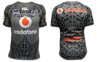
Warriors 2010 heritage jersey:

Heritage_Jersey.jpg
 

nqcowboy87

Bench
Messages
4,181
isnt that the awen guttenbiel testimonial jersey, if so the design is actually a traditional tribal design illustrating guttenibiels life
 

The Tank

Bench
Messages
4,562
It looks a touch diff to the Guttenbeil one (I think). The Vodafone logo looks a little too big. Nice though. Very nice.
 

beave

Coach
Messages
15,669
Cowboys are wearing an indigenous version of their current home jersey in next years trial. Looks a combo of the Indigenous all stars and the current home cows version, it's in todays paper, I will put it up if i can find it on the net.
 

nqcowboy87

Bench
Messages
4,181
apparently its a completely different tribal design to guttenbiels and now that i look closer it is different, also if anyone wants to know how the green me logo looks against a purple jersey they just have to have a look at the perth glorys w-league strip
 

Latest posts

Top