What's new
The Front Row Forums

Register a free account today to become a member of the world's largest Rugby League discussion forum! Once signed in, you'll be able to participate on this site by adding your own topics and posts, as well as connect with other members through your own private inbox!

2010+11 Jerseys, Logos & Sponsors

Saint Doc

Coach
Messages
11,070
I know this was already assumed by the press shots, but the anasta as confirmed on bigpond video that they're wearing their normal home strip, no sky blue this year. Bit of a shame i think...
 

Patorick

Moderator
Staff member
Messages
8,992
It's a shocking rugby league jersey, but kudos for finding another corporate partner, even if it is a one-off.
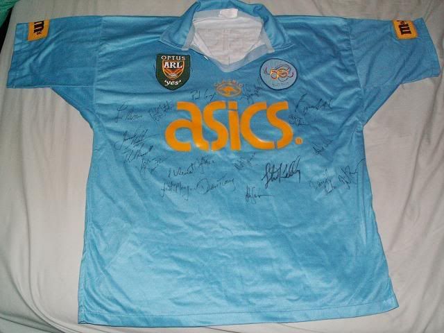
No worse than this:

MMsjersey3.jpg
 

Timmah

LeagueUnlimited News Editor
Staff member
Messages
100,972
Some interesting jersey choices today, the Rabbitohs using their white alternate against Canberra who used their black strip, and the Storm with Jayco and Suzuki upgraded...
 

Timmah

LeagueUnlimited News Editor
Staff member
Messages
100,972
Well I'm sure they had the option to choose either suzuki or Jayco on the front... although I guess suzuki already had the sleeves.
 

The Tank

Bench
Messages
4,562
Jayco doesn't look great on the Storm jersey (to be expected when you slap a sticker on there) but it's a major improvement from that other company. Suzuki looked okay on the backs replacing that other company. It's tough to fit sponsors on a shirt which features a vee (same as Saints and Dogs) and make it look good.
 

Frailty

First Grade
Messages
9,438
Jayco doesn't look great on the Storm jersey (to be expected when you slap a sticker on there) but it's a major improvement from that other company. Suzuki looked okay on the backs replacing that other company. It's tough to fit sponsors on a shirt which features a vee (same as Saints and Dogs) and make it look good.

I imagine the Jayco would look a whole lot better when it is printed on, because I can't imagine it being as big as it is. It was only that big to cover all of the ME Bank green spot.
 

Timmah

LeagueUnlimited News Editor
Staff member
Messages
100,972
The Roosters did have the same ANZAC symbol as the Dragons, but theirs was on the shoulder above oo.com.au

NRL+Rd+7+Dragons+v+Roosters+Qtsz1vRcaTNl.jpg
 

Tom Shines

First Grade
Messages
9,854
The fact that we no longer have to see the lime ME Bank on the Storm strip is the best thing to come out of the salary cap debacle.
 

Hindyscrack

Bench
Messages
3,433
Well I'm sure they had the option to choose either suzuki or Jayco on the front... although I guess suzuki already had the sleeves.

I'm sure that the choice of who was placed where was due to more then a flip of a coin or what looked better...
 

Latest posts

Top