I think what makes it good is the yellow is just a splash on the jersey and not used in ridiculous amounts. Blue, white and grey with a touch of yellow, keep it simple.
I thought our new away jerseys looked shit hot last night, nice and simple............. Just like us NQers!!!!
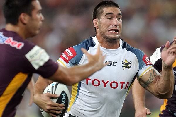
Half the sleeve is white! Might only be a iron on transfer, but if its that size its a step back.
Gazf has had a few interesting new designs out if anyone is interested - also got a few expansion teams there - Rockhampton, Perth, Wellington and Adelaide...
http://gazf.info/
I sit near the bench and it appears that it's sublimated, not an iron on transfer, so the reasoning is not to cover the wow logo. I would say it's more to do with the maximum size allowed by the nrl and sponsors using the full area allowable.
Looks like a cheap Best & Less one from the front.Sharks jersey looks so shit without a sponsor
Just give it away to a charity irvine. Youre not gonna get one
Looks like a cheap Best & Less one from the front.
Sharks jersey looks so shit without a sponsor
Just give it away to a charity irvine. Youre not gonna get one
") and get a sponsor on board.
and get a sponsor on board.Gazf has had a few interesting new designs out if anyone is interested - also got a few expansion teams there - Rockhampton, Perth, Wellington and Adelaide...
http://gazf.info/
What's with the random lines running across all the jerseys? Is it some kind of trademark thing so no one steals them?