What's new
The Front Row Forums

Register a free account today to become a member of the world's largest Rugby League discussion forum! Once signed in, you'll be able to participate on this site by adding your own topics and posts, as well as connect with other members through your own private inbox!

2013 Jersey, Logo, Sponsorship Discussion

Status
Not open for further replies.

beagle

Juniors
Messages
765
Apologies if this has already been posted:

Penrith 2013 Main jersey

picture.php
 

Saint Doc

Coach
Messages
11,100
Am I seeing things? Is that a Panther watermark on the body of the jersey, or is it just the way the light is reflecting?
 

sheepbender

Juniors
Messages
517
Am I only one the likes purple in the storm jerseys, it's the only thing I like about the club that they use purple. I hope the purple is a bit darker on the actual jerseys, it's a bit light in the above pix.. Disappointed the gold has gone, gave the jersey some pop.
 

Stagger Lee

Bench
Messages
4,931
How many 'home' jerseys would an average team sell a year and how many 'special' jerseys (charity shield / pink cancer) would a team sell?
 

ShaneO85

Juniors
Messages
513
I actually don't like the GAZF storm jersey. Like most people I'm a huge fan, can't put my finger on what I don't like but it just doesn't feel right for some reason. Just a personal feeling
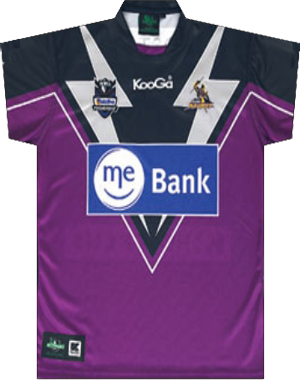
Strangely enough i'm feeling a little bit the same way.. gazf's designs is what had me following this forum for ages before finally joining in the discussion, and while the storm one is better than the stuff they have trotted out it doesn't quite hit me as well as most of his other designs...

i wish i had the photoshop skills to blend the things i like about these 2 jerseys together
cat_10.png
melbourne%20storm%20heritage%20jersey%202012.jpg

i like the way the heritage white v starts in a traditional style, i jsut think the v should be jagged like the bolts in the ME bank one. or if the mebank one had 'cartoon' style bolts that are fat at the top to go all the way up over the shoulders like a normal v does... and i was always a fan of the gold trimming.. hell i didn't entirely hate their gold jersey... but i think even less people like the all gold look than the all bright purple...
 

ShaneO85

Juniors
Messages
513
Gazf, i think i figured out what throws me off your design, if those white bolts were thicker at the top with one or two evenly spaced jags coming down to their current finishing point then i think it is a hit. not sold on the bronze-ish colour in amongst it, i think i'd prefer gold in it's place (definately on the collar, maybe not so on the body)

just imho, still wish i could design anything like yours...
 

Prometheus

Juniors
Messages
1,103
Am I only one the likes purple in the storm jerseys, it's the only thing I like about the club that they use purple. I hope the purple is a bit darker on the actual jerseys, it's a bit light in the above pix.. Disappointed the gold has gone, gave the jersey some pop.

No you're not. I like the purple too.

And anybody with even the most basic knowledge of aesthetics knows that the perfect matching colour for purple is yellow, as it sits directly opposite it on the colour wheel. Melbourne should not be removing the yellow/gold from their jersey.
 

GAZF

First Grade
Messages
8,756
Gazf, i think i figured out what throws me off your design, if those white bolts were thicker at the top with one or two evenly spaced jags coming down to their current finishing point then i think it is a hit. not sold on the bronze-ish colour in amongst it, i think i'd prefer gold in it's place (definately on the collar, maybe not so on the body)

just imho, still wish i could design anything like yours...

I'm not sure where you're seeing bronze. The colours are purple/navy/silver/white. You might have a yellow colour shift on your monitor making the silver look bronze. I'll give the jagged bolt some thought, maybe further towards the top.

No you're not. I like the purple too.

And anybody with even the most basic knowledge of aesthetics knows that the perfect matching colour for purple is yellow, as it sits directly opposite it on the colour wheel. Melbourne should not be removing the yellow/gold from their jersey.

I take complimentary colours with a grain of salt. Souths colours are complimentary but are generally considered bad colours to put together. I pretty much go with what looks good, which is totally subjective. I also like purple/yellow together, just not with navy.
 

Saint Doc

Coach
Messages
11,100
Hells yes on the gold away jersey!

It's funny, people say this about the Storm, and were saying it for years about the Broncos, and then when they finally did it, everyone bagged them. I actually like the Broncos away strip (the only one I think) but I think using gold as the base for a Storm jersey would end in tears
 

mn_tibor

Juniors
Messages
226
It's funny, people say this about the Storm, and were saying it for years about the Broncos, and then when they finally did it, everyone bagged them. I actually like the Broncos away strip (the only one I think) but I think using gold as the base for a Storm jersey would end in tears

Amen to that! I was thinking the same thing. Everyone is complaining about the Broncos yellow away jersey but requesting the Storm implement one. It's not like the Broncos had never had a yellow jersey before. I love it. Much better than a white and navy alternate that has nothing to do with Broncos historical colours.
 

KiamaSaint

Coach
Messages
17,995
^^yep, agree also. Don't mind admitting that I hate the Broncos away jersey and I would think the same if the Storm went that way too.^^
 

Zigwaa

Bench
Messages
2,744
Amen to that! I was thinking the same thing. Everyone is complaining about the Broncos yellow away jersey but requesting the Storm implement one. It's not like the Broncos had never had a yellow jersey before. I love it. Much better than a white and navy alternate that has nothing to do with Broncos historical colours.

I like the idea for the yellow Broncos jersey, it's just the shade of yellow they have used is too bright. If they used the yellow/gold they used on their orginal jersey they're look good.
 

GAZF

First Grade
Messages
8,756
Before even considering the shade of yellow, the Broncos should have just paired the design with maroon shorts. They probably didn't because it would ruin the side panel effect, another reason to not have side panels I guess.
 
Status
Not open for further replies.

Latest posts

Top