What's new
The Front Row Forums

Register a free account today to become a member of the world's largest Rugby League discussion forum! Once signed in, you'll be able to participate on this site by adding your own topics and posts, as well as connect with other members through your own private inbox!

2013 Jersey, Logo, Sponsorship Discussion

Status
Not open for further replies.

Evil_Mush

Juniors
Messages
1,037
So the Warriors superhero poster has been fully revealed in all it's cheesy glory (stolen from another forum, presumably via Canterbury FB page) :

61444_490390957671969_1472557947_n.jpg


:lol: AWESOMEEEEEEEEEE :lol:

I like how Konrad's got the Sweetooth-esque flaming head. So cheesy. So awesomely cheesy.
 
Messages
14,139
Say what you like about the Warriors' jerseys (I personally like them) but you have to admire the effort they have gone to in creating them and the promotion of them and the club in general. It's hard to criticise when most other clubs make virtually no effort and still produce pretty mediocre jerseys and other merchandise.
 

Frailty

First Grade
Messages
9,456
The warriors home & away jerseys are good. Their heritage, if it didn't have the wicker basket look, would be fantastic...

The training jerseys - who cares, they are training jerseys...

The NYC Jersey is an abomination!
 

The Great Dane

First Grade
Messages
7,960
The Warriors jerseys are a bit silly but other than the "Enforcer" they look alright. There a marketing dream to, every little kid will want one of the fire, ice or terminator ones, and I'm sure there are a few women out there that will appreciate the pink one.

In some respects it's to bad that the Raiders aren't more adventuress with there jerseys, but hope they never make an abomination like that terminator jersey.

Whats up with the moron in the joker makeup.
 
Messages
4,980
So the Warriors superhero poster has been fully revealed in all it's cheesy glory (stolen from another forum, presumably via Canterbury FB page) :

61444_490390957671969_1472557947_n.jpg


:lol: AWESOMEEEEEEEEEE :lol:

I like how Konrad's got the Sweetooth-esque flaming head. So cheesy. So awesomely cheesy.

A pretty decent marketing idea, let down by a terrible implementation. Half the guys on this forum could mock up something as good, if not better given 10 minutes and the inspiration.
 

Fire

First Grade
Messages
9,669
It's a nice, harmless, gimmick, but that's all it is, a gimmick. I'm sure true Warriors fans want to see their footy team play consistent, winning footy, and deep down could give a f**k about this sort of stuff.
 

LESStar58

Referee
Messages
25,496
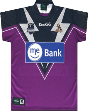
Home storm jersey gets a big tick from me.

Away jersey not so much. Hopefully they do a home shirt with silver bolts for. The WCc
 

Evenflow

Bench
Messages
3,139
I've gotta say i like it. The big plus is the Crown logo be incorporated much better, also there's more navy and an even spread with the purple. The negative we've all but lost our yellow besides in the logo which is a shame given it played such a big part on our jerseys in the formative years. That said overall i'm very happy with it though i'm sure it'll have many detractors.

The away jersey, like the white being the predominate color that's about it.


Edit: Here's the back.

2qlgw1f.jpg
 
Last edited:

ShaneO85

Juniors
Messages
513
certainly a big improvement on the last few disasters and the crown finally fits in nicely on the home strip... pity there is now gold in amongst the design somewhere...

the away strip is a bit.. meh... again a bit of gold would have been nice and why can't crown be in navy on white? why the big blue box again?!
 

ShaneO85

Juniors
Messages
513
I've gotta say i like it. The big plus is the Crown logo be incorporated much better, also there's more navy and an even spread with the purple. The negative we've all but lost our yellow besides in the logo which is a shame given it played such a big part on our jerseys in the formative years. That said overall i'm very happy with it though i'm sure it'll have many detractors.

The away jersey, like the white being the predominate color that's about it.


Edit: Here's the back.

2qlgw1f.jpg
simple.. clean.. i like it.. just hope they designed the v so that the numbers fit between the design elements not on top of them.. although a bottom back of jersey sponsor will ruin the look anyway...
 

GAZF

First Grade
Messages
8,756
The home doesn't need the side panels. I like the sponsor integration but I imagine the one under the number will be a disaster. Its a 5/10 up from a 2/10.
 

Perth Red

Post Whore
Messages
70,191
Storm is better than recent years but that's not saying much! Still too much purple, no gold and stupid thunderbolts. Looks like I'm sticking with my heritage shirt for another year!

melbourne%20storm%20heritage%20jersey%202012.jpg
 

Saint Doc

Coach
Messages
11,100
They've done well. Lets be honest, they're not going to design the type of jerseys a small group of traditionalist purists want. But they've managed to increase the amount if navy, integrated the sponsorship well, and incorporated elements of their traditional design (although a more modern take).

Bravo
 

BunniesMan

Immortal
Messages
33,738
The Storm jersey is a massive improvement. Congratulations to them. Looks like a modern twist on traditional principles, the sponsorship works well. Good job.
 

GAZF

First Grade
Messages
8,756
Storm is better than recent years but that's not saying much! Still too much purple, no gold and stupid thunderbolts.

There will be arguments for the use of purple or navy for a main colour, I prefer purple and you prefer navy. The gold had to go though, the three colours together made the set look extremely dated. The gold still works as an accent colour on logos etc... The thunderbolts just don't work any more. They've had to distort the angles of the bolt so that it fits as a flatter line rather than the top half of the bolt coming in towards the centre where it would overlap the logos. A single spike gets the point across.

Its similar to what I had in mind for them. (I'll post a link so Timmah doesn't crack the shits)...

http://gazf.info/wordpress/wp-content/uploads/2012/11/1_-MEL_Pri.jpg

...which in turn was based on their best jersey (from a bad bunch)

cat_10.png


Looks like I'm sticking with my heritage shirt for another year!

melbourne%20storm%20heritage%20jersey%202012.jpg

Eh, its an alright jersey. Crown logo ruins it. I don't care for the drab plum purple either.
 
Last edited:

Perth Red

Post Whore
Messages
70,191
I guess I am just more of a muted colour person!

Your jersey looks miles better than anything they have produced in recent years, except the purple ;)
 

Saint Doc

Coach
Messages
11,100
I actually don't like the GAZF storm jersey. Like most people I'm a huge fan, can't put my finger on what I don't like but it just doesn't feel right for some reason. Just a personal feeling
 
Status
Not open for further replies.
Top