What's new
The Front Row Forums

Register a free account today to become a member of the world's largest Rugby League discussion forum! Once signed in, you'll be able to participate on this site by adding your own topics and posts, as well as connect with other members through your own private inbox!

2013 Jersey, Logo & Sponsorship Thread II

LESStar58

Referee
Messages
25,496
Manly wearing their Indigenous jersey today.

12205-manly-warringah-sea-eagles-2013-indigenous-mens-jersey-370.jpg

Looks good.
 

Saint Doc

Coach
Messages
11,090
Dragons 2013 Close the Gap Round jersey-

To be worn against the Sharks in Round 23.
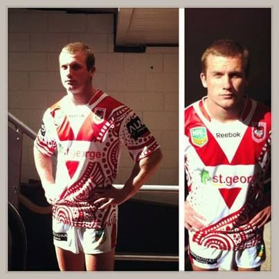
How clean does the sponsor logo look without the word "bank"?! Love it, looks tough. Hopefully it's part of a re-brand (well, I think that's been the brand for years, don't know why we persisted with "st george bank" for so long.) but yeah, hopefully all ISC jerseys carry the new sponsor logo next year!

2a3fcc01fc83d442bc4294cea9d1accc.jpg
 

Hello, I'm The Doctor

First Grade
Messages
9,124

That right there is two reasonable jersey designs f**king each other up.

What Id really like to see is teams create an identity within their jersey patter (eg knight seem to be wholly embracing the vertical blue and red and souths red and green is bands is so distinct that they can be creative with their away jerseys and its still obviously them)

The Dragons are obviously the "red V". Id love to have seen them use the idea of a red V and form it with the indigenous art patterns. So instead of this jersey where the two images clash, they could create a whole new design based on the elements of their identity.

Same could work with their ANZAC jersey and the poppies.

This kind of visual identity should be a goal for all the teams (Tigers need to work on it more than anyone else)
 

Big Sam

First Grade
Messages
8,976
Friday's Close the Gap jersey:

00092738-leadimage.jpg


It's got a bit too much going on. I liked last year's a lot more.
 

Pierced Soul

First Grade
Messages
9,202
The Dragons are obviously the "red V". Id love to have seen them use the idea of a red V and form it with the indigenous art patterns.

that would be awesome!! of course it makes too much sense to do that....

i like the broncos one but still think the main body should be maroon.

im still laughing at the storm one which had the hand reaching for the casino sponsor
 

Godz Illa

Coach
Messages
18,745
That Souffs jersey reminds me of when Superman went through an evil phase in Superman III. Was Richard Pryor involved in the design?
 
Messages
14,720
Irrelevant to the topic, regardless of how whorish the dogs have been.

Fair enough.

I actually quite like your 'home' jersey idea on your site.

I've emailed the club the links again today to see if they can get rid of the black panels.

Cheers, TMH
 

GAZF

First Grade
Messages
8,751
Fair enough.

I actually quite like your 'home' jersey idea on your site.

I've emailed the club the links again today to see if they can get rid of the black panels.

Cheers, TMH

The same basic design worked for a good 80 years, I don't get why they think they can improve it.
 

flippikat

First Grade
Messages
5,187
The same basic design worked for a good 80 years, I don't get why they think they can improve it.

It's just taking the trends of the day to put a spin on a design.. for Souths it's happened before (green shorts for a brief period, many moons ago).

I hope side-panels are just a phase in jersey design - just as "busy" designs were before them (case in point, the 2005 Grand Final).

If you go further back you'll see other trends that come and go - V-neck shirts & three-quarter sleeves were big in the late 1980s. Then in the mid-90s we saw Manly (Pepsi jersey), Norths (Citibank) & North Queensland (original jersey) all do variations on a "block & lines" design that started with Penrith's 1991 'allsorts' jersey.

Anyway, back on point - it's not unusual for a club to tweak a classic design. Just think of the variation in the Bulldogs, Dragons & Roosters V over the last few decades.
 

GAZF

First Grade
Messages
8,751
It's just taking the trends of the day to put a spin on a design.. for Souths it's happened before (green shorts for a brief period, many moons ago).

I hope side-panels are just a phase in jersey design - just as "busy" designs were before them (case in point, the 2005 Grand Final).

If you go further back you'll see other trends that come and go - V-neck shirts & three-quarter sleeves were big in the late 1980s. Then in the mid-90s we saw Manly (Pepsi jersey), Norths (Citibank) & North Queensland (original jersey) all do variations on a "block & lines" design that started with Penrith's 1991 'allsorts' jersey.

Anyway, back on point - it's not unusual for a club to tweak a classic design. Just think of the variation in the Bulldogs, Dragons & Roosters V over the last few decades.

It just seems that certain trends are getting shittier with time, with less consideration for good and practical design. I'll prefer a Souths jersey with the Fenech era shoulder stripe over a murky clash of elements every time.
 
Messages
1,390
GAZ, what's your opinion on the Broncs indigenous jersey? I'm a fan, insofar as the indigenous artwork and the predominant colour (gold) seem to have been delineated fairly cleanly.
 

flippikat

First Grade
Messages
5,187
It just seems that certain trends are getting shittier with time, with less consideration for good and practical design. I'll prefer a Souths jersey with the Fenech era shoulder stripe over a murky clash of elements every time.

On the contrary, I think there are a few trends that indicate a return to simplicity is happening.

Funnily enough, the Tigers are making a step in the right direction with the 2014 home and away designs. Funny considering the Tigers were one of the clubs that had some of the worst busy designs of the last decade.

The swish on the side of next years Tigers jerseys is a tad unnecessary, but that's an element like side-panels that hopefully will go out of favour in the next 5 years.

The toughest design element to get rid of will be the piping of CCC (Canterbury) jerseys. While their current template is a hell of a lot better than their horrid 'teardrop' jerseys, the piping still ruins some designs.
The Warriors current jersey would look brilliant without all the piping.

If CCC can't change the template, I won't mind one bit if the Bulldogs & Warriors take their current jersey designs to a manufacturer that can do it without piping.
 

Latest posts

Top