Bulldogs had an alternate starting in I believe 1999 - grey replaced the main blue part on the shoulders:

After that the alternate shirt became the blue inverted I think around 2001-02. Was always the same one jersey prior to 1999.
Dragons alternate probably came in around that early part of the 2000's when the merger was in. Maybe 02-03?
It's almost boring promoting GAZF's work on here, but once again, brilliant logo
Cowboys 20 year logo for next season


Id rather see then make a total change. Lose the Dallas Cowboys Star, lose the horns and the bad, 90s-style "Cowboys" (its SO lazy to just write the team name across the middle of the image, and it has negative effects long term)....
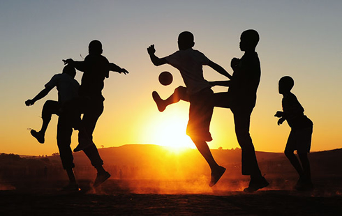
Id rather see them dig into some classic Australian folklore; a black silhouette of a drover on his horse with the club colours forming a sunset in the background.
Edit: so basically this, except maybe more of an action shot...


Can you try swapping yellow to grey, grey to blue, and blue to yellow?

My serious attempt


I would change a few things though...
- cowboy/horse in a solid black to really stand out
- different shape for the internal shield (looks very "soccer")
- brighter colours (so probably more gold) behind the drover
- the design behind the drove i think could look great as a sunset over mountains to really latch onto the Australiana and give meaning to the clubs colours (gold=sunset, blue and grey=twilight sky).


I have made changes except couldn't change the logo shape.


Anyone know the story behind this dragons jersey today after they got beaten convincingly by the panthers?
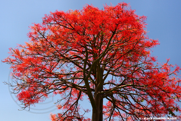
It's based on a tree native to the South Coast called the Illawarra Flame. It was picked for the indigenous round because it is recognised in the region for its importance to traditions of the local indigenous people...

If i remember correctly, the "Illawarra Flame" was actually one other original proposals for the Wollongong club (before they chose Steelers). I dont know close it was to being selected, but the official reason for its removal from the list of potential names was because it was so heavily connected to local Union teams.
Edit: with regard to the spesific design, it could have been don much better. I love the texturing of the V, but i think if would have looked much better if the V was formed with the image of the tree rather than competing with it...
