What's new
The Front Row Forums

Register a free account today to become a member of the world's largest Rugby League discussion forum! Once signed in, you'll be able to participate on this site by adding your own topics and posts, as well as connect with other members through your own private inbox!

2016 Jerseys, Sponsorship, Logos Discussion

beave

Coach
Messages
15,679
The Cowbs WCC jersey apparently has been limited to 200 only by ISC.

Once this info was passed on, I went into 'freaking out female teenager' mode and bought one immediatley.

I should have bought 2 now that I think about it.........
 

Saint Doc

Coach
Messages
11,099
Classic have gone full genius.

I was in Rebel this morning and this year's Blues gear has lime green piping. Seriously.

Unless we've merged with ACT to become the NSW/ACT Blue Green Machines...this is putrid.

27FB7323-2592-47ED-9973-55F1499EF964_2.jpg


4D73C390-B17E-49DF-8C6F-968AE4E28ABB.jpg


537C9220-CB26-45F7-AC77-6463FC0F9B2A.jpg
 

parrawentyfan

Juniors
Messages
745
Nearly everything about those is awful. Talk about an overabundance of green. VB, NIB, piping.

Just none of it goes together and the ads are so tacky. I still can't get over that the NSW origin logo is basically the VB logo.
 

Pommy

Coach
Messages
14,657
Nearly everything about those is awful. Talk about an overabundance of green. VB, NIB, piping.

Just none of it goes together and the ads are so tacky. I still can't get over that the NSW origin logo is basically the VB logo.

I don't even know why they need a blues logo it's pointless and worse than that it's shit looking pointless. They should just use the NSWRL crest with the kangaroos holding the shield.
 

beagle

Juniors
Messages
765
I don't even know why they need a blues logo it's pointless and worse than that it's shit looking pointless. They should just use the NSWRL crest with the kangaroos holding the shield.

They do use the crest, on the jersey.

Anyway, why they use the NSWRL Blues logo is to unite the game under one banner

Each competition logo and state logos are of the same design - shield with double chevron. Have a look at all of the logos, even the Kangaroos logo and the NRL One Community logo are of the same design. Victorian RL, WA RL, Touch Football, you name it, they are the same.
 
Last edited:

some11

Referee
Messages
23,675
f**king hell.

What in the actual f**k. Don't tell me VB convinced them to include some green for "synergy".
 

yakstorm

First Grade
Messages
6,074
I doubt it. If VB or NIB wanted green added to the jersey I'm sure they would have wanted a more bottle/darker green than what Classic have added there.

What Classic have done feels like a horrible rip off of the fluro yellow BLK had on the Titans & Storm training gear last year (they clearly didn't realise both those clubs have yellow as one of their normal colours) or the old Adidas Cricket Australia stuff (ie. Orange and Blue for the national team).

It's such a shame that Classic have simply butchered everything they've made for the Blues in 2016.
 

CC_Roosters

First Grade
Messages
5,221
No matter which sport it is imo jersey design as plummeted in the past 5 years. They are trying to do too much and incorporating silly little changes year on year so they can say its a new jersey in the hope of selling more. But really all the manufacturers are doing is trashing iconic brands.
 

Nuke

Moderator
Staff member
Messages
5,392
Agree 100%. I won't buy any of our jerseys anymore and just buy T-Shirts and polos that have the old school full Rooster on it. I honestly can't stand the weird ass looney tunes thing they inexplicably adopted in 2000 (although to be fair that was an improvement over the even crappier "Sydney City" logo).

I'd love for us to go to a sort of hybrid style, like what Canterbury did - mixing the basis of the classic with something modern.
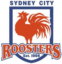
This is something I mocked up several years ago. I'm not sure why I gave it the 'Sydney City' name, but I'm thinking it was because I am one who much prefers to call teams by their location (ie: who they are supposed to represent) instead of a nickname, and I don't hear anyone calling the Sydney Roosters 'Sydney' ... but 'Sydney City' does have a more iconic ring to it and helps it stand out from South Sydney and the various other Sydney-based teams in other sports.
SydCityRoosters.jpg

There are two logos represented in this one. The obvious one is the old Eastern Suburbs one, but with the head of the chook being the current one, and with a more modern 'Roosters' text.
 

defunk

Juniors
Messages
295
I don't know whether people are aware BUT all clothing companies make approx 10-12 different designs of Jerseys, Shorts, Training gear, Polo's etc and the club or organisation will then choose what they like from there so the blame cant be totally layed onto the clothing companies.
 
Top