kdalymc
Bench
- Messages
- 4,399
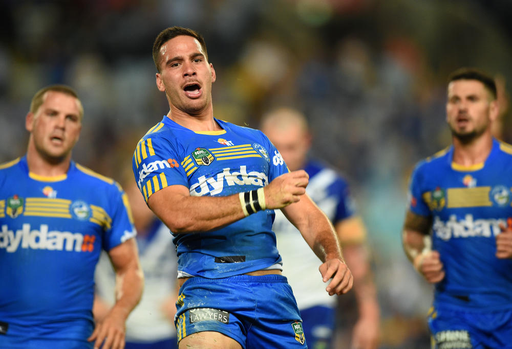
Not sure how this Parra kit qualifies as "away" but nonetheless
It's an actual away jersey.. Not a stupid "clash" or "white" jersey. Spot on if you ask me
Not sure how this Parra kit qualifies as "away" but nonetheless
Remember when they were gunna call it "Crazy John's Colosseum" and all the players were going to change their first names to "Crazy John" for the remainder of that season?
If it's largely the same as the home jersey it's not fit for purpose. At least with Souths, the black and white provide a discernable difference (which is still stupid). The idea, at least my understanding anyway, is for the away to provide a contrasting jersey to the home. Gold is one of their colours but they don't seem to want to touch it lately.It's an actual away jersey.. Not a stupid "clash" or "white" jersey. Spot on if you ask me
If it's largely the same as the home jersey it's not fit for purpose. At least with Souths, the black and white provide a discernable difference (which is still stupid). The idea, at least my understanding anyway, is for the away to provide a contrasting jersey to the home. Gold is one of their colours but they don't seem to want to touch it lately.


The uniform overall is adequate contrast here while the jersey alone is borderline.Nonesense
A uniform consists of more than a jersey. The shorts and socks make a big contribution
There is a significant difference between this:

And this

Way more difference than the souths example you used.
Apart from the well known super heroes these really are all starting to look all the same.
It's still ugly but I don't think the "Parra" logo looks as bad on these jerseys.Not sure how this Parra kit qualifies as "away" but nonetheless
Not a big deal and I assume they won't be playing with this template but I just realised thats the old ISC template.
A better look at the Broncos WCS jersey, that's a proper classic Brisbane jersey best one in years, with the multiple white stripes across the front why oh why this wasn't the main jersey I have no idea!!
View attachment 11437

Least you support the right team.I went to rebel today and noticed all the souths training grear and jackets use a duller version of the red and green which looks so much better than the jersey. This photo probably doesn't do it justice.

The jersey is sublimated while the training gear looks like its dyed. Might be one of the reasons the colours are different. The darker colours do look better though.I went to rebel today and noticed all the souths training grear and jackets use a duller version of the red and green which looks so much better than the jersey. This photo probably doesn't do it justice.

