roofromoz
First Grade
- Messages
- 7,580
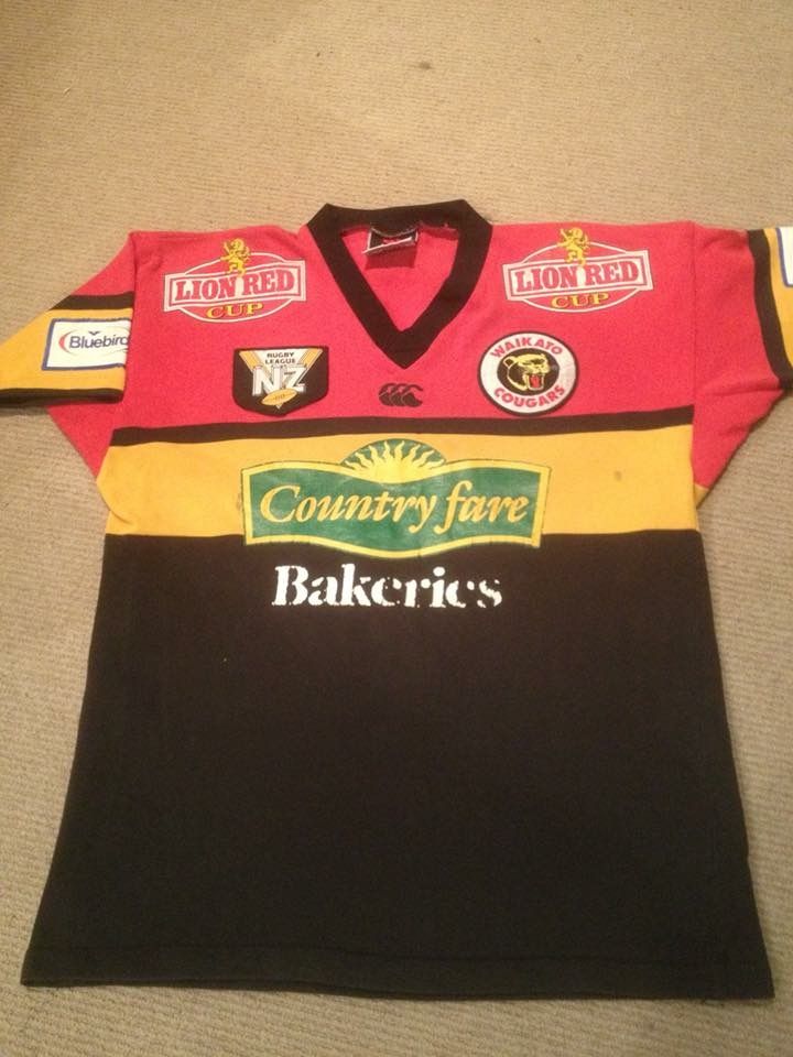
You mean this bad boy i picked up last month from NZ
Where did you get that from? I have been looking for one of those for ages...
You mean this bad boy i picked up last month from NZ
@gzerounian was just providing a good litimus test for contrast, and was not meant to indicate a literal matchup.
The point is that the other clubs are held to a standard by the NRL and we believe that Souths' away design does not adequately contrast with their home one.
Thank you GAZF for explaining the point I was trying to make. "Litmus test" is perfect.
It is very hard to make a case for Souths when you line up all the home and away jerseys next to each other. As you can see most have done a good job. Special mention to Parramatta and Manly for using their actual alternative club colour (which so happens to be white for Manly) and not resorting to a lazy Grey or White (Broncos, Warriors, Storm, Tigers could have all used another one of their club colours). I think the reason Manly looks so good is that at certain stages since 1947 that White Jersey has actually been their main jersey. I think Penrith needs to do better with their away jersey. Its too close to their home jersey. I don't see why they just don't do a direct swap in colours like the 1992 away.
View attachment 17571
I haven't seen an NRL operations manual for the last couple of years but they have previously specified a second uniform that contrasts with the first in case the first has similar colours to an oppositions. Since Souths require a third uniform to play against Canberra, I'd say it fails to adequately contrast in this regard.It depends on the definition of an away jersey. Your preference/definition is for inversed colours, but it could mean predominantly light coloured or dark coloured, or in Souths instance a slight differentiation to each other. There's no hard and fast rule and open to interpretation. From what I can tell it hasn't been regulated in the NRL like it has by other sport governing bodies, more guided by club preferences.
Special mention to Parramatta and Manly for using their actual alternative club colour (which so happens to be white for Manly) and not resorting to a lazy Grey or White (Broncos, Warriors, Storm, Tigers could have all used another one of their club colours).

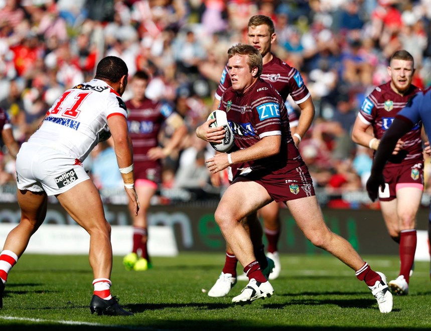
The manly jersey is at its best with the white shorts, which is how they started last year. Midway through the season they, for some reason, made the decision to wear the maroon. My special mention to Manly was specific to "that white jerseys" in particular which as I mentioned has been their main jersey in the past. They have had atrocious white jerseys in the last few years which would definitely not warrant a special mention. Apologies for not being able to express my thoughts clearly.
View attachment 17574
Where did you get that from? I have been looking for one of those for ages...
Hey mate i picked it up from this guy on facebook.
https://www.facebook.com/Edens-League-Jerseys-156079588367868/
Not sure what's going on with WC Pirates jersey this year. We seem to be channeling our inner Melbourne Storm!


That s. Burn em all.Not sure what's going on with WC Pirates jersey this year. We seem to be channeling our inner Melbourne Storm!

Bizzare to give a special shout out to manly for a white jersey, and yet looking at your image, Dragons (red), sharks (black), dogs (blue) have all used an alternate club colour for the away. And whilst white is a secondary colour for manly, it is also for warriors (black, white, red) roosters (blue, red and white) and tigers (black, white and gold).
Don’t get me wrong, manly’s jersey is good, but the giving them a special mention for not having a lazy white away jersey...when they have a white jersey...and others don’t...is strange logic. And then justifying it by saying “it’s their club colour”...when it’s also a club colour of other clubs with a white away...
Anyway, to comment on the point I think you were trying to make, the it would be nice to see the following away jersey colours
Tigers- orange/gold
Storm - yellow/gold
Broncos - yellow/gold
Hard to argue with the rest.
Raiders don’t need one, but would like to see silver/navy/lime rather than the navy/lime they have
Another thing i would like to see is compulsory shorts matching jerseys when away. I hate the mismatched look.

White jersey/dark shorts vs dark jersey/white shorts. It just looks messy.

Matching. Such better contrast
Another thing i would like to see is compulsory shorts matching jerseys when away. I hate the mismatched look.

White jersey/dark shorts vs dark jersey/white shorts. It just looks messy.

Matching. Such better contrast
