What's new
The Front Row Forums

Register a free account today to become a member of the world's largest Rugby League discussion forum! Once signed in, you'll be able to participate on this site by adding your own topics and posts, as well as connect with other members through your own private inbox!

2019 Jerseys/Logos/Sponsorships

GAZF

First Grade
Messages
8,752
This obsession with pulled up socks is weird.
  • The socks can be an effective part of communicating a team's identity (especially with diminishing space to do so on jerseys and shorts) and provide a third point of contrast from the opposing team's uniform
  • Pulled up socks are part of the uniform and have been for over a century
  • It looks more professional; short socks make the players look like a bunch of school kids playing in a park
  • Its an absolute shame that the Dragons have some of the best socks in the league, only to provide options that look like the above mentioned point
  • Socks at least hide the lower half of some shocking leg tattoos
I equate this sock thing to select players rolling their sleeves all the way up (probably impossible with modern fits), or hiking their shorts up to look like Speedos. It looks stupid and takes away from the purpose of a uniform.

Some players might not be able to keep the socks up on their own (hint: use tape) or find them uncomfortable. Too bad - there's plenty of people in the workforce that have to wear uniforms that are uncomfortable to a degree, or don't match your personal style, or are required for safety; and 99% don't make a shitload of money doing it, or have uniform suppliers bending over backwards to make the uniform more comfortable to wear on a yearly basis.
 

storm_4eva

Juniors
Messages
37
I've noticed that the @storm are still using the old style bubble grip jerseys, personal choice or maybe due to no major sponsor? Every other team has moved onto the horizontal grip.
 

Attachments

  • Screenshot_20190323-120002.jpg
    Screenshot_20190323-120002.jpg
    591.6 KB · Views: 20

sempmrh

Juniors
Messages
1,210
I've noticed that the @storm are still using the old style bubble grip jerseys, personal choice or maybe due to no major sponsor? Every other team has moved onto the horizontal grip.
Might have something to do with signing a front of jersey sponsor late and that’s just how ISC was able to get a run of player issues done in time. The Purple Bricks logo might even be heat pressed onto the jerseys worn for team photos with the gel grip added on top of that.
 

gzerounian

Juniors
Messages
1,094
  • The socks can be an effective part of communicating a team's identity (especially with diminishing space to do so on jerseys and shorts) and provide a third point of contrast from the opposing team's uniform
  • Pulled up socks are part of the uniform and have been for over a century
  • It looks more professional; short socks make the players look like a bunch of school kids playing in a park
  • Its an absolute shame that the Dragons have some of the best socks in the league, only to provide options that look like the above mentioned point
  • Socks at least hide the lower half of some shocking leg tattoos
I equate this sock thing to select players rolling their sleeves all the way up (probably impossible with modern fits), or hiking their shorts up to look like Speedos. It looks stupid and takes away from the purpose of a uniform.

Some players might not be able to keep the socks up on their own (hint: use tape) or find them uncomfortable. Too bad - there's plenty of people in the workforce that have to wear uniforms that are uncomfortable to a degree, or don't match your personal style, or are required for safety; and 99% don't make a shitload of money doing it, or have uniform suppliers bending over backwards to make the uniform more comfortable to wear on a yearly basis.
Thank you GAZF.. You beat me to what exactly I wanted to say. To some it may seem like an obsession and I get that it may seem weird. But at the end of the day we are talking about an official uniform no different to a school rule of having shirts tucked in or a policy of wearing a tie in the office (it's not uncommon for workplaces to stipulate that top buttons need to be done up and sleeves rolled down) . Sure there is no hard and fast NRL rule. This is all it states:

IMG_20190323_123748.jpg
They can even be relaxed about colours otherwise they wouldn't allow junior club appreciation week:
IMG_20190323_113211.jpg
It really comes down to the individual wearing their uniform with pride, having self respect and respect for their club.
 

Cumberland Throw

First Grade
Messages
6,543
Cows have
Production of retail jerseys begins pretty far in advance. That’s why teams go into the season with missing or innacurate sponsors. When a sponsor like Amart Furniture pulls the plug weeks before the season starts that leaves the club with racks full of outdated jerseys to sell.

Fortunately ISC are pretty good with pushing through a second, updated run of jerseys if a club asks for it.

Also, regarding the product description - ISC does that for everything.

That's why you have contracts for sponsors..

If you have them signed up for 2019 u put the logo on

If you don't .. you leave it blank

Not hard
 

Hello, I'm The Doctor

First Grade
Messages
9,124
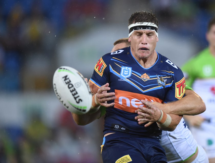
wallacej-1903176712-sd.jpg


Now that i see the Titans new jumper on the field, im coming around to it. The club (under the new management) might have just landed a soft rebroand without anyone noticing.

Predominantly dark blue with a vivid turquoise and gold for features is actually very unique, strong and striking. They finally look like their own team.

I just hope they stick with it (knowing the Titans, theyll be in pink next year)
 

Stallion

First Grade
Messages
7,467
No they look like the Cowboys navy jersey of the last few years. Just replaced the light blue with white and it's the same concept really.

A thick light blue and gold V would have worked fine! Both Vs as wide as eachother.
 

Lambretta

First Grade
Messages
8,689
Is it just my imagination or is 2019 the best year we have had for jerseys on the whole for some years?

Seems to me most clubs are trying for clean designs. There are fewer side panels and other horrid ideas and are keeping it simple.

They are using special one off jerseys to be creative but are keeping the home jerseys classic and simple.

Yay
 

sempmrh

Juniors
Messages
1,210
My issue with the Titans home jersey isn’t the colours - it’s just such a nothing design. Their away and heritage jerseys have more character - and I don’t even care much for their original jersey.

I would have liked to see a dark version of this for their home jersey:

61979A35-BFCB-47A2-90C1-3A51460A8BAF.jpeg
 

GAZF

First Grade
Messages
8,752
wallacej-1903176712-sd.jpg


Now that i see the Titans new jumper on the field, im coming around to it. The club (under the new management) might have just landed a soft rebroand without anyone noticing.

Predominantly dark blue with a vivid turquoise and gold for features is actually very unique, strong and striking. They finally look like their own team.

I just hope they stick with it (knowing the Titans, theyll be in pink next year)
I would half agree if the Cowboys weren't also a predominantly navy team. Predominantly navy with light blue suits the Titan mascot but doesn't suit the Gold Coast as well. I think they should have stuck with the lighter blue (or slightly more teal-ish blue) and introduced a navy third jersey.
 

kdalymc

Bench
Messages
4,343
wallacej-1903176712-sd.jpg


Now that i see the Titans new jumper on the field, im coming around to it. The club (under the new management) might have just landed a soft rebroand without anyone noticing.

Predominantly dark blue with a vivid turquoise and gold for features is actually very unique, strong and striking. They finally look like their own team.

I just hope they stick with it (knowing the Titans, theyll be in pink next year)
Pfft, there is 2 teams in the SAME state with the SAME jersey. And 14 teams in the same comp.
flop
 

beave

Coach
Messages
15,671
a
Is it just my imagination or is 2019 the best year we have had for jerseys on the whole for some years?

Seems to me most clubs are trying for clean designs. There are fewer side panels and other horrid ideas and are keeping it simple.

They are using special one off jerseys to be creative but are keeping the home jerseys classic and simple.

Yay

yep, best year for jerseys bar 2 dickhead teams.
 

GAZF

First Grade
Messages
8,752
My issue with the Titans home jersey isn’t the colours - it’s just such a nothing design. Their away and heritage jerseys have more character - and I don’t even care much for their original jersey.

I would have liked to see a dark version of this for their home jersey:

View attachment 28351
Hadn't seen that one before. Looks heavily influenced by Melbourne Rebels designs from a couple of years back.
 

Stallion

First Grade
Messages
7,467
Hadn't seen that one before. Looks heavily influenced by Melbourne Rebels designs from a couple of years back.

All they had to do was use light blue and gold : be it horizontal stripes, a V style but they haven't. Amazing. All the other team jumpers are recognisable and show their colours . Not a real hard ask but the people at the Titans couldn't get it right this season.
 

sempmrh

Juniors
Messages
1,210
Hadn't seen that one before. Looks heavily influenced by Melbourne Rebels designs from a couple of years back.
I’ve suspected for a while that Dynasty (formerly Zoo) has some kind of lineage to BLK - so perhaps that’s how it came about.
 

DlEHARD

Juniors
Messages
823
All they had to do was use light blue and gold : be it horizontal stripes, a V style but they haven't. Amazing. All the other team jumpers are recognisable and show their colours . Not a real hard ask but the people at the Titans couldn't get it right this season.

It's true.
 

Latest posts

Top