What's new
The Front Row Forums

Register a free account today to become a member of the world's largest Rugby League discussion forum! Once signed in, you'll be able to participate on this site by adding your own topics and posts, as well as connect with other members through your own private inbox!

The Game 2020 Jerseys/Logos/Sponsorships

yakstorm

First Grade
Messages
6,046
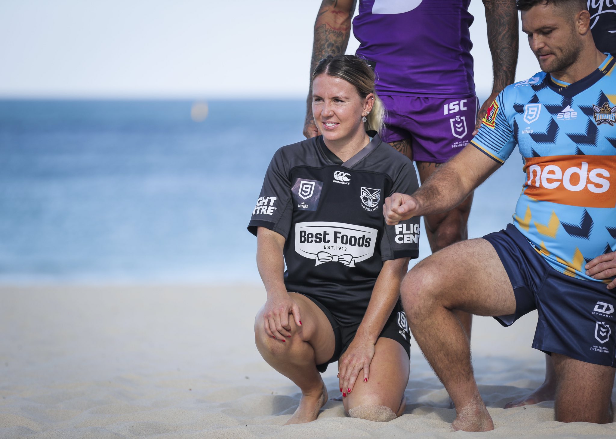
Warriors Women's Jersey from another angle:
EQpM0bmUEAE4qJ0


Bulldogs jersey is meant to have some 'brick' texture on it... however it is near impossible to see... With the lack of blue piping on the player's jersey, it is up there with the Storm S jersey and Warriors Women's jerseys as 'least effort' kits.

EQnxlzpUUAArepo
 

Jackson Allison

Juniors
Messages
184
Warriors Women's Jersey from another angle:
EQpM0bmUEAE4qJ0


Bulldogs jersey is meant to have some 'brick' texture on it... however it is near impossible to see... With the lack of blue piping on the player's jersey, it is up there with the Storm S jersey and Warriors Women's jerseys as 'least effort' kits.

EQnxlzpUUAArepo
Yeah warriors women should just use the men's kit as it's way more appealing and cool than their current kit. Although it probably wouldn't make sense as the warriors men's kit has pictures of all the other 15 clubs logos and there's only 3 other clubs in the NRLW. Out of the men's kits bulldogs, broncos, panthers and storm have the least effort applied to them.
 

sempmrh

Juniors
Messages
1,211
Warriors Women's Jersey from another angle:
EQpM0bmUEAE4qJ0


Bulldogs jersey is meant to have some 'brick' texture on it... however it is near impossible to see... With the lack of blue piping on the player's jersey, it is up there with the Storm S jersey and Warriors Women's jerseys as 'least effort' kits.

EQnxlzpUUAArepo
Looks like the Warriors have repurposed a training jersey of some kind because you can see the Canterbury logo under the heat-pressed NRL Nines patch.
 

kdalymc

Bench
Messages
4,346
Looks like the Warriors have repurposed a training jersey of some kind because you can see the Canterbury logo under the heat-pressed NRL Nines patch.
hahah they have to.. patch issues aside, a black t shirt is worse then storms purple t shirt. hahah what a cock up
 

azza29

Juniors
Messages
1,057
I don't understand why the club insists on using such a weak, anemic looking yellow for graphics, social media and membership stuff.
Agree, whoever is choosing these colours needs their eyes checked... dark purple and gold looks great, how hard can it be...?
 

beagle

Juniors
Messages
763
Hilarious - they've got the same three kits as last season but in a different order? Odd choice

I don't know what else they could of gone with as the alternate, if they really needed one at all. I struggle to think when they will wear this considering it must be worn at least once since it is available retail.

Could be a way of getting around the design for 3 year rule, they might have had to use it.
 

Blues Riff

Bench
Messages
3,350
On that drab Perth playing surface, the only jerseys that pop are Panthers, Storm, Raiders and Parra. Everything else looks like a pile of wet newspaper.
 

wazdog

Juniors
Messages
377
Really like the Souths 9 kit. Very clean and retro looking.

Much better option that the black shorts used for the promo (was probably done due to the clash).

Will most likely wear black shorts against the Raiders.

Big fan of the Parra jersey!
 

Latest posts

Top