Trollhammaren
Juniors
- Messages
- 2,064
Tigers rocking this on Saturday.
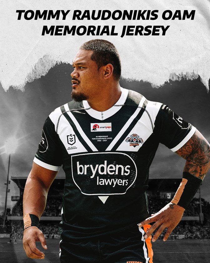


should be the standard jerseyTigers rocking this on Saturday.

Only if it was reversed white with Black V, and since it's for Tommy it should be this, they better win this weekend, not like that crap they dished out against the cowboys the weekend after tommy had passed at Leichardt.should be the standard jersey
have one jersey identical to magpies and the other identical to Balmain..... and they club would make millions! keep it K.I.S.S.Only if it was reversed white with Black V, and since it's for Tommy it should be this, they better win this weekend, not like that crap they dished out against the cowboys the weekend after tommy had passed at Leichardt.
Not a big fan of Brydens logo where it is, especially since its a one off for tommy, should have been major sponsor free or at least below the white V, seriously!
But one that typifies their existence. But hey they have a weatherman for chairman and someone who looks like Brain Mannix from Uncanny X-Men after he's snorted an 8-ball on the Board so they've changed tack. f**k westsSadly, I don't think anyone will forget the 1999 Magpies on-field form, or severe lack of it.
A horrific ending of that club as a standalone entity in the NRL.
China, Pakistan, possibly local.Where did this come from?
Tigers rocking this on Saturday.

Tigers rocking this on Saturday.

I'd buy one and I'm neither a Tigers or Magpies fan.Shame it's not for retail sale, I reckon they'd sell truck loads this jersey.
"dot work"?... Thats not dot work. Theyre all perfect circles generated on computer using copy paste.https://www.sharks.com.au/news/2021/05/03/2021-sharks-indigenous-jersey-now-on-sale/
The Sharks 2021 Indigenous jersey has been launched ahead of the upcoming NRL Indigenous Round.
A striking design, the Sharks will wear the jerseys in their round 12 clash against the Gold Coast Titans to be played in Coffs Harbour.
The concept and design were done in collaboration with local Elder Aunty Deanna Schreiber and the Sharks Indigenous players, Andrew Fifita being very involved in the design process, with the jersey now available and on sale through the Sharks store.
The Sharks 2021 Indigenous jersey heavily features blue and white dot work to represent the bubbles of the ocean and saltwater bays of the local region, where the Gweagal people of the Dharawal Nation, the Traditional Owners, inhabitants and caretakers of the Land around Kurranulla (Cronulla) have lived for many thousands of years,
The handprints on the back of the jersey represents the Aboriginal and Torres Strait Islander players on the Sharks team and their respective Nations, including Club Captain Wade Graham (Bundjalung), Will Kennedy and Braydon Trindall (Kamilaroi), Fifita and Jesse Ramien (Wiradjuri).
The large handprint on the front of the jersey symbolises the People of the Dharawal speaking Nation, the area where our team and community come together and the Sharks proudly live, work and play.
The jersey will also feature the branding of One Disease on the top back after Sharks major partner Zambrero gave up their jersey position for this Indigenous Round game.
Founded by Dr Sam Prince in 2011, the creation of One Disease was inspired by Professor Frank Bowden who led the elimination of the disease donovanosis, from Australia’s remote Indigenous communities.
A not-for-profit organisation, One Disease works alongside disease experts and remote communities to eliminate crusted scabies following our evidence-based Crusted Scabies Elimination Plan.
View attachment 48112 View attachment 48113
f**kenoath, they should hand paint every jersey individually"dot work"?... Thats not dot work. Theyre all perfect circles generated on computer using copy paste.
Effect → Distort & Transform → Roughen, Object → Path → Simplifyf**kenoath, they should hand paint every jersey individually
I only f**k wiv ms paint U know thisEffect → Distort & Transform → Roughen, Object → Path → Simplify
Anyone notice the different size number font

By the look of it, there seems to be a difference in design that impacts the actual size. The black on 14 is much thicker as the outer border is also black rather than white (the 6 only appears to have the inner border), and the centre of the 4 is filled in compared to the 6.the heat pressed numbers are much much smaller than the subbed ones.


