mistertaylor
Juniors
- Messages
- 415
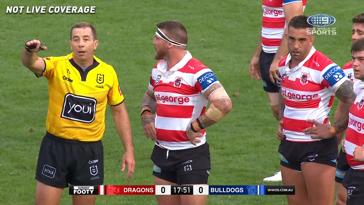
Dragons kit today looks very nice. The hooped jersey, black shorts and socks... so good!
Dragons kit today looks very nice. The hooped jersey, black shorts and socks... so good!

I absolutely loved it.
It’ll never clash with another side, potentially Newcastle away... but if it’s our away jersey that’s never happen anyway...


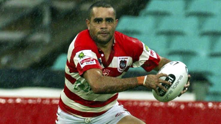
only clash would be Newcastle's 2008 centenary heritage strip
Edit: i forgot what a unit Danny Wicks was, and he had a magnificent try in this game too
So both centenary strips are pretty much the same!
Well I’ll be ...
And yeah, I loved Danny Wicks. I’m pretty sure that game was the one he skipped away for over half the field to snare a try... was an absolute weapon...
Yeh, against us if memory serves. The merkin lol
Go back to the start of the league in 1908, that was what it was,Thick horizontal stripes with a collar is such a great look. Lots of clubs would look great in that style. Switch the red for light blue and it’d make a great Cronulla kit. Orange for the tigs, blue and yellow for Parra etc.
Yes it was mate....
Not directed at you but I just had to post it.... you're under obligation to click "play"....
As a side note - interesting that they had black numbering too for this jersey (like the Dragons from yesterday)...
It's nice seeing the hoops back. The Dragons did use hoops for their alternate very early on in the merger, though moved away from it.

From a non-Dragons fan perspective, I do like the hoops. It has plenty of history, is instantly recognisable what club is wearing it and doesn't clash.
Not a bad option if the club doesn't want to use the Steelers kit as their alternate.
Toyota forklifts- Raiders major sponsor for next year?

Broncos now calling this their Magic Round jersey, to be worn v Manly Friday night..

Doritos probably, everyone loves DoritosNot meant to be a criticism but looks like a soccer top. Do we know the meaning behind the pattern and triangles?
Not meant to be a criticism but looks like a soccer top. Do we know the meaning behind the pattern and triangles?
Doritos probably, everyone loves Doritos
