What's new
The Front Row Forums

Register a free account today to become a member of the world's largest Rugby League discussion forum! Once signed in, you'll be able to participate on this site by adding your own topics and posts, as well as connect with other members through your own private inbox!

The Game 2021 Jerseys, Sponsorship, Logos etc

Messages
8,480
That Knights one is almost as bad as the early Storm ones.
White NIB with no box would look fine ffs

Yeah...

Although the NIB here - whether as it exists or without the box,,, is laid right smack bang over the centrepiece of the artwork (the circular centre with the reptiles - or at least the one reptile that I can actually see)...

If anything The Raiders one "isn't as bad" given the sponsor is not seemingly covering any detailed aspects of the design...
 

kdalymc

Bench
Messages
4,312
Yeah...

Although the NIB here - whether as it exists or without the box,,, is laid right smack bang over the centrepiece of the artwork (the circular centre with the reptiles - or at least the one reptile that I can actually see)...

If anything The Raiders one "isn't as bad" given the sponsor is not seemingly covering any detailed aspects of the design...
More so what I was getting at, the storm one hand a hand reaching to the crown logo ...
 

Disease

Juniors
Messages
2
nib.. as a Novocastrian and Knights fan i'm so torn on them.
They're a local company and have been sponsors pretty much since day dot so i really respect them for that, but the logo on the front (i never minded them on sleeve) is such a jersey killer.

I know its their brand image but i wish they would be open to a little compromise, even as little as changing the box to an outline would be a help ...or just fully change their logo to red and blue :D
 

MugaB

Coach
Messages
11,822
nib.. as a Novocastrian and Knights fan i'm so torn on them.
They're a local company and have been sponsors pretty much since day dot so i really respect them for that, but the logo on the front (i never minded them on sleeve) is such a jersey killer.

I know its their brand image but i wish they would be open to a little compromise, even as little as changing the box to an outline would be a help ...or just fully change their logo to red and blue :D
That won't happen, but at least dont cover the home jerseys pinstripes, the designs of the classic inaugural hennypenny red and blue, is great, but you cant see it, with where theyve placed the big old green box
 
Messages
8,480
nib.. as a Novocastrian and Knights fan i'm so torn on them.
They're a local company and have been sponsors pretty much since day dot so i really respect them for that, but the logo on the front (i never minded them on sleeve) is such a jersey killer.

I know its their brand image but i wish they would be open to a little compromise, even as little as changing the box to an outline would be a help ...or just fully change their logo to red and blue :D

The only way I'd see that change is if members/fans of the knights lobbied the club and/or NIB into a compromise.

Corporates wont get the concern with their branding.... unless they are made aware of how their branding is perceived by many people.

I agree, their branding on a jersey is ghastly... and it makes me hate the NIB brand even though I'm not a club fan...

Im with HCF myself but if I was in the market for a health insurance provider I simply wouldn't go with NIB because of this - no matter how good they may be at their service. May sound daft to people, but it's true.
 

MugaB

Coach
Messages
11,822
The only way I'd see that change is if members/fans of the knights lobbied the club and/or NIB into a compromise.

Corporates wont get the concern with their branding.... unless they are made aware of how their branding is perceived by many people.

I agree, their branding on a jersey is ghastly... and it makes me hate the NIB brand even though I'm not a club fan...

Im with HCF myself but if I was in the market for a health insurance provider I simply wouldn't go with NIB because of this - no matter how good they may be at their service. May sound daft to people, but it's true.
Flipside is i won't buy this jersey, till the design is actually showing, if they'd lowered it like steggles on the roosters or Brydens lawyers on the tigers, i don't think I'd give a shìt that its a big green box.
The other GRIPE i have is the Parramatta Home jersey sleeves, theres 4 gold & 4 Blue stripes completely covered by the white box sponsorship.
Like WTF ! if im a graphic designer and make a great jersey that pays homage to the past whilst, creating a fresh new look, and nail it, like the eels did, then the sponsors get added after... seriously i just up and quit... the game needs sponsors! I get that, but how is that good for merchandise and marketing when the retail price is $160, and the sponsors are covering the best parts of the designs
 

GAZF

First Grade
Messages
8,735
Flipside is i won't buy this jersey, till the design is actually showing, if they'd lowered it like steggles on the roosters or Brydens lawyers on the tigers, i don't think I'd give a shìt that its a big green box.
The other GRIPE i have is the Parramatta Home jersey sleeves, theres 4 gold & 4 Blue stripes completely covered by the white box sponsorship.
Like WTF ! if im a graphic designer and make a great jersey that pays homage to the past whilst, creating a fresh new look, and nail it, like the eels did, then the sponsors get added after... seriously i just up and quit... the game needs sponsors! I get that, but how is that good for merchandise and marketing when the retail price is $160, and the sponsors are covering the best parts of the designs
It's a terrible feeling when your designs get shat on by endless modifications with no consideration for aesthetics. You see it in all levels of mainstream design, particularly sport.

Sponsors are unlikely to take much of a backward step, unfortunately. Best approach is to design around the placements, and hope that new placements aren't allowed in the future.
 

Perth Red

Post Whore
Messages
65,411
The only way I'd see that change is if members/fans of the knights lobbied the club and/or NIB into a compromise.

Corporates wont get the concern with their branding.... unless they are made aware of how their branding is perceived by many people.

I agree, their branding on a jersey is ghastly... and it makes me hate the NIB brand even though I'm not a club fan...

Im with HCF myself but if I was in the market for a health insurance provider I simply wouldn't go with NIB because of this - no matter how good they may be at their service. May sound daft to people, but it's true.

I reckon Cash Convertors figured out that people would hate the sponsor if it took away from the club brand. They are one of the few companies I have seen that are quite happy for the colours to match the design.
Untitled.jpg
 

Perth Red

Post Whore
Messages
65,411
Flipside is i won't buy this jersey, till the design is actually showing, if they'd lowered it like steggles on the roosters or Brydens lawyers on the tigers, i don't think I'd give a shìt that its a big green box.
The other GRIPE i have is the Parramatta Home jersey sleeves, theres 4 gold & 4 Blue stripes completely covered by the white box sponsorship.
Like WTF ! if im a graphic designer and make a great jersey that pays homage to the past whilst, creating a fresh new look, and nail it, like the eels did, then the sponsors get added after... seriously i just up and quit... the game needs sponsors! I get that, but how is that good for merchandise and marketing when the retail price is $160, and the sponsors are covering the best parts of the designs

TBF sponsorship brings ina round $6mill plus, merch sales $1mill or less. From a revenue stand point they have prioritised the higher revenue earner. Not that they shouldnt work hard to find a compromise position so they dont run out looking sht every week!
 
Messages
8,480
I reckon Cash Convertors figured out that people would hate the sponsor if it took away from the club brand. They are one of the few companies I have seen that are quite happy for the colours to match the design.
View attachment 48426

Absolutely, bang on. They've adapted their presence to integrate with the design/colour scheme while still maintaining a recognised, strong brand presence..

They've shown it's not that hard to do...

In Australia however.... different story. There have been sponsors like Kia and Trip-A-Deal have "allowed" their branding to alternate in order to better fit the jerseys of the clubs they've sponsored.. And they've lost absolutely nothing in the process.

If only companies like NIB would be more forward thinking..
 

Perth Red

Post Whore
Messages
65,411
Absolutely, bang on. They've adapted their presence to integrate with the design/colour scheme while still maintaining a recognised, strong brand presence..

They've shown it's not that hard to do...

In Australia however.... different story. There have been sponsors like Kia and Trip-A-Deal have "allowed" their branding to alternate in order to better fit the jerseys of the clubs they've sponsored.. And they've lost absolutely nothing in the process.

If only companies like NIB would be more forward thinking..

there's still a lot of old school marketing people in the industry that think that brand colour/logo is the most important part of brand recognition. Even then you could put NIB in their green colour and lose the box and it would look a bit better.
 

Perth Red

Post Whore
Messages
65,411
yeh
If only Cash Converters were so flexible when it comes to their predatory payday loans that destroy peoples lives. Oh well

Yeh its a sht part of their business. Like pokie dens, loan sharks will always be around preying on the poor and desperate it seems.
 

kdalymc

Bench
Messages
4,312
'may' be relevant with the chicks cos they probs won't play a test match on the same night....
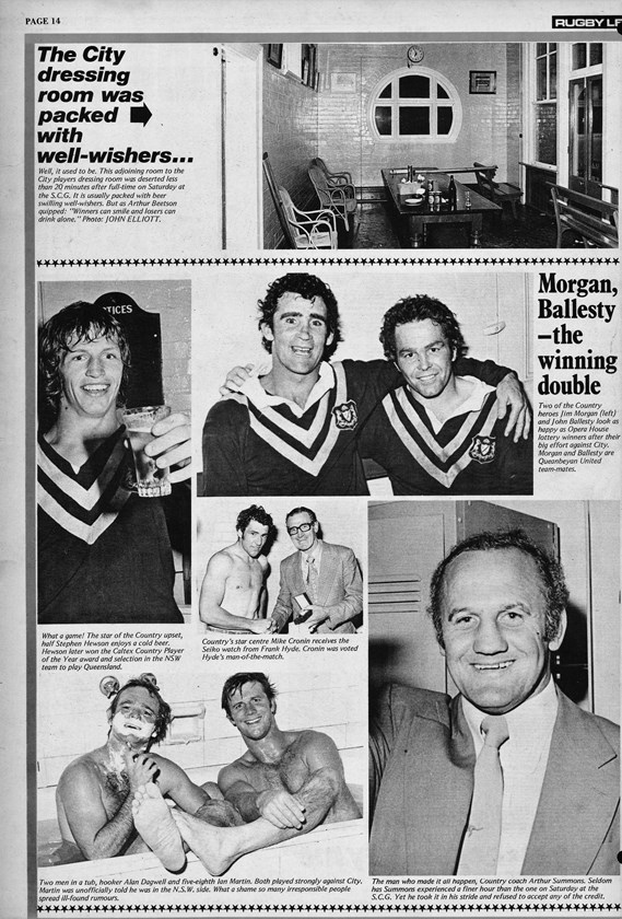
Also, was the country always a solid gold Vee while only city had the double Vee?
 

unforgiven

Bench
Messages
3,138
'may' be relevant with the chicks cos they probs won't play a test match on the same night....
Also, was the country always a solid gold Vee while only city had the double Vee?

No country used to have a double vee as well

country75pics.jpg
 
Top