What's new
The Front Row Forums

Register a free account today to become a member of the world's largest Rugby League discussion forum! Once signed in, you'll be able to participate on this site by adding your own topics and posts, as well as connect with other members through your own private inbox!

The Game 2022 Jerseys, Sponsorship, Logos etc

MugaB

Coach
Messages
15,002
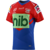
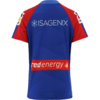
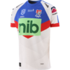
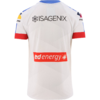
That new green NIB logo is worse than the previous one - the jerseys themselves are fine, though.
Simple but fine...


NIB reaEEEEEELY suck dem balls

Any reason they cant put the NIB below the design, or are they intentionally wanting to fk the design everytime.... seriously did the Oneills graphic designer fk the NIB owners wife or something.... run over his cat... take the last marshmellow..
WHAT!!!
 

Maccas4177

Juniors
Messages
611
I really wish the premiers would get a gold badge for the season. Would be a nice touch and surely good for sales.
Yeah, agree with this. The winners of the EPL have a gold EPL logo on their shirts. The winners of the champions league or world club champions (cant remember which) have a gold trophy badge in the middle of the chest.

A gold NRL trophy badge would be a nice touch!
 

MugaB

Coach
Messages
15,002
Yeah, agree with this. The winners of the EPL have a gold EPL logo on their shirts. The winners of the champions league or world club champions (cant remember which) have a gold trophy badge in the middle of the chest.

A gold NRL trophy badge would be a nice touch!
Yeah im fairly sure its happening, ive seen a penrith jersey with the gold telstra/Nrl logo,
But it might be just for fan purchase, not for players to wear during the '22 season
 

Maccas4177

Juniors
Messages
611
Yeah im fairly sure its happening, ive seen a penrith jersey with the gold telstra/Nrl logo,
But it might be just for fan purchase, not for players to wear during the '22 season
that's just the supporters premier range. Remember it from all the Sharks gear in 2016.

Really hope they adopt some sort of recognition. Currently its just all the "defending Premiers" verbal diarrhea that comes from the commentators.
 

Frailty

First Grade
Messages
9,453
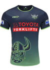
Cronulla are making the mistake the Raiders have made- a simple, traditional design is spoiled by too many different coloured sponsor logos/ fonts.
Outside of the green Zambrero, I don't have any issue.

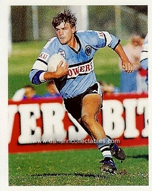
Red goes with the historic approach to the jersey:
l_1993%20sticker%20missing%20ones0005.jpeg
 

cooko

Juniors
Messages
520
Well it’s official now

Looks better on somebody then what the original image does but still ruined by the horrible and over sized nib box.

Sternum sponsor in a white box looks horrible as well
Source - Newcastle herald website

View attachment 55646
Surely the designers know that the major sponsors logo is a big green and white (now green and green) box.

There would then be an opportunity for them to work the design around that.

It is constantly amazing how many jersey designs seem to ignore the fact that there will be a large wording or a box but they still seem to think it works.

And then even more bizarrely it goes through the approval process and gets the green light.
 
Last edited:

Reflector

Bench
Messages
2,534
Outside of the green Zambrero, I don't have any issue.

Red goes with the historic approach to the jersey:
l_1993%20sticker%20missing%20ones0005.jpeg
I didn't like the red font back then either. Would've looked much better in black font, AKAI could've got away with it as a minor/ sleeve sponsor.
 

Reflector

Bench
Messages
2,534
Well it’s official now

Looks better on somebody then what the original image does but still ruined by the horrible and over sized nib box.

Sternum sponsor in a white box looks horrible as well
Source - Newcastle herald website

View attachment 55646
You watch NIB become the longest running club major sponsor in the NRL era and never change their jersey logo once...
 

Nuke

Moderator
Staff member
Messages
5,358
Surely the designers know that the major sponsors logo is a big green and white (now been and green) box.

There would then be an opportunity for them to work the design around that.

It is constantly amazing how many jersey designs seem to ignore the fact that there will be a large wording or a box but they still seem to think it works.

And then even more bizarrely it goes through the approval process and gets the green light.
This is the part that bewilders me far too often. It's one thing for designers to come up with questionable / experimental designs, but someone (or, actually worse still, a group of people) then choose it and approve it.

I know from personal experience as a former / occasional graphic designer, for presentation of final ideas, you submit four. Your best one, two average ones, and one not-so good one. The average and not-so good designs are there to emphasise how good the good one is. To make it really stand out. It amazes me how often one of the poorer designs get chosen.
I suspect jersey designers do something similar, and can also feel amazed that one of their lesser designs gets picked.
 

parrawentyfan

Juniors
Messages
745
That Knights jersey is disgusting. Worse than the Broncos Wow jerseys.

The sponsor obviously. It is really making me hate nib which I'm sure is not the intention.

But also why go with a V. I'm sick of them using Vs for teams that have no history of using them.

Raiders a few years ago and Manly come to mind. I wasn't a fan but at least it was sort of tasteful unlike the Knights attempt.

I dread the day they ever do another serious Parramatta jersey with a V. Our last attempt was 2001 era..
 

flippikat

First Grade
Messages
5,210
That Knights jersey is disgusting. Worse than the Broncos Wow jerseys.

The sponsor obviously. It is really making me hate nib which I'm sure is not the intention.

But also why go with a V. I'm sick of them using Vs for teams that have no history of using them.

Raiders a few years ago and Manly come to mind. I wasn't a fan but at least it was sort of tasteful unlike the Knights attempt.

I dread the day they ever do another serious Parramatta jersey with a V. Our last attempt was 2001 era..
You have a good point.

For home jersey, clubs that don't have a history of a V should stay away from it.

Sure get crazy as you want for an alternate/away jersey, but the home is your main identity.

IMO Premier league football clubs have the right idea - the main/home shirt stays largely the same.. with slight tweaks to sponsor, collar, trim, shoulders, watermark etc each season.. and the AWAY & 3rd jersey are where you get adventurous.

The closest we have to that here is the Rabbitohs, Roosters, Dragons & Bulldogs, who've stayed pretty much on the same home design for decades (Souths brief "Minties" flirtation notwithstanding), and their brands are rock-solid because of that.
 

Latest posts

Top