- Messages
- 5,392
So on the biggest day of the NRL year, 'The' are unveiling their jersey.
Either to give themselves some of the spotlight ("Look at me! Look at me!"), or to sneak it in with minimal fanfare, hidden beneath all of the Grand Final news.
So on the biggest day of the NRL year, 'The' are unveiling their jersey.
What this does, moreso, is announce that their logo isn't changing for 2023. It doesn't necessarily need it, but an update to it might be considered about due.I have a sneaking suspicion that NQ's 2023 jersey is going to have chevrons and look something in the ball park of the 2014-2015........View attachment 66807
So on the biggest day of the NRL year, 'The' are unveiling their jersey.
Either to give themselves some of the spotlight ("Look at me! Look at me!"), or to sneak it in with minimal fanfare, hidden beneath all of the Grand Final news.
Seems strange to release on GF day, it’s not like they won the QRL GF & play in the interstate cup game
 . I bet it is the NRL’s idea to tie in the announcement with the grand final show.
I reckon it looks like this, obviously without the massive logo on the chestYou know it is going to look exactly like the St George jersey don’t you. I bet it is the NRL’s idea to tie in the announcement with the grand final show.
The game has (corporate waffle) and now with the 2023 season approaching let us formally introduce the Dolphins as part of the NRL family (cue somebody in the Dolphins jersey and crowd cheering)


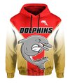
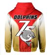
I reckon it looks like this, obviously without the massive logo on the chest
View attachment 66826View attachment 66827
The gold fade to white looks great, and the red is pretty deep and uniquely cut... reminds me of the original wolverine costume
View attachment 66828
Obviously in red and gold, not in brown/tan

Bulldogs has ice hockey shoulder pads in the 80s... so why notI think that would look fantastic. That gold would be really unique. I don’t know about the Wolverine claws being allowed though
Bulldogs has ice hockey shoulder pads in the 80s... so why not
Pity they've evidently stuck with that same shitty logo for yet another year. It was crap when introduced in 2003, considering they changed their logo 3 times in the first 8 years of their existence it boggles the mind why the marketing department stay so loyal to easily the worst logo they've ever had...I have a sneaking suspicion that NQ's 2023 jersey is going to have chevrons and look something in the ball park of the 2014-2015........View attachment 66807
Georgia Football Federation, looks pretty shmickThe Dragons one is difficult, in that they've virtually had it for decades, going back into the St.George days pre-merger. It'd be a hard task to simplify it and modernise it without everyone hating on it for those two reasons.
Those are just my thoughts, for what it's worth.

Probably having a media conference during the kick off of the grand finalSo what time were the Dolphins thinking of releasing the jersey?
Probably having a media conference during the kick off of the grand final
