What's new
The Front Row Forums

Register a free account today to become a member of the world's largest Rugby League discussion forum! Once signed in, you'll be able to participate on this site by adding your own topics and posts, as well as connect with other members through your own private inbox!

The Game 2023 Jerseys, Sponsorship, Logos etc

GAZF

First Grade
Messages
8,752
The NQ graphic designer Marie worked with Dynasty on the jersey design. She was interviewed on a podcast late last year and talks about trying to get rid of the yellow (and the star in the logo) as much as she could. I've always said in the late 90's for some reason the club merch went away from navy, grey and white to mostly just navy and yellow and she says the same thing. It looks cheap and is very confusing as all the general merch when you walked into the team store looked like it could have been parra's.

The original jersey the Cowboys had, the yellow was only an accent colour by being 2 thin stripes across the sleeves and body. I'm okay with the current jerseys having a highly reduced amount of yellow in it compared to the previous 20 years and mirroring the colour proportioning of 1995.

The yellow is probably needed in all honesty to avoid legal clownery by the Dallas Cowboys.
It felt like the Cowboys were never going to ease up on the yellow. 10-15 years of merch looked so cheap, particularly with the current subpar logo + red text outline combo.

The gold usage is about right now. I'd prefer if white was only used on the away design base, with the general striping comprised of silver/navy/gold/navy/silver. Shorts could have used a small amount of gold as well.
 

It's Been Done

Juniors
Messages
716
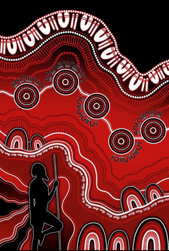
The winning design for this years St George's Indigenous Jersey by Zoe Raymond 'Stand Your Ground'
screen-shot-2023-03-06-at-9.51.17-am.png


Dogs Of War

Coach
Messages
12,721
Anyone watch the Dawn Of The Dolphins first ep on Stan last night? They showed a bit about the jersey design process etc.. and it was refreshing to see the CEO's only criteria was that it be "clean"
I really enjoyed it. Will watch the rest as it comes out.
 

MugaB

Coach
Messages
15,058
Anyone watch the Dawn Of The Dolphins first ep on Stan last night? They showed a bit about the jersey design process etc.. and it was refreshing to see the CEO's only criteria was that it be "clean"
Yes watching Wayne talk about his introverted personality, but also how it doesn't let him get taken over by it, coz he needs/wants and has to coach players, was such a great insight into his mindset..
He is rather jovial, but you can see how he isn't fond of attention, like most coaches/players are

The episode was great, it gave us an insight to how much work and hoops they had to jump just to get all the mechanics of a 1st grade side, and mostly the funside of the expansion bid, just like designing the jersey... some of the other designs were terrible,
I can see why they went with this... i really like the away in white, normally i hate white jeresys as they are boring and are without effort, but this one, the cowboys away from '19, and the raiders '23 are all great... parras, knights and bronx for this year are tasteless, its the very reason I've hated white jerseys
 

beave

Coach
Messages
15,671
Yes watching Wayne talk about his introverted personality, but also how it doesn't let him get taken over by it, coz he needs/wants and has to coach players, was such a great insight into his mindset..
He is rather jovial, but you can see how he isn't fond of attention, like most coaches/players are

The episode was great, it gave us an insight to how much work and hoops they had to jump just to get all the mechanics of a 1st grade side, and mostly the funside of the expansion bid, just like designing the jersey... some of the other designs were terrible,
I can see why they went with this... i really like the away in white, normally i hate white jeresys as they are boring and are without effort, but this one, the cowboys away from '19, and the raiders '23 are all great... parras, knights and bronx for this year are tasteless, its the very reason I've hated white jerseys
Cowboys home and away '18-'19' were an abomination to RL........
 

Dawesy76

Juniors
Messages
275
Am I right in thinking this is the third year of this jersey? Must be the first time in a long time that we’ve had something more than 2 years
Not quite. Away Jersey has less maroon on it this year and no side panels. It looks cleaner.
 
Last edited:

beave

Coach
Messages
15,671
Maybe it was '20 away then, which ever the away heritage 25 season strip was
oh, yeah the '20 home and away were mint.

I preferred the home as it looked more like the 1995.

E2240AD5-2565-4195-9CCA-FE82BE9ABB38.jpeg

I also liked the simplified horns logo, i wish we would just adopt that instead of the current version. I know Marie at the club has tried to convince the powers to be to remove the star but she can't get it over the line.

Sidenote, i believe they are using a 1995 retro inspired jersey for 2025.............
 

MugaB

Coach
Messages
15,058
oh, yeah the '20 home and away were mint.

I preferred the home as it looked more like the 1995.

View attachment 70968

I also liked the simplified horns logo, i wish we would just adopt that instead of the current version. I know Marie at the club has tried to convince the powers to be to remove the star but she can't get it over the line.

Sidenote, i believe they are using a 1995 retro inspired jersey for 2025.............
I bought the away strip and im not even a cows fan..
That's how good it was
My daughter sporting the jersey20191219_131926.jpg
 

hellteam

First Grade
Messages
6,536
Agree Cowboys colour balance of their home jersey is off. It basically looks all navy from afar. It may look better with grey or white pants but the all navy doesn't work for me, those two jerseys above are perfect for them.
 

mn_tibor

Juniors
Messages
226
Not quite. Away Jersey has less maroon on it this year and no side panels. It looks cleaner.
Yeah you're right! Replacing Ladbrokes (red) with The Star (black) on back also makes a big improvement. I don't think it would count as a design change but it may be enough for me to purchase it again. I didn't get last years so there is even more difference between 2021 and 2023. That's what I am telling myself at least.....
 

cooko

Juniors
Messages
520
Yeah you're right! Replacing Ladbrokes (red) with The Star (black) on back also makes a big improvement. I don't think it would count as a design change but it may be enough for me to purchase it again. I didn't get last years so there is even more difference between 2021 and 2023. That's what I am telling myself at least.....
Can't understand why The Star can't be black text and lose the box. Would be so much cleaner. Same goes for whoever their sleeve sponsor is.
 

Nuke

Moderator
Staff member
Messages
5,363

It's Been Done

Juniors
Messages
716
Host Plus have returned to the lower back spot on the Cowboys jersey after strangely being absent during the pre-season and round 1
 
Top