God the old Dogs logo sucked hard, glad we changed it. Up there with this one for sure

Why don't you post your own crap logo then you piece of tard
God the old Dogs logo sucked hard, glad we changed it. Up there with this one for sure
:lol: Piece of tard. How clever. Our logo was ditched in 2009, if you can't remember it then there's not much hope for you my friend. Not that you've ever been accused of having too much hope
Look between the eyes.
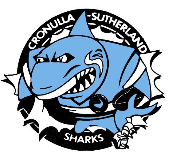
Does anyone have scans etc of the old alternate logos of the mascot breaking out of the emblem? Like the broncos one from earlier in the thread. If I remember right there was a sticker set of them or something.

The colours don't do Penrith any favours, black purple teal red and yellow makes for a 90's inspired mess. Less colours would help. Wordmark needs an update too.
Why don't you post your own crap logo then you piece of tard
That cartoon one is awesome! I wish I could get my hands on the Raiders version of it.


Looks like they were early on the Wests Tigers logo too;

someone foresaw the future