What's new
The Front Row Forums

Register a free account today to become a member of the world's largest Rugby League discussion forum! Once signed in, you'll be able to participate on this site by adding your own topics and posts, as well as connect with other members through your own private inbox!

2010+11 Jerseys, Logos & Sponsors

Charlie124

First Grade
Messages
8,509
From that picture i like that a lot better than their old one, which to me looked like a cheap training shirt.
 

Pumba

First Grade
Messages
8,542
main_titans,0.jpg


Another pic.

http://www.leaguehq.com.au
 

Goddo

Bench
Messages
4,257
This appears on the Saints website... not confirmed however if it is the genuine article...

Kinda hope it's not legit
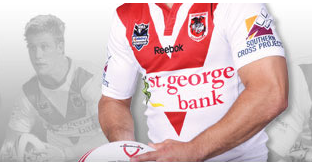
rbkpoo1.png

The whole banner and background has changed. I'd say that is it. Probably accident leaking it when updating the website before the anouncement.

I'm not a fan... Reebok written over the V is gay. If they are going to do a collar, make it white.

Looks like I'll be keeping my 08 jersey for game days until something better comes along. I hope the Alternate is an improvement...
 
Last edited:

Saint Doc

Coach
Messages
11,070
I like the titans, but agree that the white shorts dont look great.

Dragons jersey...would MUCH prefer a white collar, but i feel whats i get over the shock, this one has potential to grow on me.

As for the reebok branding...looks disgraceful. Why couldnt they use the "Rbk" logo instead of Reebok across our vee??
 

Coaster

Bench
Messages
3,162
Titans looks awesome IMO, much better then i thought.

Dark blue shorts and they are a winner.
I had a feeling they were heading more Dark blue after this years Members hats.

I was never really a fan of the light sky blue, as a queenslander i have been conditioned to hate it. This is much better. and a collar of sorts !!
 

Timmah

LeagueUnlimited News Editor
Staff member
Messages
100,973
any word when the new bulldogg jersey released?


also, is it safe to say they have the sponsors downpat already?
Bulldogs jersey is due end of Nov/early Dec. Jaycar renewed through til the end of 2012 just before the Eels prelim final
 

innsaneink

Referee
Messages
29,365
Haha....thats as close as Prince gets to the King...looking a right wally

I reckon if they swapped the shorts the outfits would look a bit better.

And that saints jumper...how bodgey is that??? LOL
 

hellteam

First Grade
Messages
6,533
I actually think that Titans jersey would look really really good with dark blue pants. But a bit late for that now, surely someone could hvae worked that out
 

DeeJ

Bench
Messages
3,119
The Titans swap their home and away shorts all the time anyway so perhaps they will continue to do so with the new jersey.
 

Knightmare

Coach
Messages
10,716
I like the new collars- have that retro v-neck look to them that all the collarless jerseys should have. However, the Titans away jersey is too plain, and the home one is too 'busy' looking. And I don't understand why the Dragons persist with a red collar, looks totally out of place.
 

Nuke

Moderator
Staff member
Messages
5,286
Here's my thoughts as a non-Titans supporter and as someone who (for some reason) is passionate about having teams look their best (possibly as it represents the sport in a good way if they look as good as they could).

The white kit: The light blue shorts are a winner. The socks I'd be happy with. The jersey isn't right. Sure, white works here, but I'd have other ways of having light blue on there other than that peacock's tail thing. That ruins it for me.
Also, the jersey needs just a tad of yellow. The club colours are light blue, white, and yellow. I'm not seeing any yellow on that entire kit.

The dark kit: A mish-mash. You've got a mostly dark blue jersey with light blue and yellow sections (plus a prominant white box for the sponsor). You have white shorts, and socks that are mostly light blue with a dark blue bit. It's all over the place, and far too busy. Like others have said, perhaps the light blue shorts would suit this better (I wouldn't do a straight swap with the white kit though ... that'd be too much white for that kit). What's wrong with teams having only one pair of shorts? There's no need to have two designs / colour schemes of jerseys, shorts, AND socks for every team. Jerseys, yes, I can understand. The shorts and socks, not necessarily. That being said, I have no problems with these socks.
 

Timmah

LeagueUnlimited News Editor
Staff member
Messages
100,973
Reebok hasn't done your mob any favours, the Reebok bit across the Vee looks terrible.
 
Messages
1,585
somehow I dont think that will be the jersey, They did the same thing on the website when we got rid of Globe as sleeve sponsors and just did a dodgy photoshop job to keep the sponsors happy.
I could be wrong but I'm pretty sure it will be different.
f**ken hope so lol
 

Saint Doc

Coach
Messages
11,070
somehow I dont think that will be the jersey, They did the same thing on the website when we got rid of Globe as sleeve sponsors and just did a dodgy photoshop job to keep the sponsors happy.
I could be wrong but I'm pretty sure it will be different.
f**ken hope so lol

Unfortunately, I think thats it.

- If you look in the background, the photos of the actual players, the adidas logo has been photoshopped out, but they still have the adidas collars
- The ball the person is holding has the 'Dragons Community' logo...this isnt a photo of a player that has been photoshopped...someone in the office is holding that ball and wearing the jersey!
- The sleeve sponsor logo looks to be in a bigger font than last year
- The new collar - why would you bother photoshopping that in if its a temporary image?
 

Timmah

LeagueUnlimited News Editor
Staff member
Messages
100,973
The name of your sleeve sponsor has changed - SC Constructions is now SC Projects.

It's definitely the 2010 jersey.
 

Saint Doc

Coach
Messages
11,070
The name of your sleeve sponsor has changed - SC Constructions is now SC Projects.

It's definitely the 2010 jersey.

good pickup. The only hope we have is that it is a prototype that got sent back to reebok with the direction to get their sh*tty logo off our vee.
 

Latest posts

Top