What's new
The Front Row Forums

Register a free account today to become a member of the world's largest Rugby League discussion forum! Once signed in, you'll be able to participate on this site by adding your own topics and posts, as well as connect with other members through your own private inbox!

2010+11 Jerseys, Logos & Sponsors

Messages
12,381
For all their weirdness, there are still some Superleague jerseys that are OK.

Refer to designs here:
http://en.wikipedia.org/wiki/1997_Super_League_%28Australia%29_season

* The Perth jersey was not too bad, a little bit better than the 1995 "panels" jersey, which was a bit busy - interestingly, the current Reds jersey is closer to the SL jersey than the 1995 jersey.

* I like the Cowboys jersey with the striped V - it's a straightforward design, and it's a damn lot better than some of the art projects they've been wearing recently.

* The Sharks design was not too bad (same template as the Reds, but it looked ok). Although my favourite sharks jerseys were the ones with fin designs that they wore after SL.

But there were soome shockers too.

* The Broncos/Raiders template was just plain weird.
A star-burst? arrows pointing to the groin? Were the designers on crack??

* The Mariners/Rams template was silly too.. the same v-design on back AND front? WRONG!

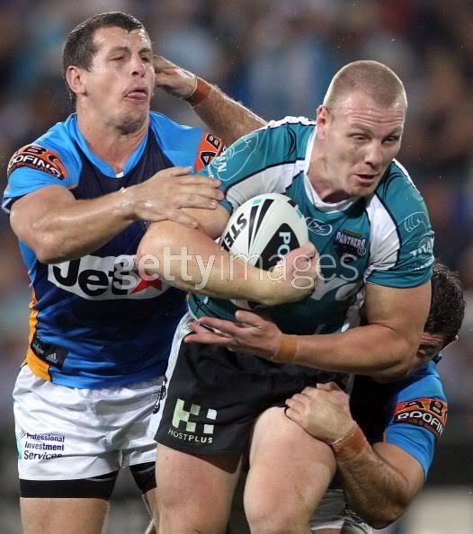
But I had a particular hate for the Warriors/Panthers template - psychedelic spaghetti.
The only other first grade jersey I've seen like that was the Tigers from a few years ago.

Why don't designers understand that "less is more"?


Nah, they all sucked. They fact that a couple of clubs shared a template – just with different colours, shows that those merkins had no idea about fan culture IMO.

Looking at those templates, they showed Penrith in Brown, black and white. I thought they took the Liquorice All-sorts colours with them to SL but in that dicky SL design. Yes?
 

flippikat

First Grade
Messages
5,007
Nah, they all sucked. They fact that a couple of clubs shared a template – just with different colours, shows that those merkins had no idea about fan culture IMO.

Looking at those templates, they showed Penrith in Brown, black and white. I thought they took the Liquorice All-sorts colours with them to SL but in that dicky SL design. Yes?

Yeah, I think they got Penrith wrong in that Wiki article.

But I still think that the SL Cowboys jersey is FAR better than a lot of the ones they've had post SL - only thing I'd change about it would be removing the stripey-vee on the back.
 

beave

Coach
Messages
15,669
my mate bought a 2010 cowboys jersey at the stadium last night for $60-70.

Me thinks that being this is the 3rd year with that stupid bullshead design and him getting the current jersey for so cheap, the Cowbs will be getting something new next year.

I have seen in the past jerseys go for cheap at the end of year, but not that cheap, normally about $100, but that is when the basic design has rolled over to the next year. Just reading between the lines I suppose.
 

DeeJ

Bench
Messages
3,119
my mate bought a 2010 cowboys jersey at the stadium last night for $60-70.

Me thinks that being this is the 3rd year with that stupid bullshead design and him getting the current jersey for so cheap, the Cowbs will be getting something new next year.

I have seen in the past jerseys go for cheap at the end of year, but not that cheap, normally about $100, but that is when the basic design has rolled over to the next year. Just reading between the lines I suppose.

I was always a big fan of the white, blue and yellow one with the big bull horns on the front. Cowboys have had some good jerseys, just leave out the grey.
 

axl rose

Bench
Messages
4,940
* The Broncos/Raiders template was just plain weird.
A star-burst? arrows pointing to the groin? Were the designers on crack??

By the same guy who decided there would be special soaps placed in toilets at all Super League games. That way people could get use to the aroma of Super League.. honestly it happened.

Luckily those SL guys like Finch, Annesley, Gallop, Shubert are long gone so they can no longer do any dama...oh

Is Ettingshausen still famous in Hong Kong? Phil Adamson? if anyone is in town can you keep an eye out for any billboards..
 

beave

Coach
Messages
15,669
I was always a big fan of the white, blue and yellow one with the big bull horns on the front. Cowboys have had some good jerseys, just leave out the grey.

I disagree, we have had some absolutely disgraceful jerseys.

The best jersey we've ever had is the one in my avatar, which has probably the most grey in it out of any of our jerseys. There is nothing wrong with grey, it was actually one of the primary colours in our early days (our original team song used the reference 'the blue and the grey') and over the years its use was getting less and less, but this latest abortion has a fair amount in it but the actual design overall is terrible. I cannot wait for the day it is f**ked off along with Carl Webb, Michael Bani, Ash Graham etc etc........ :D
 

Lockyer4President!

First Grade
Messages
7,975
Down the track I wouldn't be surprised to see NQ change their colours/jersey to the heritage strip/traditional NQ rep jersey. It's a classic design and no-one else in the NRL uses royal blue with white trim.
 

Tom Shines

First Grade
Messages
9,854
North Queensland went alright... but yeah to a man they were basically all turd, especially when coupled with the basketballesque numbering system.
 

nqcowboy87

Bench
Messages
4,181
i remeber a lot of people blwing up (and rightly so) over the titans and panthers match and the clash of strips

98776400.jpg


but looking at this from the qcup norths devils and sunny coast sea sea eagles match it doesnt seem so bad, by the way the norths players is on the left of the picture

md_DEVVSUN-SP104JPG.jpg
 

Tom Shines

First Grade
Messages
9,854
i remeber a lot of people blwing up (and rightly so) over the titans and panthers match and the clash of strips

98776400.jpg
[/IMG]

Yeah I was one of them... I wasn't even (that) pissed and I could barely tell the difference.
Bit of a kit clash in the Sharks/Warriors game too.
 

Timmah

LeagueUnlimited News Editor
Staff member
Messages
100,970
The other night? Really?

I thought the blue was the best option for NZ as the black and white were probably worse clashes. Sharks' colours really are a nightmare and have had the most clashes this year IMO.
 

beave

Coach
Messages
15,669
that QLD cup game, I would have hated to have been the ref or the players, that is terrible.
 

S.R.

Juniors
Messages
1,307
The other night? Really?

I thought the blue was the best option for NZ as the black and white were probably worse clashes. Sharks' colours really are a nightmare and have had the most clashes this year IMO.

The Sharks colours are a nightmare??? WTF???
It's up to the team playing against Cronulla at Toyota Stadium to come up with a kit that doesn't clash.


Teams that simply reverse their kits for an alternate strip are the problem.
How the hell the Bulldogs get away with what wear for an 'alternate' strip is beyond a joke.
 

Dr Crane

Live Update Team
Messages
19,531
warriors wore their black home strip against the sharks in round 2, the sharks wore their home blue jersey and there was no clash at all.

dark blue and light blue barely qualify as a clash though.
 

S.R.

Juniors
Messages
1,307
Sharks are wearing a special "yellow" jersey on Friday night, supporting the Cancer Council.

00008468-image.jpg
 

Patorick

Moderator
Staff member
Messages
8,992
Cronulla going India for the day...

Penrith should of wore the pink versus the Titans. Or the brown.
 

Saint Doc

Coach
Messages
11,065
I found the sharks/warriors a bit tough, esp as I was watching at the pub and not concentrating. Can't believe anyone would suggest that a totally black jersey is more of a clash with a sky blue jersey than royal blue??? Seriously?

Don't see the issue with dogs alternate though...it's blue, the home is white. If anyone is gonna complain about an alternate, it should be souths, there's is a joke. But good on them for telling the NRL to get f***ed!
 
Top