

FWIW, that's what they termed their heritage jersey, not home alternate.On the subject of the "cut off V" - I actually prefer it when it's done like this
As the sponsors name really does properly cut it off and it looks natural
When it's the shallow V as per some of the Super League jerseys it looks too squashed in and all wrong
I really hope the Roosters go back to have an alternative home strip with hoops - we look best when we play in the wide blue stripes like this
Cellarbrations sponsorship was 2009-11 so it's gone from the bottom, and I dare say they're opening up the top to sell as well.Dragons 2012 in the flesh - interestingly St.George Bank appears to have relinquished back of jersey sponsorship. Currently blank.
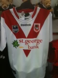

Cellarbrations sponsorship was 2009-11 so it's gone from the bottom, and I dare say they're opening up the top to sell as well.
I wonder how confident they are of selling both spots now the club's profile would be slightly lower without Bennett.
It could just be my eyes and the angle of the photo, but does the V look slightly more tapered than it has in previous seasons?

