What's new
The Front Row Forums

Register a free account today to become a member of the world's largest Rugby League discussion forum! Once signed in, you'll be able to participate on this site by adding your own topics and posts, as well as connect with other members through your own private inbox!

2013 Jersey, Logo, Sponsorship Discussion

Status
Not open for further replies.

Prometheus

Juniors
Messages
1,103
What the hell is it with side panels on jerseys these days?

Why are the manufacturers unable to keep the design going around the entire waist?
 

Frailty

First Grade
Messages
9,456
The Sharks jersey is not quite there as a heritage jersey. The stripes are too wide and the blue is off, need to eliminate the side panels as well.

Sharks_Heritage_Jersey-500x500.jpg


Sharks-med.jpg

You seriously nit picking...

The blue is actually good (the painting has it the darker colours of more recents years):
$(KGrHqJ,!iQE89KfjUM9BPfV,hYcGQ~~60_35.JPG


As for the hoops being too wide...

00004032-thumbnail.jpg


1994%20dynamic%20duos0013.jpg


I don't think proportionally it is that far off if at all.
 

100%green

Juniors
Messages
514
And likewise, you can't discount the opinions of people here. Wouldn't a forum full of rugby league fans have a greater variation in opinion compared to people purchasing jerseys because they like them?

Its not just the number of jerseys that teams are trotting out, its also the quality of them. I find it hard to believe that fans were screaming out for basket weaves, flaming V's and RoboCop torsos. Go have a look on the Warriors forums for a general consensus, you'll find that its far from 100% positive.

I am not discounting the views on here I just think you and a few others who go on about it don't see outside your own views.

I really like the SL jerseys in 97 and would have liked to see them continue as I thought they were great new designs compared with the jerseys before that. But people hated them so I moved on.

Everyone has different tastes and if the clubs are making money, getting media PR and various other things then what is the harm?

I'm sure many women love the pink jerseys. There are a few of you who have complained about them and had enough. So those who like them should have to go without?

I remember reading heaps of negative posts on here regarding the Anzac jerseys, they all sell and pay a tribute to our armed services.

I'm sure the Bulldogs and Storm got a great sponsorship deal for their "movie" jerseys and not only made money from sales or auctions but may have even got attention from people who don't follow them or the game.

Not everything that comes out will be a winner, for the most part I like most of those Warriors jerseys. In the past on paper their designs have been 50/50 but when in store or on tv they sell. They are trying new things and I applaud them for that. Sometimes it works.

For the record not everything is great. I can't remember the last really good Tigers jersey. The Dragons should always be in a St George or Illawarra jersey. The Broncos haven't had a good jersey since the 02 away. I could go on....

My point is I am all for decent and tastefull home and away jerseys and your designs are awesome. But there is nothing wrong with event, training or charity jerseys. Surely there is enough room in the market for all of us to enjoy.
 

Timmah

LeagueUnlimited News Editor
Staff member
Messages
100,992
The flame training jerseys are in poor taste but the casual fan doesn't have to deal with them. The rest are all onfield jerseys and saying that the pink one is the least offensive of the new jerseys is saying A LOT.

The U20's jersey will be the only one of these new "abominations" that will see the light of day more than once or twice.

You'll find of the 24-27 matches the Warriors play, they'll wear either the black home or white away strip 20 or more times. They usually give their heritage strip (which looks good to most people I think) 2-3 runs, the pink jersey will get 1, maybe 2 games, and that's it.

I also think as someone who is passionate about kit design in sport, you're probably just a little too close to it all. The average joe, particularly in Auckland supporting this club, will lap it up. And CCC know that, regardless of how silly it might look to rusted-on, hardcore fans.

What? A restrained WiL jersey that wont be onfield? Get outta here!
Won't be onfield? :?

I take it that the Knights jerseys will remain the same since they were new this year.

I think they were already posted, but essentially yes. The stripes jersey was actually heritage last year but by some loophole the Knights wore it something like 15-20 times if I recall correctly.

The away stays, and there'll probably be a new heritage strip (maybe back to Henny Penny again, dunno?)
 

GAZF

First Grade
Messages
8,756
You seriously nit picking...

The blue is actually good (the painting has it the darker colours of more recents years):

As for the hoops being too wide...

I don't think proportionally it is that far off if at all.

The painting was a poor example of the colour difference. Now I'll be nit picky.

1glops.jpg


I'd prefer to see the blue on the right on the hooped jersey, the blue on the left has too much green in it and looks more like the original V jersey colour. The material that Blades uses also makes that blue look like cyan in certain lights.

How about this hoop comparison?

This
img_9622.jpg


looks way better than this
531380-cronulla-sharks.jpg


There's too much white in the current version. Can't do much about the shoulder sleeves due to different cuts but the chest hoop could be lowered 5cm to reduce the crowding up top and the side panels need the continuous hoops. Those last pictures also show the differences in colour.

And of course the logo, shorts and socks are wrong, if this is a heritage strip. And since Blades can do a v-neck collar (Tigers 2008-10), I'll add that to the heap as well.

Just a few tweaks...
 

IowaRL

Juniors
Messages
419
The painting was a poor example of the colour difference. Now I'll be nit picky.

1glops.jpg


I'd prefer to see the blue on the right on the hooped jersey, the blue on the left has too much green in it and looks more like the original V jersey colour. The material that Blades uses also makes that blue look like cyan in certain lights.

How about this hoop comparison?

This


looks way better than this


There's too much white in the current version. Can't do much about the shoulder sleeves due to different cuts but the chest hoop could be lowered 5cm to reduce the crowding up top and the side panels need the continuous hoops. Those last pictures also show the differences in colour.

And of course the logo, shorts and socks are wrong, if this is a heritage strip. And since Blades can do a v-neck collar (Tigers 2008-10), I'll add that to the heap as well.

Just a few tweaks...

The blue in the second picture looks too vibrant, needs to wash out a little, get rid of a little of the white in it. Has there been a reason given for a lack of continuous hoop, or just being lazy?
 

GAZF

First Grade
Messages
8,756
Credit to GAZF's design.. Thought Id change it a bit, needed more colour..

nzw_by_sheepbender-d5kgaqx.png

I didn't want to add red initially but you've trumped me here, looks great.

Won't be onfield? :?

I jumped the gun when I saw "member's jersey". What does pink have to do with Eels members anyway?

I am not discounting the views on here I just think you and a few others who go on about it don't see outside your own views.

And likewise, yourself. The majority opinion here is against yours, its not something that can be ignored. As a collector of jerseys, an extra jersey here and there is great but the jerseys are getting to be too much and the quality has dropped off in a major way.

I really like the SL jerseys in 97 and would have liked to see them continue as I thought they were great new designs compared with the jerseys before that. But people hated them so I moved on.

The SL jerseys are what got me into design, but that design aesthetic has an obscenely short shelf life. The late 90's was a time when designers had access to new tools and their reliance on these tools made for a dark age in design (in general), look at 90's NBA teams for example. A few NRL sides haven't crawled out of this rut, or seem to crawl in and out of it.

Everyone has different tastes and if the clubs are making money, getting media PR and various other things then what is the harm?

Brand dilution for one, kind of makes a mockery of the term "uniform" if you don't immediately recognise who's playing who.

I'm sure many women love the pink jerseys. There are a few of you who have complained about them and had enough. So those who like them should have to go without?

I'm sure some do, I'm sure a lot of fans don't. If its necessary, make fashion jerseys that don't appear onfield, this is a solution the NFL has come to to not compromise their strict onfield policies.

I remember reading heaps of negative posts on here regarding the Anzac jerseys, they all sell and pay a tribute to our armed services.

Theres nothing wring with a more subtle tribute. Dragons nailed it last year.

I'm sure the Bulldogs and Storm got a great sponsorship deal for their "movie" jerseys and not only made money from sales or auctions but may have even got attention from people who don't follow them or the game.

The Dogs and Storm have managed to transcend having a sponsor by becoming the sponsor, yuck. I also doubt many fans of a movie will jump onto a team because their jersey became a movie poster for a week.

Not everything that comes out will be a winner, for the most part I like most of those Warriors jerseys. In the past on paper their designs have been 50/50 but when in store or on tv they sell. They are trying new things and I applaud them for that. Sometimes it works.

For the record not everything is great. I can't remember the last really good Tigers jersey. The Dragons should always be in a St George or Illawarra jersey. The Broncos haven't had a good jersey since the 02 away. I could go on....

My point is I am all for decent and tastefull home and away jerseys and your designs are awesome. But there is nothing wrong with event, training or charity jerseys. Surely there is enough room in the market for all of us to enjoy.

MOST of it is flawed, a lot of which is for the silliest reasons. CCC for example ruined a perfect Warriors design this year with their patented piping that I'm sure improves player performance two-fold. Dogs will be the same next year. And before someone barges in and claims "its a modern interpretation", I ask does "modern" inherently means "cluttered".

Yes there's room for all parties to be happy but, with up to 6 jerseys a year, overkill territory has been reached.

Broncos heritage Jerseys are the worst. wrong colours, wrong everything

Not to mention the stripes are about a foot below where they used to be. They're also another side panel disaster.

The blue in the second picture looks too vibrant, needs to wash out a little, get rid of a little of the white in it. Has there been a reason given for a lack of continuous hoop, or just being lazy?

I guess I could have made the blue a bit more hazy, like columbia blue, it also depends on the screen you're looking at it on. I really should get my monitors calibrated. On sidepanels, its either laziness or cheapness to not print on the sidepanels.
 

ShaneO85

Juniors
Messages
513
i personally quite like the 2012 broncos throwback. it combines elements of the iconic 92 jersey with the current design. while i'm sure they could have been done better without any of the current elements then it would just be a replica and i can buy one of those already.

as for the nit-picking over the current sharks jersey, i think they have it nailed. by positioning the white band the way they have and with it's current width it allows great sponsor integration and definition without compromising the iconic look. This is 90% of the gripe on here usually and i think they do it brilliantly.
 

Frenzy.

Post Whore
Messages
51,386
The painting was a poor example of the colour difference. Now I'll be nit picky.

1glops.jpg


I'd prefer to see the blue on the right on the hooped jersey, the blue on the left has too much green in it and looks more like the original V jersey colour. The material that Blades uses also makes that blue look like cyan in certain lights.

How about this hoop comparison?

This
img_9622.jpg


looks way better than this
531380-cronulla-sharks.jpg


There's too much white in the current version. Can't do much about the shoulder sleeves due to different cuts but the chest hoop could be lowered 5cm to reduce the crowding up top and the side panels need the continuous hoops. Those last pictures also show the differences in colour.

And of course the logo, shorts and socks are wrong, if this is a heritage strip. And since Blades can do a v-neck collar (Tigers 2008-10), I'll add that to the heap as well.

Just a few tweaks...

There was discussion about this during the season in the Sharks forum. I hate that jersey, primarily because of the incomplete hoops but apparently they can't be completed if the side panel is desirable to have. When told of this I looked at all the Blades jerseys and they are the same, no patterns on those side panels. I have no idea why that stretchy stuff can't have hoops, stripes, bells and whistles but it seems to be true.

It's all moot anyway because none of them are the real Sharks heritage jersey.

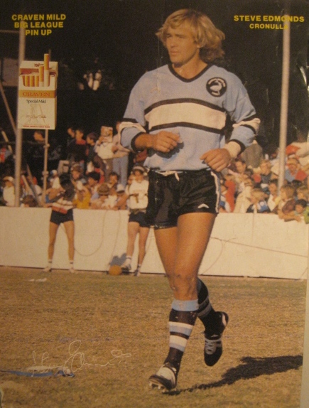
This is, and it will always be the best looking Sharks jersey IMO

1967%20mirror%20team%20card%20201205260003.jpg
 

100%green

Juniors
Messages
514
I didn't want to add red initially but you've trumped me here, looks great.


I jumped the gun when I saw "member's jersey". What does pink have to do with Eels members anyway?


And likewise, yourself. The majority opinion here is against yours, its not something that can be ignored. As a collector of jerseys, an extra jersey here and there is great but the jerseys are getting to be too much and the quality has dropped off in a major way.


The SL jerseys are what got me into design, but that design aesthetic has an obscenely short shelf life. The late 90's was a time when designers had access to new tools and their reliance on these tools made for a dark age in design (in general), look at 90's NBA teams for example. A few NRL sides haven't crawled out of this rut, or seem to crawl in and out of it.


Brand dilution for one, kind of makes a mockery of the term "uniform" if you don't immediately recognise who's playing who.


I'm sure some do, I'm sure a lot of fans don't. If its necessary, make fashion jerseys that don't appear onfield, this is a solution the NFL has come to to not compromise their strict onfield policies.


Theres nothing wring with a more subtle tribute. Dragons nailed it last year.


The Dogs and Storm have managed to transcend having a sponsor by becoming the sponsor, yuck. I also doubt many fans of a movie will jump onto a team because their jersey became a movie poster for a week.


MOST of it is flawed, a lot of which is for the silliest reasons. CCC for example ruined a perfect Warriors design this year with their patented piping that I'm sure improves player performance two-fold. Dogs will be the same next year. And before someone barges in and claims "its a modern interpretation", I ask does "modern" inherently means "cluttered".

Yes there's room for all parties to be happy but, with up to 6 jerseys a year, overkill territory has been reached.


Not to mention the stripes are about a foot below where they used to be. They're also another side panel disaster.


I guess I could have made the blue a bit more hazy, like columbia blue, it also depends on the screen you're looking at it on. I really should get my monitors calibrated. On sidepanels, its either laziness or cheapness to not print on the sidepanels.

Well as I have said to you before I am going to agree to disagree, cause I do understand your points I just don't agree with them.

I think the fact we have Home and Away jerseys then the other jerseys means that there is something to please eveyone.

It really is simple, if you don't like it DON'T BUY IT!!!!

There is no reason the rest of us have to suffer because there are others who don't like these jerseys.
 

GAZF

First Grade
Messages
8,756
Well as I have said to you before I am going to agree to disagree, cause I do understand your points I just don't agree with them.

We always seem to agree on this.

I think the fact we have Home and Away jerseys then the other jerseys means that there is something to please eveyone.

It really is simple, if you don't like it DON'T BUY IT!!!!

There is no reason the rest of us have to suffer because there are others who don't like these jerseys.

There's no Raiders jersey I want to buy at the moment, I wish they released a retro jersey.
 

Danish

Referee
Messages
32,019
Quite possibly the nerdiest footy conversation ever to grace the forums going on right now :sarcasm:


Unfotunately for me I'm such a nerd I am enjoying it :lol:
 
Status
Not open for further replies.

Latest posts

Top