Atleast they don't have a 3rd badge in the middle now, but still one team not having the tournament logo is pretty f**ken amateur...
PS. What is a NSW PI's
How did they get away with not having the Ampol sponsorship on the jersey as well?
Atleast they don't have a 3rd badge in the middle now, but still one team not having the tournament logo is pretty f**ken amateur...
PS. What is a NSW PI's
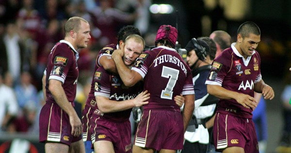
NSW used the NRL font last year, but with the Bryden's Lawyers logo instead of NRL at the base of each number. Qld used numbers from the manufacturer.Tooheys new looks great on the NSW jersey. Get rid of the chevrons, bring back the striped socks and it would be nearly perfect.
Qld jerseys look great from the videos I've seen online.
Will be interesting to see the number fonts. Hopefully not the standard NRL numbers.
Bring back the silver numbers!
Agree, it is by far the best 'recreated' jersey.That 2001 Newcastle jersey definitely suits the O'Neils template better than their home jersey does
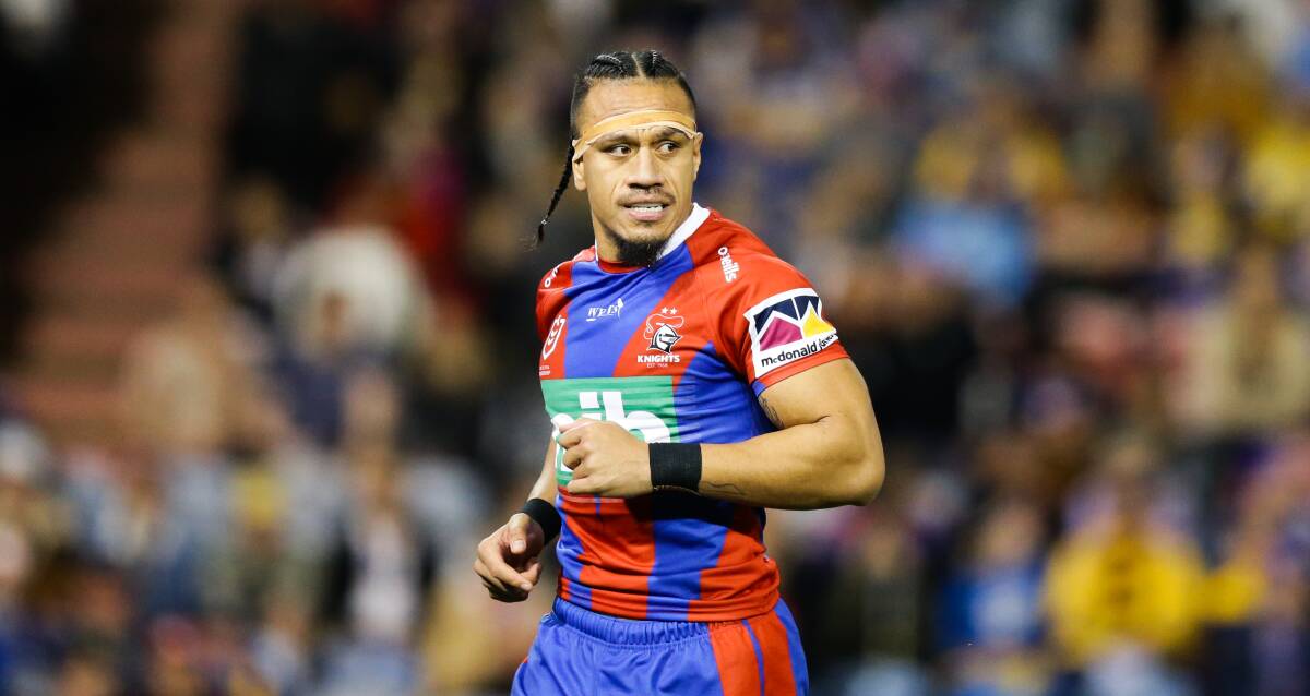
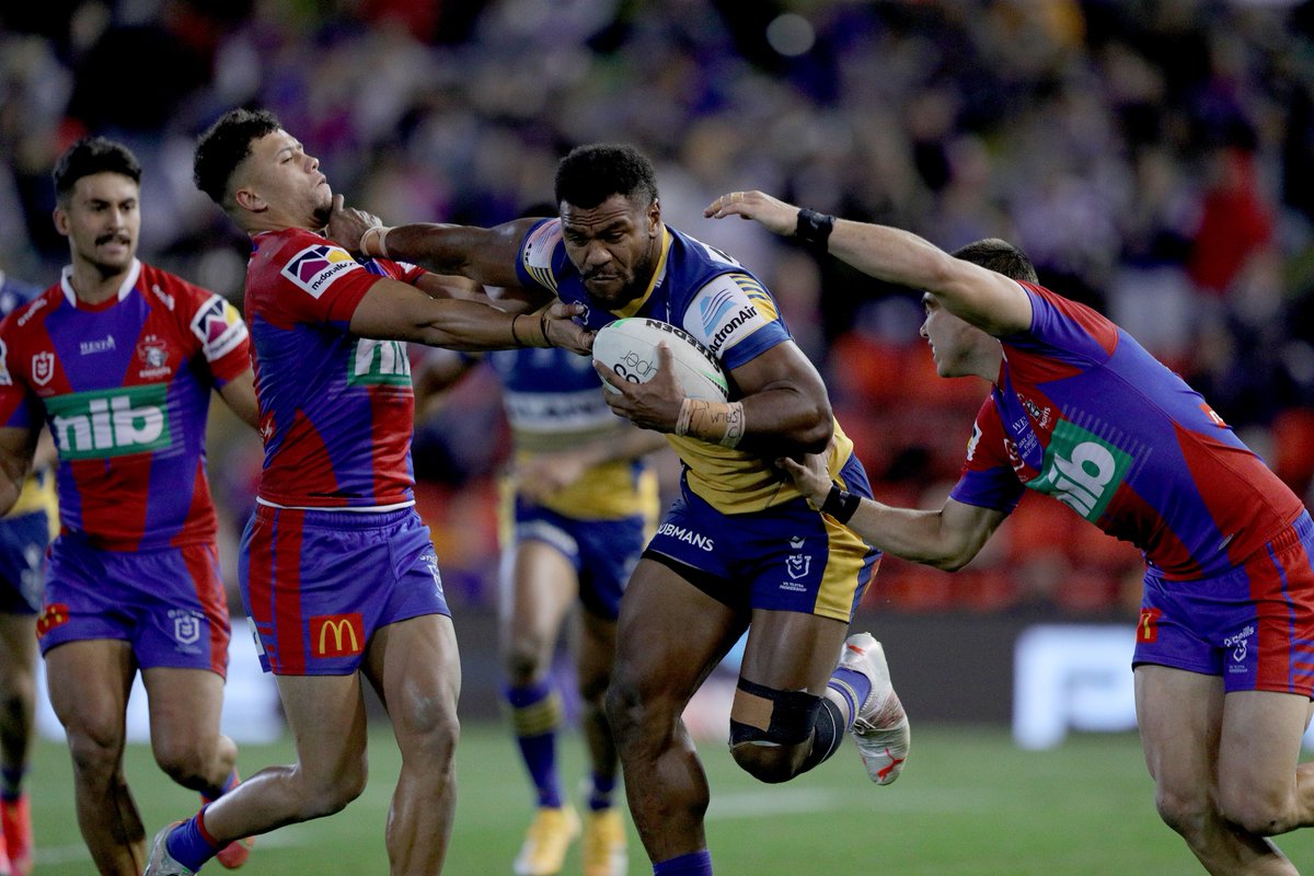
Looks like the Adelaide Rams to meAgree, it is by far the best 'recreated' jersey.


"Local-ish"
Little bit boring without the gold strip somewhere on the jersey, i mean this years kit looks amazing because of how they've incorporated more gold into their jersey, instead of the boring navy shit from the past few seasons priorTitans "Neon Lights" city jersey to be worn in the Round 25 fixture v NZ Warriors.
It will feature the names of all members that pledged their membership to the club in 2020 and 2021.
View attachment 49294View attachment 49295
"Local-ish"
I don't think so, it would've been announced by nowDo NSW have a shitty alternate Jersey again this year or scrapped that idea?
Titans "Neon Lights" city jersey to be worn in the Round 25 fixture v NZ Warriors.
It will feature the names of all members that pledged their membership to the club in 2020 and 2021.
View attachment 49294View attachment 49295
