kdalymc
Bench
- Messages
- 4,343
That is spewStorm: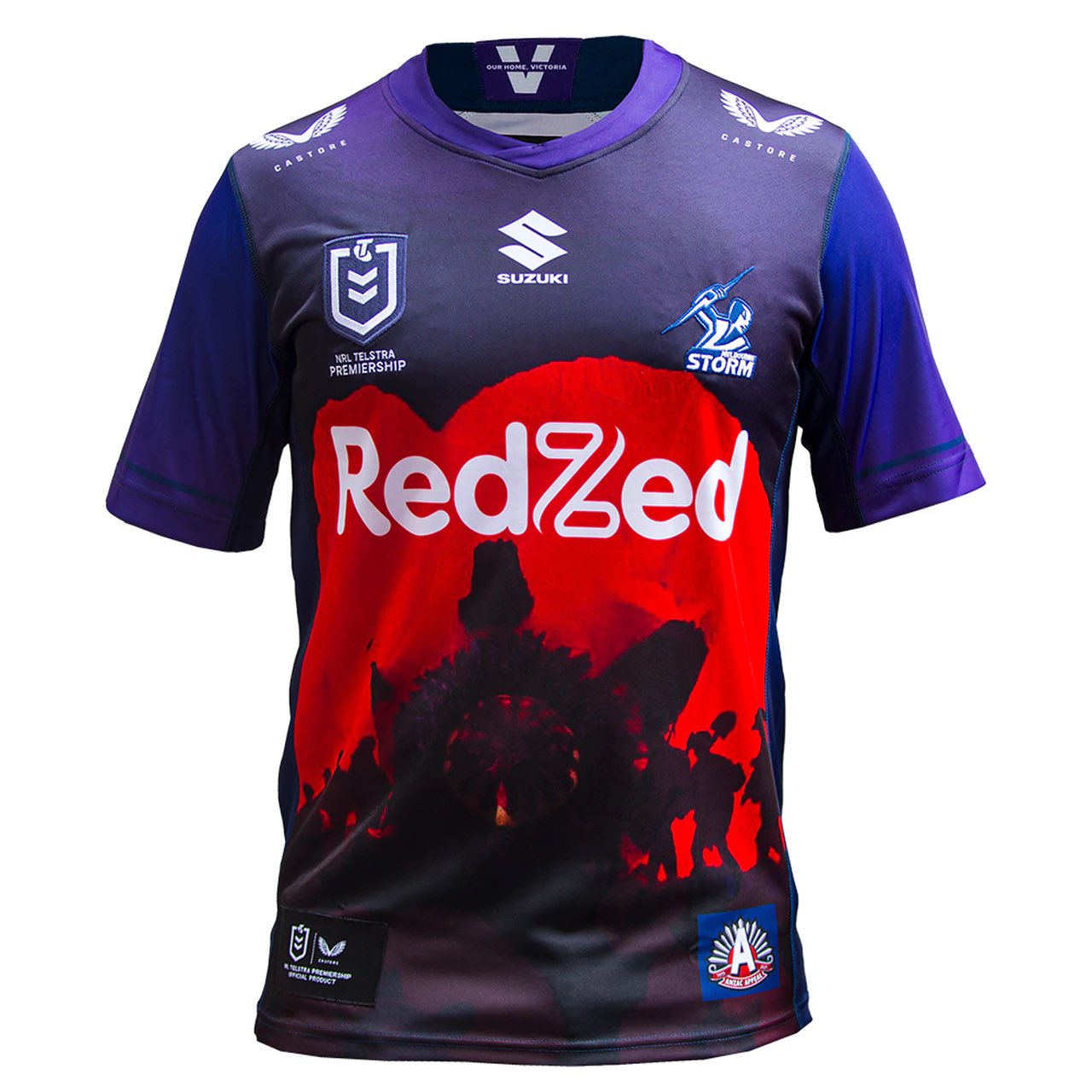
That is spewStorm:
Absolute dog shitStorm:
Storm:
Absolute dog shit
This enters top 5 worst territory. Who at Castore was throwing tampons to lay a base?Storm:
I'm confident in saying that the Raider's Heritage jersey is being used as their home jersey full time. That's the 3rd time they've worn it at a home game to date
Hot mess on field next Sunday then...
I'm confident in saying that the Raider's Heritage jersey is being used as their home jersey full time. That's the 3rd time they've worn it at a home game to date
I love the "as first revealed at bluebet stadium" as though fans are frothing over a sponsorship extension announcementHertz remains the PENRITH!!! sleeve sponsor until 2023...

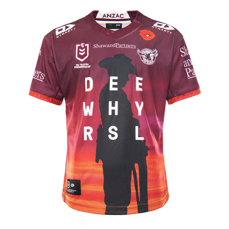
There has been a reason each game for the heritage tbf. R1 opening game of 1991 anniversary season, V Canb as the actual commemoration, and this week because it was the best non clashing kit v Brisbane. Anzac jersey this week then probably more normal jerseys going forward. Heritage will probably get less air timePenrith have worn their heritage jersey 3 out of the 6 matches so far too, 2 in the pink away and only 1 time the home ( v Storm). Maybe the heritage will 'organically' become the home soonish. Hope so, but also love the simplicity of the current home design as well.
I don't like the whole jerseys color combo, but reversing the main color and sleeve color would have probably worked better, castores stitching is also pretty ugly looking, its almost like they are even tryingThe actual artwork itself I don't mind, with the combination of the poppy and the diggers, for me I just don't know why they needed the blue square around the ANZAC Appeal logo and why the fade for the sleeves isn't the other way around.
Haha wot.A hint what the NSW Blues jersey might look?
Actually its probably what the see thru part will be... not sky blue.. just logos!Well at least there’s less logos and embroidery.
