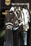
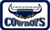
Bring this back....
View attachment 67882
They had this for all of one year a few seasons back... along with their best jerseys ever.. im not even a cows fan and i bought them both
Agreed, that they need to go back to something similar to this, IMO just getting rid of the star would probably suffice.
The explanation of why they went away from that font at the end of 2001 was because the embroidery costs at the time and the intricacy of the actual wording. A lady involved at the club at the time was telling us in fans in Sydney that it was essentially 3 layers of stitching (grey background, the white and then the navy over the top). She alluded that they had a heap of merch made up and it turned out rubbish and they had to bin it all, which pushed them to move to the current simple font. This was 20 years ago so i'm sure technology has improved, cost might still be a factor though?
Back on NQ's jerseys, I'm interested to see who takes the centre breast sponsorship as Bundy rum doesn't appear at the moment.


