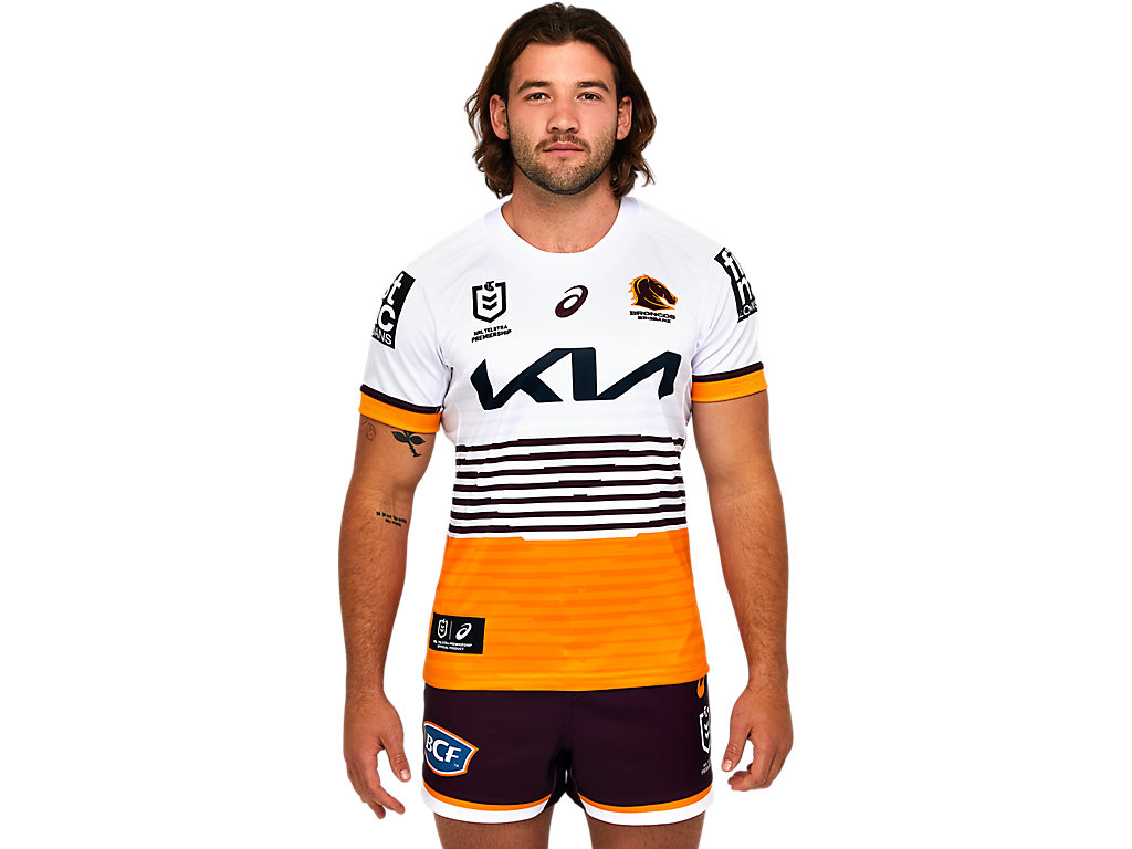
f**k me I jinxed thatYet it still wouldn’t be the worst we’ve ever come out with (looking at you: 2013/14 weird angle jersey)
Thats what happened with the white away kit for penrith, several years ago... fkn terribleI think it's a merchandising angle.
Maybe because they believe white is easier to sell to fans than bright yellow (especially the more casual end)?
Now, if that's the case.. I'm not sure if they would have done any research to back that up - but my thoughts are
1 - if a casual fan/new supporter was gonna shell out for a Parra jersey that's not too bright they'd buy the blue one. (Not white OR yellow)
And 2 - the hardcore fans seem to want yellow as the away. NOT white.
So this white thing ends up unloved by both groups.


f**k me I jinxed that
It’s such a weird feeling seeing much the same design for a third straight season. The last time it happened for us would be the 2010-2012 home jersey (I think), and the last time it was an away jersey would be 2007-2009The away would be nice if it didn't have the V within the stripes
View attachment 68720
Some companies just shouldn't be allowed near Rugba Leeg.....
Going for an asymmetrical design like that is pretty bold.Here it is
I like it now that I’ve seen videos of it being worn. It stands out.Going for an asymmetrical design like that is pretty bold.
Yeah it’s alright, nothing special, but not terrible either.
The boring old arseholes who hate anything that isn’t an exact replica of designs from the 80s and 90s will piss and moan about it endlessly though…
It's objectively awfulGoing for an asymmetrical design like that is pretty bold.
Yeah it’s alright, nothing special, but not terrible either.
The boring old arseholes who hate anything that isn’t an exact replica of designs from the 80s and 90s will piss and moan about it endlessly though…
Is it now lamo.It's objectively awful
The designer took acid? No no.. that would be the 2005 Tigers jerseys.Looks like the designer took acid…but I’m sorry. I like it and think it will look great on field
