Perth Red
Post Whore
- Messages
- 73,763
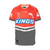
It would have been nice if they had come up with a really iconic design for year 1 that becomes their main stay every year. It feels like another Titans where most people would have a hard job describing what their jersey brand actually is. The invention of subIimation has sadly taken away from the simplicity of brand design.


")