My best guess is that it'll be a captains run shirt, or maybe something for magic round.
Yeah good shout on the latter. Didn’t think of magic round
My best guess is that it'll be a captains run shirt, or maybe something for magic round.
And bulldogs would wear blue over the white being away... so no white either wayIt's got the NRL logo so my thoughts are we will see it in a game. Magic round makes sense.
Canberra play Bulldogs in magic round and are the home* team so they'll likely be in green and unlikely would have to be in their away.

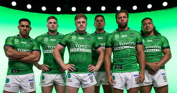
I don’t understand how the Raiders jersey designers still have their jobs.View attachment 84087

Raiders launch 2024 Alternate Jersey
The Canberra Raiders are proud to officially launch their 2024 alternate jersey featuring an all-green design.www.raiders.com.au
My first thought of this reveal was TGD would shake his head in disbelief, hahahahaI don’t understand how the Raiders jersey designers still have their jobs.
Canberra are generally having a crisis with their colours. They can't seem to stick to a common shade of green and now they're messing around with their shades of blue.
This is quite possible the worst jersey in the NRL bar Canterbury Bulldogs Home jersey.
Raiders brand stronger, fitter, green-eyed and ready for season 2024 and beyond
Just as our players look for ways to stay on top of their game, so too does our organisation when it comes to our brand.www.raiders.com.au
They rebranded (again) last year, refining and uniting their two greens, but I think the blue (navy?) has been the same for 3-4 years now
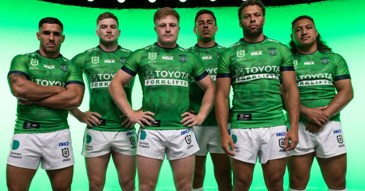
When they said they wanted predominantly green jerseys what they meant was that they didn’t want jerseys that are half navy and steel, not that they wanted ugly failed abortions with a shit logo stretched across the front.The Canberra Raiders have shared more details about its alternate jersey for the 2024 NRL season. A special edition Indigenous jersey and one more design will make a total of five different Raiders jerseys worn this year.
"We wanted something a lot cleaner in terms of colour palette, and to trial sponsor logos in mono," Raiders chief operating officer Jason Mathie said. "For the fans there was also a lot of commentary on social media and on game day saying they wanted a predominantly green jersey.

Raiders reveal more details about all-green alternate jersey
Tantalising teaser of new kit and logo prompts fan debate.www.canberratimes.com.au
Why did the Cowboys revert from their classy, modern 25 years logo in 2020 back to the shitty 2003 Clipart jersey the following season?Hard to have a good jersey when it's based around a completely rubbish logo. Such a shame, the previous revision of their logo was actually really good and modernised the viking quite nicely.
That Warriors heritage is utter sex. I pray Dynasty do something similar for us next year.
Not sure, they've at least removed the red outline around the wording which seemed to come into the equation whenWhy did the Cowboys revert from their classy, modern 25 years logo in 2020 back to the shitty 2003 Clipart jersey the following season?
All of them totally green.The Canberra Raiders have shared more details about its alternate jersey for the 2024 NRL season. A special edition Indigenous jersey and one more design will make a total of five different Raiders jerseys worn this year.
Why do you care, you're a bears fan anyways,When they said they wanted predominantly green jerseys what they meant was that they didn’t want jerseys that are half navy and steel, not that they wanted ugly failed abortions with a shit logo stretched across the front.
Besides, the Raiders only ever ask the same tiny minority of over the hill, self important, wankers about this stuff, never the broader general fanbase. It’s genuinely one of the biggest problems with the administration of the club at the moment.
I bought both those 25 years jersey home and away, they are the BEST, and im not even a cows fan, the grey/silver really stands out, makes the jersey work, the current shit they are wears in boring as, its like they want to be the eels but shitterNot sure, they've at least removed the red outline around the wording which seemed to come into the equation when
Toyota jumped on board in the early 2k's
There has been talk of star removal, i think it's has its day and just horns with the current text would be absolutley fine IMO if they wanted to do that full time.
I am yet to see a new version of the horns (or any other completely new version for that matter) that hits the mark. The horns are dated but they're recognisable.
Sidenote- I really hope Dynasty are cooking up something heritagey for NQ's home jersey next year....
