And in most club cases they have a contrasting alternate colour to work with.
Brisbane - Maroon & Yellow. Why not have maroon home and yellow away?
Bulldogs - Blue & White. Predom White home, Predom blue away
Canberra - Lime & White (with blue and yellow), they use this well now.
Cronulla - Blue Black and White. Used well also. Although that away jersey does look sh*tty.
Gold Coast - Aqua white and gold, all used well with each other
Manly - Maroon & White - inversion of each other again, well used.
Melbourne - Navy, purple, gold and white. Need to pick up their act with that away jersey quick smart. No reason they can't do a navy/purple home strip and a yellow/purple away strip.
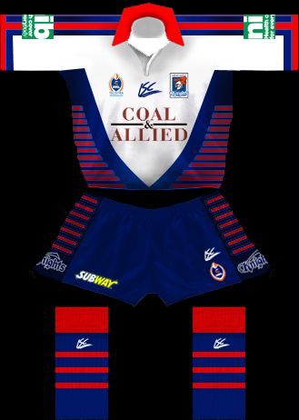
Newcastle - perfect setup - Blue and Red inverted H&A strips.
New Zealand - Black and silver. Inverted H&A Strips, well set up again.
North Qld - Navy, grey, yellow and white. An unknown quanitity although their cow horn jerseys worked well inverted for a few years.
Parramatta - Well set up again - yellow home, blue away, even a white if they get stuck.
Penrith - Black, teal, rust. Not sure why their away jersey needs to be white when it's been a club colour (teal) for the past few seasons but whatever works Pemriff...
Saints - Self explanatory, white with red v at home, red steelers strip away. good use of colour inversion
Souths - pretty dodgy IMO... the home jersey looks great but the away is a pretty minor deviation from the home jersey... seems pointless. They should've gone with the mintie strip or something. That said they do look quite sharp.
Sydney - Use the tricolours well although the OTTness of some of their away jersey designs lately is weird. Could've just stayed as is.
Wests - hope they stick with the current pattern. Each is a good tribute to the parent clubs and look good.
At the end of the day every club will do whatever they want anyway :lol:


