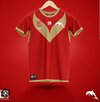
They've got it back to front. If anything, the "heritage" is iconic and classical, has meaning. Also, uses gold as a trim as it should've been. And the "home" is actually more akin to a gimmicky over-colorful "alternate" jersey.Thing is, I predict their heritage jersey will become their main jersey and (like the Raiders) they will have 'modern' jerseys alongside it for seasons to come. Technically, their heritage jersey was also their debut jersey released for the NRL.
The club won't please everyone I guess.
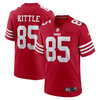
I am biased, but I love it. Coke jokes aside from the peanut gallery (lol), the strip is good on the eye. The red and gold is a nice contrast (some similarities to the infamous American 49ers NFL team). We will have multiple variations in '23, and I am assuming at least three to four including the Women in League, and ANZAC Day rounds.


Got himself some camel toe too...The model is posing like a kindergartener on his first day of big school.
Ok your obviously trolling now... you just litterally replied to you on the dolphins thread, and you talked about how shit the colors were, golden sand aka baby poo,Starting with a blank piece of paper they did have the opportunity to avoid the Titans mistakes and actually come up with a design that would be iconic and instantly say Dolphins. Instead they have come up with a local club design that will no doubt change significantly every year. Colours are nice done correctly but would have been nice if they had made the effort to come up with a design that would set them up for the next 20 years.
I would prefer this but in gold/red reversed, and a red V/tail/finView attachment 67062
They should have just used what the Q Cup team wore this year. The template is old school and distinctive. Red and white is fine without the Gold.

red, white and gold works well if gold is used sparingly and in the right shade. Neither of which they've done in this. Theres too much and it looks, at least in photos so far, a horrible shade of gold. Might be better in the flesh but its not great right now lol.Ok your obviously trolling now... you just litterally replied to you on the dolphins thread, and you talked about how shit the colors were, golden sand aka baby poo,
so which is it?? Again trolling whingers
So are the colors nice, or are you just pissed coz they used thr proposed pirates colors... seriously your so fkn transparentred, white and gold works well if gold is used sparingly and in the right shade. Neither of which they've done in this. Theres too much and it looks, at least in photos so far, a horrible shade of gold. Might be better in the flesh but its not great right now lol.
Design is poor and doesn't scream this our brand for years to come does it?
Considering 95% of comments I've read so far dont like it I think I'm in a majority on this one lol
mate not everything's about the pirates, give it a rest, you seem obsessed lol.So are the colors nice, or are you just pissed coz they used thr proposed pirates colors... seriously your so fkn transparent
I was at the GF, it was pretty good, had a cheer squad, mascot introduction (phinny) andmate not everything's about the pirates, give it a rest, you seem obsessed lol.
Those wont be our colours so not sure what you are going off half cocked at? We wil have black inthere as a key colour you would think.
The colour combination is good, works well together.
The execution of those colours in this instance looks sht what I've seen so far, imo and the majority of others opinions it would seem.
Are there any photos from the actual stage launch at GF so we can get a better idea of what it looks like in the flesh to speak?
 massive flag of the jersey, took up about a 1/8th of the field... it was a pretty impressive roll out
I was at the GF, it was pretty good, had a cheer squad, mascot introduction (phinny) and View attachment 67088massive flag of the jersey, took up about a 1/8th of the field... it was a pretty impressive roll out
PHINNY... i said it already, brotherDo they have a name for the mascot yet?
PHINNY... i said it already, brother
One of my mates is named Vincent, vinnie for short... been calling him Phincent since we saw the new mascot, probably buy him a jersey to solidify the nicknameS*** sorry. Obviously skim reading. Not a bad name - it’ll be popular with the fans.
thats not the issue. to be fair yes, the bar isnt that high. and there is some shockers going around. but its a brand new team, with a chance to come out with a bang. theyve f**ked up nearly everything here, and to top off the shit jersey, you can guarantee they will do a titans/tigers and change design/colours/shades within 2 years....I believe we have done a good job with the nod to our proud history (established in 1947) with the new jersey. The new jersey, with the red, white and gold, has been eloquently explained by the club on their website. I love the jersey. I love the vision.
If not pleasing the other 16 teams' fan bases isn't going to be achieved. So be it.
Gold is best suited to trims and details though. That red jersey body with a proper Gold St George style Chevron V (not this curly one) and no gold patch under the armpit would be an iconic jersey. Simple. Timeless.I would prefer this but in gold/red reversed, and a red V/tail/finView attachment 67076
'Eyesore' NIB logo will be less of an eyesore in 2023. Thank whatever-deity-you-choose-to-believe-in.I’ll add that my team (Raiders) have got that stupid blue jersey - seriously we are called the Green Machine for a reason so stick with it. The Knights will probably have that eyesore NIB logo. So don’t worry mate, it’s not just your club
