Crocs would have been good and very NQ. Stockman is just the Australian term for Cowboy but its more a central QLD thing than North.Nah they should have been the Crocodiles (Crocs)
And no the basketball team wasn't called the Crocs at the time (they were the Suns).
The word is that the local Townsville Union side was called the Crocs, and objected that that name being used but frankly who gives a flying f**k, throw them a few bucks.
Crocs would have been good and very NQ. Stockman is just the Australian term for Cowboy but its more a central QLD thing than North.
As long as a little thought is put into it, blood red and metallic gold shouldn't clash with maroon and yellow gold. Burgundy on the hand probably would.I agree with what you are saying with the red/gold but it's nearly saying to fix it they should change to Broncos colours. It's already far too close as it is.
The shade of red Redcliffe have used for years is great, no idea why they changed it. White seems to have always been in their plans, but they should never have picked gold as the third colour. Red/white/black, red/white/grey were much better options.
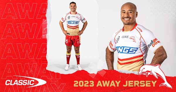
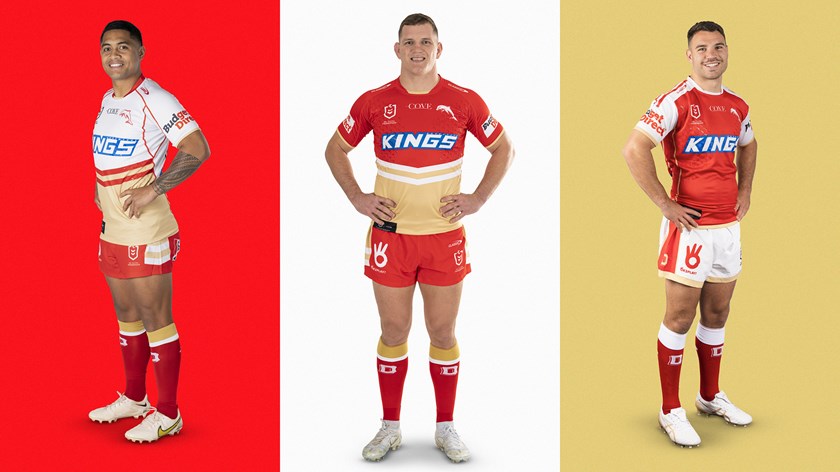
The gear is hideous, something about the shade of red is so amateur, real Gold Coast Suns vibes (Dolphins are giving them a run for the worst sporting branding in Australia). Classic are also by far the worst apparel makers which makes it worse. I've watched their recent Instagram posts and it looks like a local junior team training.
Got lucky because Telstra stopped being a monopoly and technology was becoming bigIts almost like professional sport collapsed when they banned tobacco advertising. Oh hang on........
You'd think they would only have that as the heritage... i saw the normal hoop design last week in a pic for a sponsor with nicho, some pages backOn the latest episode of the ‘ Aussie Jersey Watch’ podcast, one of the hosts mentioned that he’s heard that the Sharks home jersey for 2023 will be blue with a white chevron, like the original 1967 design/2017 heritage
The odd thing is I'm wearing the heritage jersey right now, and the gold on it is old gold. When the team was announced they specifically said the third colour was old gold, supposedly meant to be an accent colour only to the primary club colours of red and white. Why they changed their minds and made gold the second colour and made it a beige shade instead of old gold is beyond me. The jersey should have the gold and white switched, in my opinion. Old gold chevrons dividing the red from the white would have looked much better.It's honestly amazing how the Dolphins have manged to take red and gold, one of the best colour combos on the planet, and make it so ugly.
Their problem is that the shades are way off. Changing the shade of gold to a darker shade like old gold or brilliant gold would go a long way to fixing their problems. Moving from a bright red to blood red, or maybe something even darker like burgundy, would make the gold pop even more and look amazing as well.
They should also look to either replace white with a dark grey or black in their colour scheme, both of which go much better with gold than white, or use the white much more sparingly in their kit.
They also need to lower the ratio of gold to red on their home jersey as well, and explore using materials that actually give a metallic effect as well.
Cowboy is also literally the term for a bullrider. Plenty of rodeos in NQStockman is just the Australian term for Cowboy
Nah they should have been the Crocodiles (Crocs)
And no the basketball team wasn't called the Crocs at the time (they were the Suns).
The word is that the local Townsville Union side was called the Crocs, and objected that that name being used but frankly who gives a flying f**k, throw them a few bucks.
Okay, this was just a very quick mockup, but it's pretty much what I was talking about. Simplifying the NQ Cowboys logo by reverting to a similar version of the original 1995 logo, cleaning up the text, and those simultaneously make the logo more along the lines of the clean, modern, social media friendly logos that have engulfed the NRL, and Australian sport in general.Yeah, there's a lot of intricate bits going on in that 'COWBOYS' text with the blue, white, black, and grey. That logo with a simplified version of the text (and removing that 90's style Publisher 'word art' shadow) can / would look brilliant.
Would’ve been my choiceShould have been the Marlins........
I personally would have called them the MugabesWould’ve been my choice
Not bad mate, not bad at all.Okay, this was just a very quick mockup, but it's pretty much what I was talking about. Simplifying the NQ Cowboys logo by reverting to a similar version of the original 1995 logo, cleaning up the text, and those simultaneously make the logo more along the lines of the clean, modern, social media friendly logos that have engulfed the NRL, and Australian sport in general.
Maybe include '1995' in there somewhere, as the year of establishment is also popular these days, and I think NQ would be close to having their logo!


Seeing the home and away together for the first time, I totally agree with this. If the only gold was the two lines across the torso, the rest red and white, they would look good.The odd thing is I'm wearing the heritage jersey right now, and the gold on it is old gold. When the team was announced they specifically said the third colour was old gold, supposedly meant to be an accent colour only to the primary club colours of red and white. Why they changed their minds and made gold the second colour and made it a beige shade instead of old gold is beyond me. The jersey should have the gold and white switched, in my opinion. Old gold chevrons dividing the red from the white would have looked much better.
