What's new
The Front Row Forums

Register a free account today to become a member of the world's largest Rugby League discussion forum! Once signed in, you'll be able to participate on this site by adding your own topics and posts, as well as connect with other members through your own private inbox!

New Jersey Released - Pictures inside.

sixtynine

Juniors
Messages
826
i actually love new homee one + the white away one the blue one is average but i cantt waiit till chriissy hitting up the home onee probzzz..!!!
yeewww
 

Parra Guru

Coach
Messages
14,645
The Quest For Glory said:
Will there be any last minute sponsors on the back? This will be my xmas pressie and I dont want any surprises like last years Red Rooster.

anyone got a definate on this yet?
 

ParraDude_Jay

First Grade
Messages
6,160
Blue one is very sharp. Not sold on the yellow and the white is pretty bad.

And thank god they kept the collars and we won't look like bloody Broncos supporters.
 

BlueNGoldBlood

Juniors
Messages
1,296
I like the predominately blue one.

The gold/yellow one has way to much gold/yellow imo.

Not a fan of the white one though.
 

Parra Guru

Coach
Messages
14,645
just a tip for anyone thinking of purchasing a jersey from Wynnies when they get there....

Currently on their website there is a printable voucher for 20% off your purchase (excludes items already discounted).... here's the link if you want to print one off..

http://peterwynnscore.com.au/pw.html
 

Hellsy

Immortal
Messages
30,754
True EEL said:
i liked the old Tesltra Premiership logo, but that one is alright too, bit like the new jumper, its a bit old school and cool

Here is the progression over the last 11 years:
rllogos.jpg
 

Nikki

Coach
Messages
11,495
I still dont get the colours for the new logo. I always assumed the green and gold in the old logos was to represent australia. So now the Kiwis and the sharks are being represented by the new one!! :lol: :lol:
 
Messages
14,648
Nikki, they are Telstra's Corporate Colours.

Look at the Next G Ads.

Sky Blue, Black, Brushed Silver and Orange.

It isn't the new NRL logo, it is the telstra Premiership logo.
 

rowdy

First Grade
Messages
5,367
the logo does look very sharkesqe

anyways...the jersey looks alrite on, could have done with a bit better posing! haha
 

btaag

Juniors
Messages
662
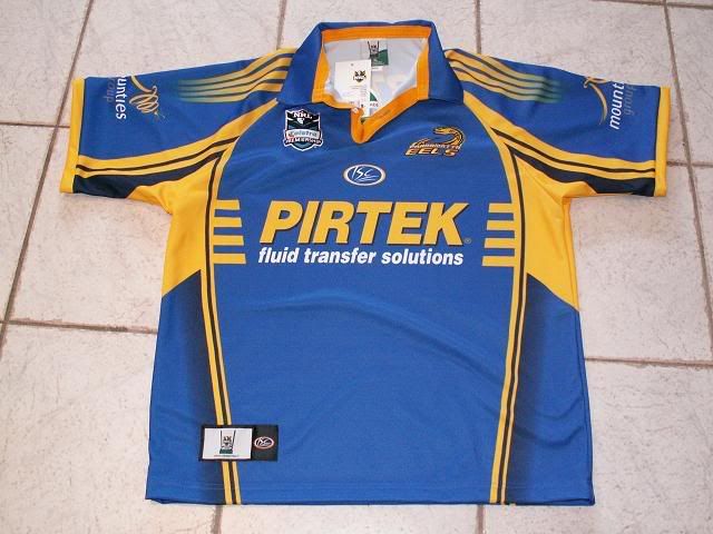
I am happy with the blue design, I dont mind the yellow and can tolerate the white design.

I totally refute any suggestions that we should use a yellow home jersey because it doesnt clash with other designs, and makes us more distinctve - what rubbish. As a majority of people have said, the blue design is the best and we have historically worn Blue as a home top (or had a minimum of 60-40% blue in our home top on average since inception).

The fans who came on board post 1996 might preference the yellow, but I would like to point towards the thousands (literally) of Parra fans who have bought either the 1982 retro Blue top, the 2005 70's retro blue or the 80's retro blue top and wear them to the games over the current designs as proof that we want the blue as our home strip.

Its all good to make money for the club ( and I will get the blue and possibly the white/training top), but lets stick to our tradition, eh?????

You dont see the dogs using a blue and white away top and a white and pink home top to make more money, do you?

PS. I love the return to Royal blue.
 

ParraMatt

Bench
Messages
3,668
Love the new jersey, i'll be buying one very shortly, and suprisingly enough yeh i love the gold number 1, but i'm a fan of the white, might just buy that one. be a bit different. hehe
 

Parraren

Bench
Messages
4,100
It's interesting that the club decided to go back to the more traditional & popular 'lighter' blue rather than the dark/navy blue of recent years.

Wonder if they did any market research into this because i'm pretty sure most people on this board and probably most parra supporters in general prefer the 'lighter' blue to the navy.

Good move either way.
 

bartman

Immortal
Messages
41,022
Some better graphic versions of the new jerseys, for people that like to keep such things on their computers, use in building sigs/banners etc. (They've still got the old Telstra Premiership logo though...)

eels%20home.JPG

eels%20away.JPG


That's home and away - still looking for a graphic the alternate (blue) - looks like it may not be stocked in the UK.
 

Avenger

Immortal
Messages
32,985
The blue one looks fantastic. I went to the leagues and actually preferred the white one over the yellow one.
 

Latest posts

Top