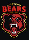
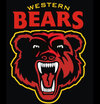
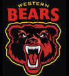
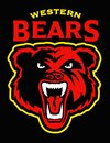
I started designing my mockups before I came across those. Mine are based off both the NS logos of the early 90s (the round logo) and the late 90s (the badge). The bear head emblems are a little different from eachother, by the way.
My logos took common elements from those emblems: basic head shape, front-on view, thus placement of eyes, nose, ears, mouth all align with the classic NS emblems. The placement of the shadows (the angle from which the sunlight was hitting the bear) was also a conscious decision. The mouth was pretty much just copied across from one of them with just a couple of minor alerations.
My logos were designed with the current theme of logos to be social media friendly (ie: simple, yet still unique). Those old NS logos have a shit-tonne of detail (nearly every strand of fur on their faces was depicted!), so really needed simplifying.
My logos also, for my own personal preference, need to have a hidden or subtle addition reference. In this case WA, either the shape of the state or the initials. My earlier versions had a W in one ear and an A in the other, but my final versions just had a big W on the cheek instead.
Along the way, those IP-submitted logos came out, but my thoughts, preferences, and ideas remained. The only addition to my logos since then was the wordmark, which I took directly from the NS & NRLWA press statements, presuming they're a taste of what's to come from their finalised logo.
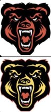
@Centy Coast, you requested a red bear with gold outline. Well, here 'tis!
View attachment 93685

